For more than a century the Walker Art Center has been one of the nation’s top contemporary art institutions. Nestled on a sloping hill just outside of downtown Minneapolis and connected to the city’s renowned system of parks and lakes, the Walker campus is home to a challenging and diverse program focused on visual, performing and media arts.
Global Architecture & Design Awards 2018
Third Award | Category: Cultural (Built)
Architects: HGA | Joan Soranno
Country: United States

With a campus that includes two existing architectural masterpieces by Edward Larrabee Barnes (1971) and Herzog and de Meuron (2005), the Walker offers a multidisciplinary, diverse approach to the creation and interpretation of art. However, when the Herzog expansion shifted the main entry away from the Minneapolis Sculpture Garden, the Walker suffered from an absence of clear identity and circulation, particularly from the garden. Additionally, it lacked an engaging public space that could unify its distinctive architecture and iconic landscape.

PROJECT SCOPE
The project includes a new 5,500-square-foot entry pavilion containing a new restaurant and kitchen, entry vestibule, foyer and green roof. The project also includes a 15,200-square-foot renovation of the main lobby, parking entry and mechanical rooms, and a complete reclad of the existing Barnes brick building to bring the modernist landmark up to contemporary energy codes and performance. Finally, the Walker’s previously incomplete upper garden was renovated and integrated into the newly unified 19-acre campus.

DESIGN INTENT
The new pavilion takes cues from the adjacent Barnes masterpiece in materiality and massing to create an architecture that is deferential and contextual, yet still has a voice of its own. Tucked into the existing hillside, the landscape appears to peel up to accommodate the pavilion and reveal a brightly lit, convivial space beneath. Accessible paths now meander through the upper garden’s groves of trees and contemporary sculpture, and a green roof over the pavilion offers expansive views of the sculpture garden.

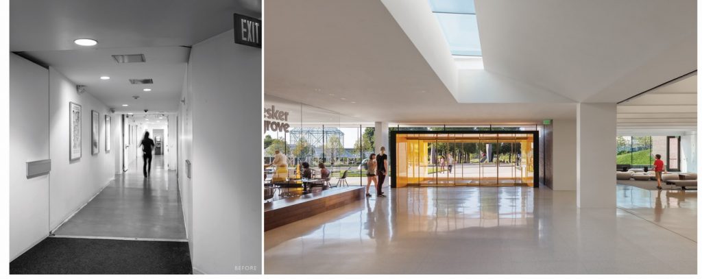
Visitors enter through a bronze vestibule, lined in a high-gloss Ferrari-yellow aluminum liner, offering contrast to the pure white interiors of the original Barnes building. The entry from the underground parking has been vastly improved, where a formerly circuitous path through a cramped hallway is straightened out and expanded, offering a direct visual connection from the parking lot to the sculpture garden. The pavilion contains a new restaurant featuring an expansive canvas for rotating art, and floor to ceiling windows that overlook Claes Oldenburg’s iconic Spoonbridge and Cherry sculpture. The renovated lobby is opened up to views of the sculpture garden and Barnes’ original precast concrete tees, covered by a lid in the 2005 renovation, are exposed and celebrated. A new centrally-located information desk, satellite museum shop and lounge area transform the space into a new public hub connecting the primary visitor amenities.

The entry pavilion and renovation unifies the formerly disjointed site and presents a clear, bold new identity for the Walker Art Center. Through a series of simple but complex moves, the pavilion, renovation and upper garden now manifest as a new public heart for the sprawling Walker campus.
If you’ve missed participating in this award, don’t worry. RTF’s next series of Awards for Excellence in Architecture & Design – is open for Registration.
Click Here


