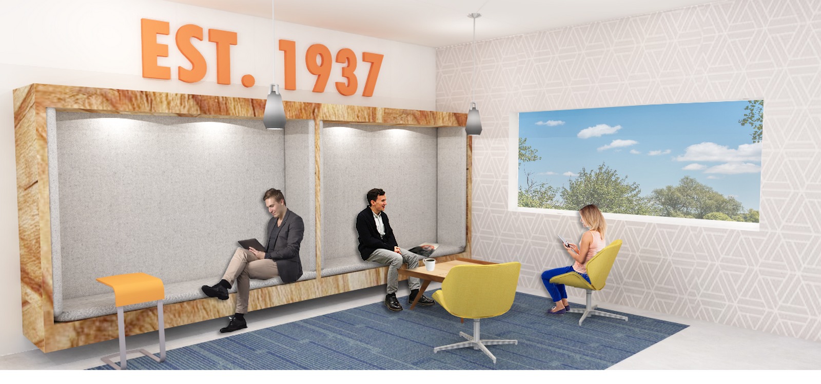
Project Concept: OFS is a furniture company with core values of sustainability and craftsmanship. Representing five different lines of furniture, the work styles and demographics of these internal departments have dramatically changed. It was time to rethink their workspace and create a home for the next phase of the ofs evolution. The re-design of the OFS headquarters hopes to generate a more comfortable and progressive interior. Creating a space that functions both as a workplace and as a showroom in hopes to express the ofs brand.
Architects: Jessica Micallef
Project Partner: Lauren Deshamp, Workplace Studio
Programs Used: Revit, Sketchup, Adobe Photoshop, Adobe Indesign, Podium
(I have pasted the images next to the text that correlates to it! – also in the correct order that it should be formatted in to tell the story of the project)

There are 8 departments that need to work cohesively together on the floor incorporated with leadership offices, collaboration spaces, and workplace amenities. The goal was to place each department based on acoustics, work style, and environmental needs. One of the challenges with the existing plan (shown left) was working around the columns, not interfering with structural walls, and creating an experience with some of the skylights. Shown right is a schematic diagram determining proximity planning.

The layout of the different departments and areas was done to relate to my concept being that this OFS space is the headquarters to the company. Therefore, the theme of space planning becomes a metaphor for the layout of a home. Shown right is my progression of planning going from a home layout to the ofs workplace layout.

The floor plan uses concrete and wood to determine circulation and collaborative/meeting areas. Whereas different colored carpets break up the areas into the different departments. All furniture used for the workplace areas are from OFS collections. Other pieces in collaboration or lounge areas use manufacturers such as Herman Miller, Grand Rapids, and Knoll.

OFS is strongly connected to tree-farming through the manufacturing of their furniture pieces. With their culture striving to be connected to the woods, incorporating raw wood elements into the interior was important. Woods were selected that ofs uses for their pieces and with the adjectives and meanings of the raw materials. a connection was created with wood types to the areas that related to their meanings. Within each area, there are wood elements that relate to the raw material.

The kitchen area is a main social hub of the space. Equipped with a full coffee bar and multiple seating options. Bringing the staff together throughout the spaces was implemented in several locations. A variety of them have large white board spaces for community interaction as well as being a great collaboration tool.

Over the skylights is a customized furniture piece. Using one of OFS’s Hinchada couch pillows; turning it into a swinging seat.

There are also a variety of other spaces to create unique aspects such as: Touchdown spaces for casual meetings or personal time.

Personal lockers and a community wall over by the lockers.

Conference room spaces that are equipped with an av/media projector system

Within the space, there are projected graphics on the walls that incorporate OFS furniture pieces. Each graphic represents pieces that are exhibited in the area. This creates a unique experience for the visitors and rep’s as they tour through the headquarters. Under each of the graphics is an explanation on the product shown; how it was designed, when, and what for. These graphics are projected on the wall to allow for flexibility and change


The lounge area is a central hub to meet, relax, and engage with others.

The reflected ceiling plan shows how multiple lighting elements were used. Exposed ceilings are implemented in many of the showrooms, so translating that at the headquarters was important to create a branding connection. Several acoustical products were used to help with sound control for the open office plan. Within the spaces, incorporating different ceiling heights brought unique characteristics to the areas.

This render shows one of the raw wood elements implemented to be a unique divider to the space, in between customer service and order entry. In the center core there are offices for the leadership of the departments as well as an open conference space. It’s important to have different accommodations for gathering together to meet or collaborate.


Jessica Micallef
Jessica Micallef currently works as an Interior Architect/Designer at the Architecture firm SmithGroup in Downtown Phoenix, Arizona. She graduated this past May 2018 with a Bachelor of Science in Interior Design, and a Minor in Architectural Studies from Arizona State University. During her time as an undergraduate student she had the experience of working on a diverse range of studio projects and studying abroad in Europe. She values the opportunities to travel and experience new cities and architectural history. Being born and raised in New Zealand, gives her an understanding of the differences that culture and an environment can bring. Having also recently travelled around several countries in Europe, her background gives her a diverse outlook on culture and human experience within spaces. Her main interests lie in commercial design and focusing on ways to enhance the user experience through architectural elements. She plans to continue on her education in the future and acquire a Master’s degree in Architecture.


