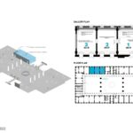
The Welcome Center fosters our understanding of the built environment, talking to global warming and the increasing requirements of the ever-growing human population. The three galleries provide the functional requirements of ticketing, orientation, and information, but more than that, they become the soul—a central driving spirit—for the institution.
Rethinking The Future Awards 2022
First Award | Exhibition Design (Built)
Project Name: National Building Museum Welcome Center
Studio Name: Studio Joseph
Area: 2,700SF
Year: 2021
Location: Washington / DC
Consultants: David Genco, Graphic Design; Studios ,Architect of Record; Gallery 2 media, Bluecadet, Curatorial Andrea Collomina-Marpillero and Kubi Ackerman
Photography Credits: Yassine El Mansouri
Other Credits: Southside, fabrication
We created a friendly new front door for the museum through a collaborative process and utilizing our knowledge of environmental and design issues. As a result of community engagement, it became clear to the museum that the public, tourists, and especially the local communities did not feel welcome. Visitors did not understand the critical dimension of building as part of global health, from the more intimate aspects of their daily lives to the broader concept of natural resources and climate change. Now, they are part of the discussion.
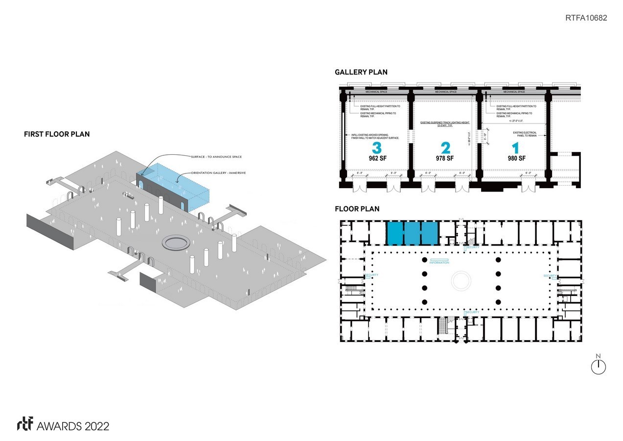
The Center comprises three galleries, each taking on an aspect of the environment and its makers (architects, landscape architects, buildings, and others in the construction industry.)
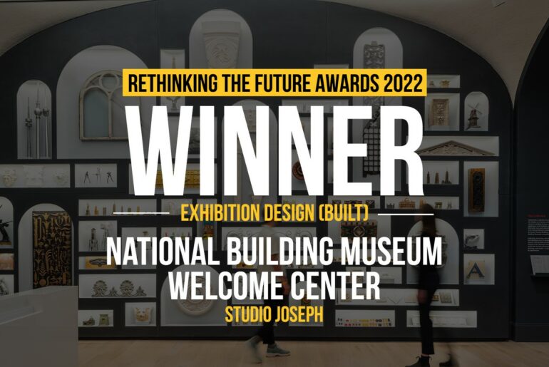
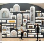
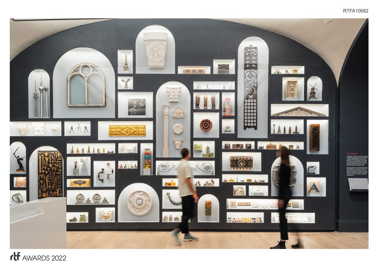
- Gallery 1 houses a monumental display of the museum’s collections alongside museum services. The diversity of artifacts (toys, building fragments, models) reminds us that we are all creators. The entire facade of the casework is made of welded, dark gray Corian. Each of the vitrines is lit with LED and shaped as a “seamless” backdrop, so the objects appear to float in a field of abstraction. The middle space,
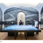
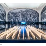
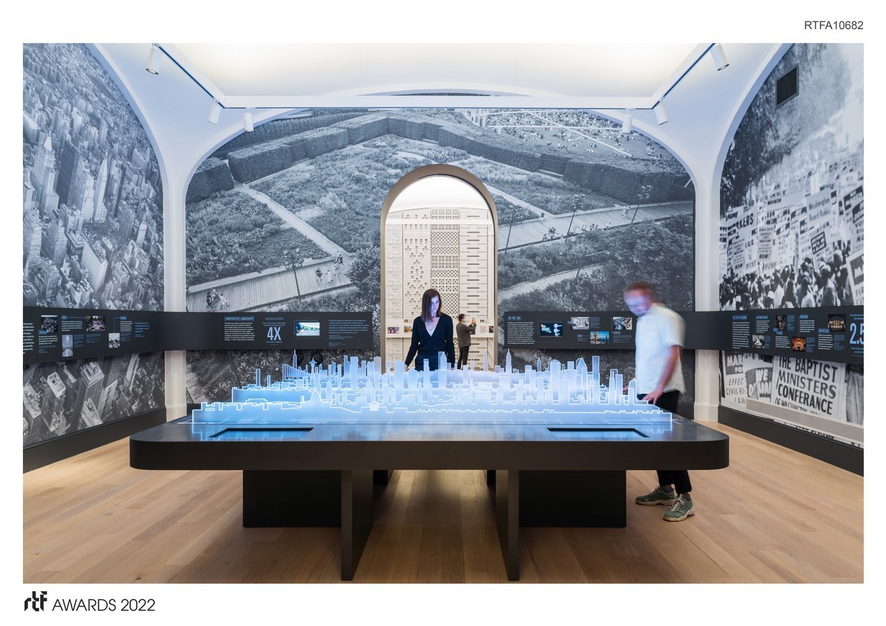
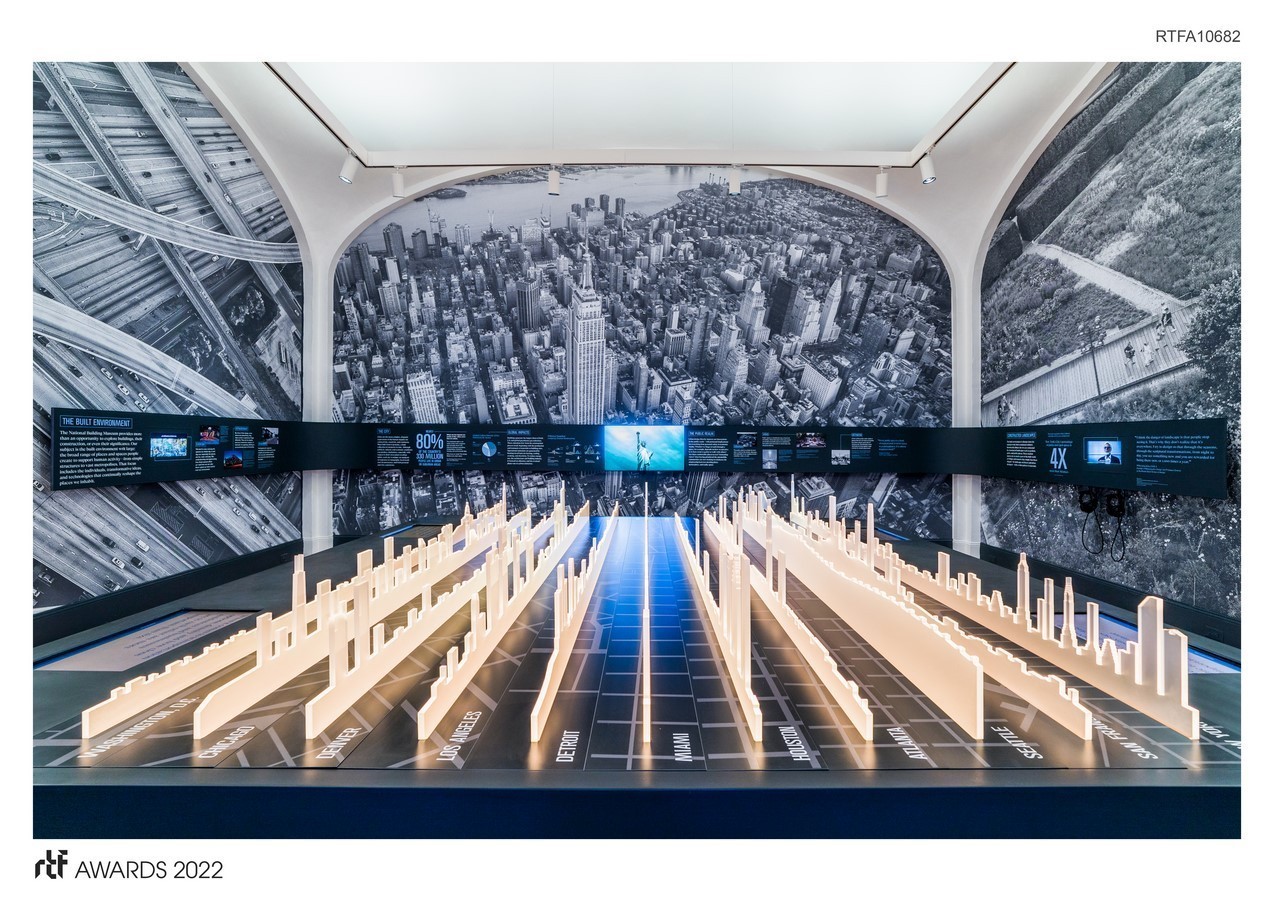
- Gallery 2 looks at constructed landscapes, infrastructure, cities, and places for gathering. We discuss urban issues and their effect on human health, ways of living, and working via a central table installation featuring a dynamic, programmed, light “graph” of American urban resilience. The LED lights are color-coded to themes such as resiliency, transportation, housing, and landscape, drawing the visitor into the discussion. The graphic surround focuses on data.
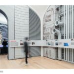
- Gallery 3 shows the full-size materiality of constructed places. There are several audio devices where visitors can hear firsthand from designers about how they make material choices to
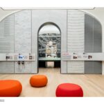
understand the cultural context. Materials are rendered abstractly to focus on scale and texture and then combined with touchable samples of the actual products used in construction. The CNC-routed surfaces are painted with Zolotone, portraying an abstract air-brush quality with different tones. Similar in configuration to Gallery 2, the surrounding graphic band provides information in more detail to the visitors.
Taken together, these spaces are the beginning of a visit that will illustrate the impact of our built environment on our lives. We hope everyone will become an active participant in improving our environment.

