
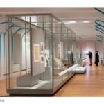
Hector Guimard trained as an architect in the Beaux-Arts tradition. But his aptitude in the worlds of decorative arts, graphics, and related disciplines brought him into the center of Parisian culture and drove forward the Art Nouveau style. Known widely for his Metro entrances, this exhibition brings forward the full range of his artistic vision, elevating the work by giving the visitor a proper understanding of the context and the times in which he worked. Respecting Guimard’s style and working process, the installation is sometimes a backdrop and, at others, in direct conversation with his work. The graphics and armature play with the Art Nouveau tone but are intentionally not derivative of Art Nouveau or Guimard.
Rethinking The Future Awards 2023
Second Award | Exhibition Design (Built)
Project Name: Hector Guimard: How Paris Got Its Curves
Category: Exhibition Design (Built)
Studio Name: Studio Joseph
Design Team: Wendy Evans Joseph, Monica Coghlan, Jose Luis Vidalon, Sharon Li, Sean Barbe, Brandon Studer
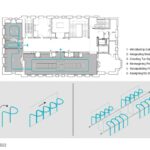
Area: 2,800 SQ
Year:2022
Location: Cooper Hewitt, Smithsonian Design Museum
Consultants:
Photography Credits: Matt Flynn
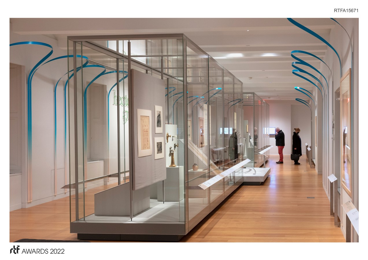
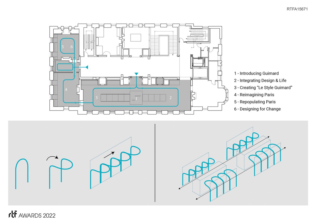
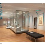
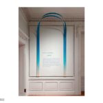
We accomplished this by creating a simple gestural architectural motif and a carefully considered graphic identity. The feeling is more contemporary, employing subtle nods to the modern design objects also found within the exhibition. We created looping forms from ¼” thick “Sintra,” twisting a single strand so that when wall-mounted, it stays upright due to the structural integrity of the arc. The arches, printed with a color gradient, delineate a path of travel and frame section text panels in each gallery.
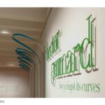
TYPOGRAPHY AND COLOR Given Guimard’s prowess in this field, we thought carefully about font choices, color gradients, and design strategy. The titling for the exhibition is set in Le Jeune Poster, a modern adaptation of the French Modern popularized by the Didot family. By setting titles in all lowercase, the shape of the French letterforms reference and align visually with the curved forms of the installation design that populate the space. The flowing searching lines and movement found in Guimard’s sketches and the exhibition’s armature design are the main inspirations for this graphic.
We created a 3-dimensional version of this title graphic as the introductory statement to the exhibition. The text separates into two parts—a flat graphic underlayer and a raised top layer made of letters laser-cut in aluminum. This treatment strengthens the integrity of the exhibition identity harkening to the 3-dimensional qualities of the architectural design.
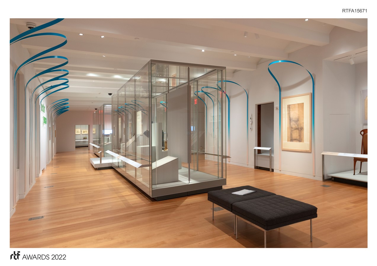
The colors that make up the two-tone gradient are used throughout the exhibition and serve multiple functions. The blue breathes life into the galleries by introducing a playful spirit and vibrant throughline. The cream color connects the graphics and arches, the cream-colored paper used in Guimard’s sketches, and the sepia-toned photographs seen throughout the exhibition.


 | 4892 Grand River, #2")


