Project Info
Architects: CHT Architects
Location: Richmond VIC, Australia
Design Director: Ivan Turcinov
Project Director: David Carabott
Project Architect: Chivonne Hollis
Project Leader: Nathan Byron
Area: 4,356 sqm
Year: 2012
Photographs: Christine Francis
Architect: Johan Hermijanto, Ilana Freadman
Interior Designer: Chantelle Balliro, Adele Bates
Documenter: Darius Tanujoyo
Developer: Carta Group
Building Surveyor: Reddo Building Surveyors
Structural Engineer: The O’Neill Group
Services Engineer: The O’Neill Group
Fire Engineer: RawFire
Acoustic Engineer: Acoustic Logic
Construction Manager: Adam Wulff
Builder/Contractor: Momentum Pty Ltd
Introduction
Conceptual Framework
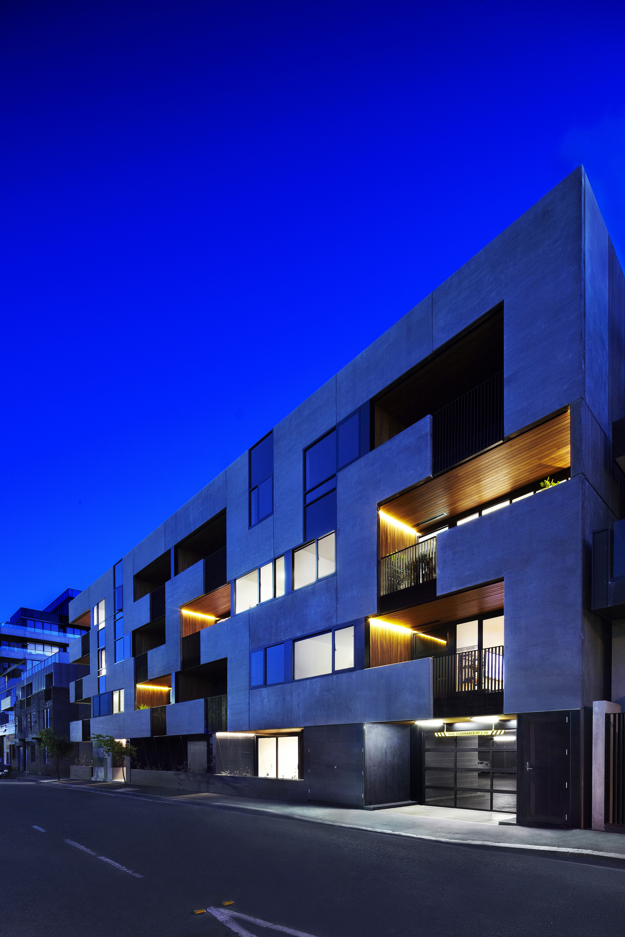
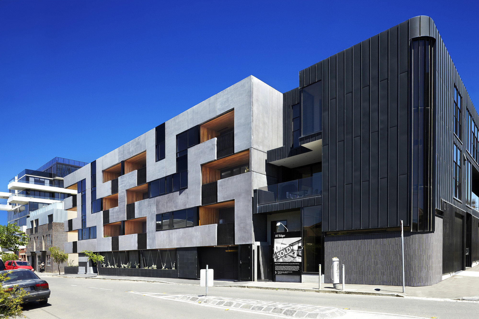
The Maze Apartments is a five-storey building comprising 32 one- and two-bedroom apartments. The concept behind its facade evolved through the exploration of graphic patterns and how they could be manifested in contemporary architecture. During conceptual design, works by artists, such as Helmut Federle and Sol LeWitt, as well as diagrams and patterns, were referenced. The found geometry of a maze was eventually projected onto the facade grid, informing both the composition and placement of architectural elements.

Details
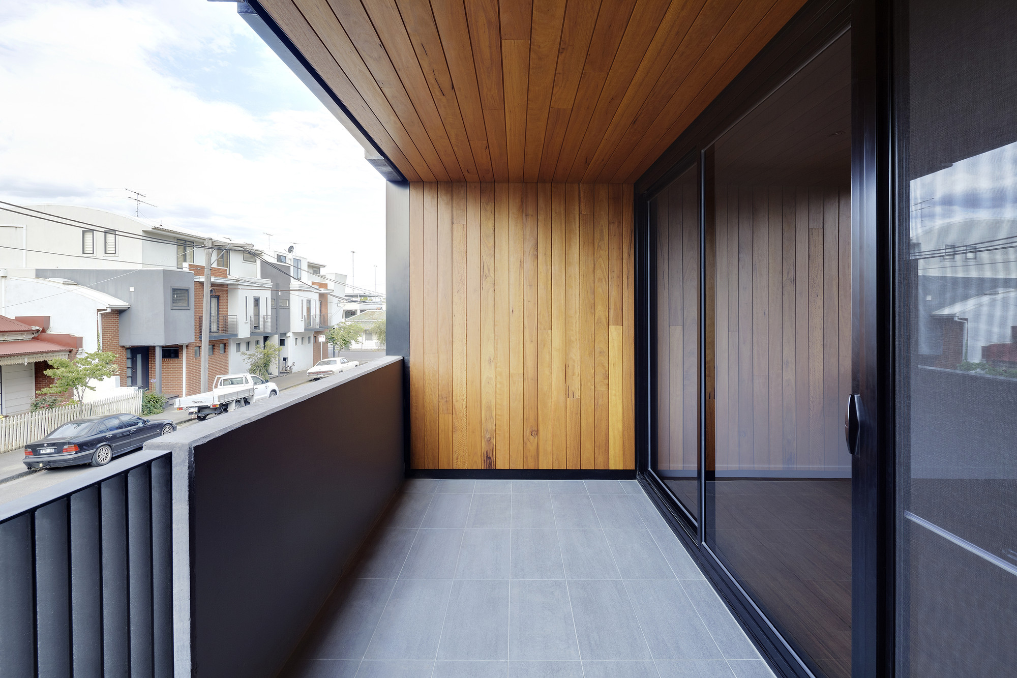
The spandrel weaves balconies and windows in a ribbon-like manner, adhering to an order, yet creating a non-repetitive facade that becomes the built diagram. Essentially, the building is an orthogonal block that has been carved into with intent. The materials are inspired by Melbourne’s apartment typologies, yet are applied in a way that liberates them from their typical use. A non-repetitive composition of concrete forms, that float between ribbons of glass and planes of timber, results in a unified, identifiable and resolved presence
Public and Cultural Benefits
With its raw and robust materiality, the building pays homage to Richmond’s former light-industrial context, while also acting as a contemporary example of residential architecture. In fact, The Maze Apartments has been referenced by the City of Yarra’s planning department as an architectural precedent for future developments.
Relationship of Built Form to Context
The building is sympathetic to Richmond’s industrial history, while referencing the area’s current residential and commercial uses. Its surrounding urban fabric consists of hard-wearing, refurbished industrial buildings, as well as high-density, multi-residential developments. The site sits on the edge of the high-density precinct, where it meets an established, single-storey residential neighbourhood to the north. The orthogonal block-form of the building responds to the streetscape, as well as the different site interfaces, where it varies in height, composition and setbacks. Various textures and materials have been used to provide visual interest and resonate with the surrounding precinct.

Program Resolution
The client brief was to build a cost-effective, raw and robust building, with maximum amenity. A stacked floor plan meets the commercial objectives, without compromising the architectural aspirations for the building. Apartment typologies reflect current market trends with high-quality detailing and finishes.
Integration of Allied Disciplines
Close collaboration between the architects and consultants was a hallmark of this project. By working closely together, the team was able to ensure the architectural intent of the building was not compromised.
Cost/Value Outcome
In order to achieve a cost-effective outcome, a stacked floor plan was implemented, however, the complexity of the facade helps to create a non-repetitive aesthetic.
Sustainability
The majority of apartments are north-facing with excellent solar access. Apartment layout and building plate arrangement provide maximum daylight and natural ventilation. All south-facing apartments have large windows, without overhangs. High-performance glass and energy efficient systems have been used throughout.

Response to Client and User Needs
Effective planning and a strong architectural concept were vital in attracting discerning owner-occupiers. Well-thought-out design also ensured that overshadowing to the development to the south was kept to a minimum.

