SoBo: A rendezvous with the Art District
South Bombay or SoBo – as it is affectionately called – arguably is India’s leading art district that exudes a character that is reminiscent of yesteryear, yet very much part of the present. Labeled as a “museum of architecture”, the area is an expanse of culture and heritage with an eclectic blend of styles – Neo-Classical, Gothic, Victorian and Art Deco – coupled with a flair for the contemporary – that corroborate the unique spirit and aesthetic of the place.
The architecture and design house wanted to land a studio space, within the district, which would be conducive to its sensibilities – a space with a strong affinity for natural light, one that would be easily accessible by public transit, and could also respond to its needs.
Project name: The Loft
Architect’s Firm: Studio PKA
Principal Architect: Puran Kumar
Project Team: Preethi Krishnan, Revina Soni
Project location: Fort, Mumbai, Maharashtra, India
Completion: March, 2017
Gross Built Area: 3,700 Sq. Ft.
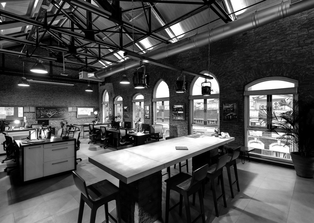
With Victoria Terminus to the East, galleries, museums to the South, and sprawling maidans to the West, the office falls neatly in the contextual and cultural sweet-spot – effectively allowing the studio to be part of, and contribute to this collective sense of an urban cultural identity amidst a resurgent artistic precinct.

The space, a part of a heritage structure, was acquired with the windows boarded up, the wooden trusses retrofitted with metal bracings and Non-Load bearing brick walls enclosing and segregating zones from one another.
Therefore, the need for a critical response to the inherited space, an honest reflection of the context and a pragmatic functional design order, that would be true to the space at hand.

Design Approach and Ideology
Layers: Of Time, Discovery and Anticipation
Located along the heritage mile of SoBo, on the 4th floor of a 100-year-old Victorian era building, the studio space explores the innate tactility and highlights the structural integrity of the heritage structure. A conscious effort was made to rigorously explore, live and breathe the space so that the process of “peeling away” layers and exposing the natural character of the space followed simple acts of pausing, taking a couple of steps back and moving forward again – akin to a rhythmic staccato.

The idea of unearthing and discovering, rather than a set mandatory approach, was adopted not only to respect, retain and celebrate the spirit of the place but also respond to the myriad experiences the space could possibly offer. Natural light, ventilation (virtually non-existent in office spaces in the urban sphere) and the objective of utilizing the various vantage points to the fullest were of utmost importance while designing the space.
Accentuated by the sheer volume, the unapologetic tactility and the visual connect with SoBo outside and between the spaces within – the space elicits an emotional response that evokes interstitial moments of reflection, discovery and presence.
In effect, the space has embodied an inextricable layer of time that revels in its ability to intermingle with disparate components of distinct eras.

Form and Function
Co-existence: Of Light, Volume and the Tactile
A certain sense of scale and the idea of zones within zones was explored within the facility – either through a visual connect or dedicated space configurations within a single zone.
The atrium which doubles up as the entrance, allows a steady stream of light to filter in through the skylight above and houses the reception, a formal meeting room and a vertical backdrop that frames the machine room that sits atop the wooden elevator.

Mirroring the functional and formal arrangements within the space, the clay tiles covering the meeting room are a true reflection of the roof above, while the machinery is a metaphorical reflection of the studio space – the powerhouse of the firm.
The formal articulation of spaces and segregation of the same expands beyond the atrium and weaves its way across the floor plate towards – the studio; the cafeteria; the principal’s zone; the client zone; and the library. Intersecting gabled roofs along with their structural supports were important contributing factors to the spatial language of the studio. The wooden purlins and rafters as well as the robust trusses clad in metal, have all been stripped and restored to create an emphatic flavor. Each unique flavor stares at a different space below.

Although a formal spatial arrangement exists, transparency allows the various segregations to seamlessly flow into one another – the character thus pervades throughout the facility. A certain charm and thrill of discovery is ever present as the inherited elements spring up as evocative defining characters – the metal sections, the roofs and trusses, the windows and the staircases that act as bridges between separate levels.
The tactility stays true to the raw, unkempt and stark nature of the space by: retaining the inherent character; revealing surfaces beneath superficial layers of paint and plaster; and re-cycling elements such as discarded doors, salvaged from demolished buildings within the city, and breathing new life into them.
Limiting the introduction of new materials, that were lightweight as well as cost effective – cement blocks and boards, wood, hollow metal sections and stone – complements rather than detracts from the essence of the place. Glass, on the other hand, acts as an interesting departure and counterpoint to the roughness of textures that brings forth dimensions of transparency and depth.

The transformation of the space alludes to a journey through time – remembering the past, living the present and looking out to the future.
The studio has been envisioned as a multi-functional and flexible design solution. One that pushes the boundaries of conventional workspaces – where collaborative sessions, workshops and exhibitions can be held, bring forth a new discourse within the fraternity and bridge the gap between students and professionals.
The Loft is a poetic expression wherein the creation and the nature of the existing structure are allowed to take the reins and drive the design forward.

Puran Kumar – Principal at Studio PKA – Believes in creating spaces that exude a strong sense of place and identity. Now 25 years into the practice, Puran continues to explore and adopt fresh, innovative and exciting new ways of breathing life into the wide gamut of projects that come his way.
From Corporate Interiors to Residential Spaces and explorations in Adaptive – Re-Use, Puran’s repertoire of architecture and interior projects is as wide as it is simple.
Studio PKA, now located within the Art District in Fort, Mumbai, is breaking new ground as it expands, evolves its design language and ventures out in search of new typologies in the field of architecture and design.

