Shukufuku is a Japanese Bento restaurant located on Lygon Street; a bustling street infamous for its restaurant and food culture, within Melbourne, Australia. The client required a fresh, bright environment with a fun, inviting atmosphere. Featuring natural materials such as timber and rope, the neutral toned materials palette is juxtaposed with pops of their corporate colours, blue and yellow.
Third Award | DAF 2016 Awards
Category: Commercial Interior (Built)
Participant Name: Vincent Choi
Team Members: Sandra Ha, Eleni Alexiadis
Country: Australia
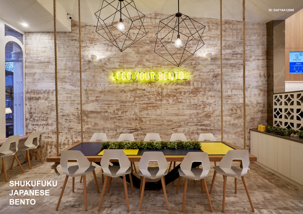
The design brief was simple; to create an interior, which reflected, highlighted, and enhanced the Shukufuku brand. Utilising their geometric logo as a starting point, a visually dynamic design language emerged. Highlighting Shukufuku’s strong brand identity, geometric features were included throughout the interior. From the subtle diamond shaped wall tiles, to the oversized wire-frame pendant lights; the interior is continually reinforcing the Shukufuku brand identity. The star of the show is the geometric ceiling feature, which is made of over 20 faceted panels.
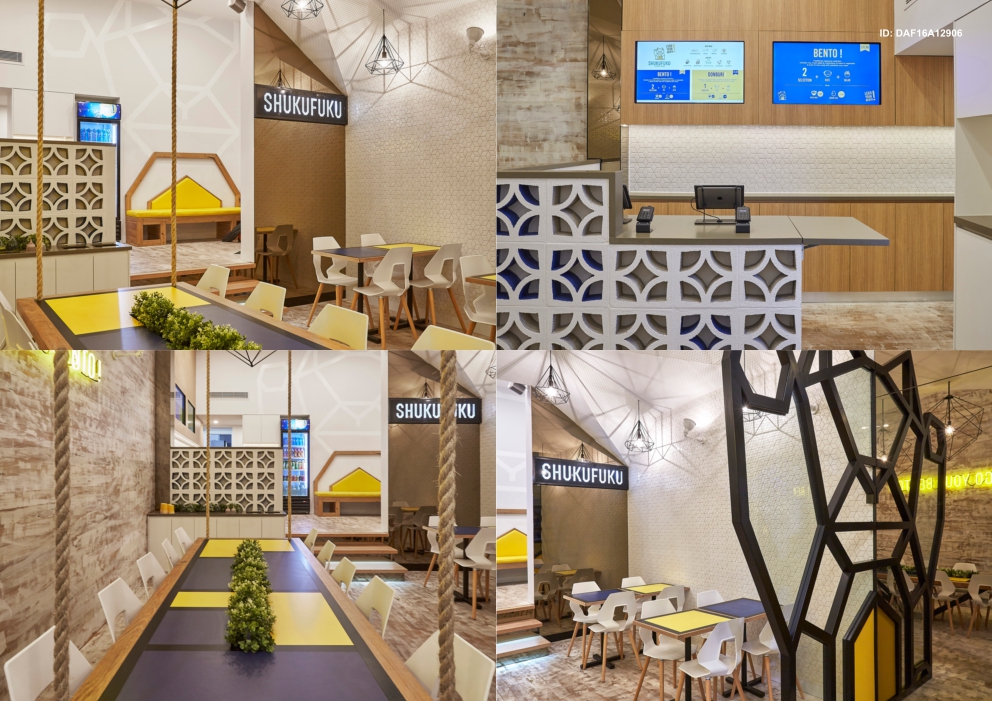
To truly capture the essence of Shukufuku, it was imperative that the menu was also taken into account when developing the design. The identity of the menu is reflected within the design language, with both being a twist upon the traditional. The building’s facade has been painted white, and the front door a bright yellow; incorporating both the branding and the heritage overlay, harmoniously.
The space is light, vibrant, and inviting, catering to all demographics, those looking to enjoy a quick bite by themselves, to those wanting to enjoy a lengthy meal with a group of family or friends. Shukufuku required a fast paced module, whereby patrons are able to move in and out of the store in a quick manner. A youthful and fresh colour palette aims to attract the younger university student demographic nearby.
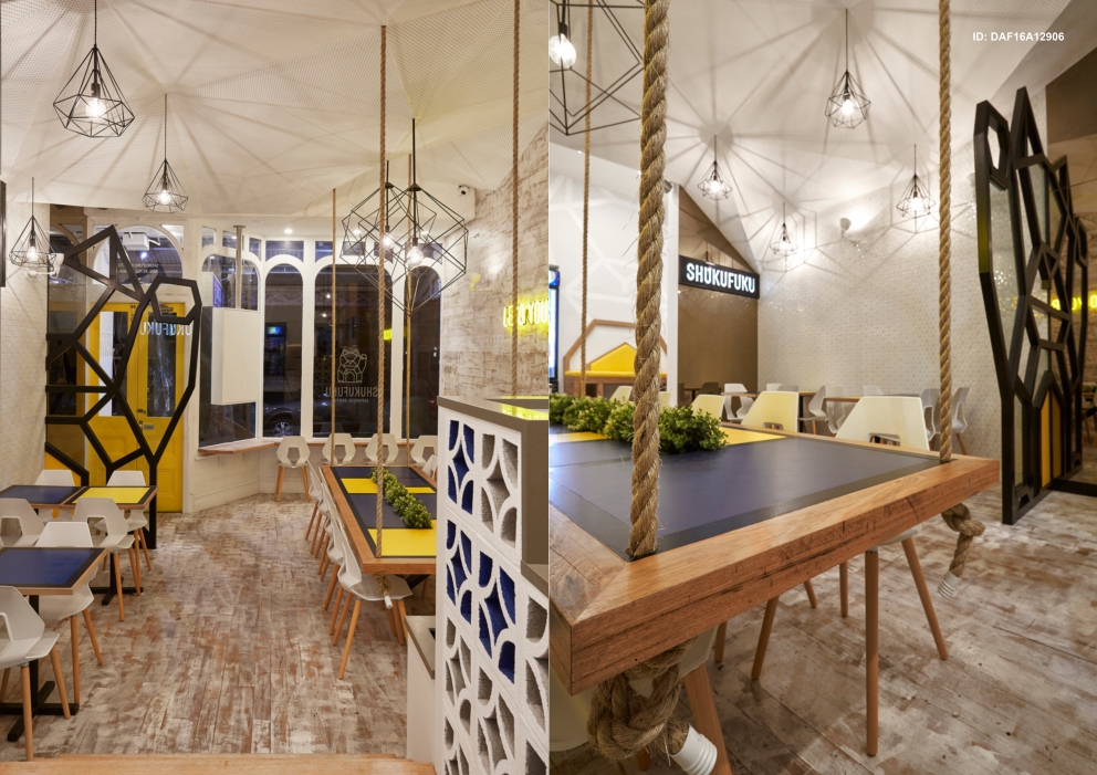
Working with and catering to a relatively small restaurant space, it was imperative that the interior was a creative and intelligent representation of the brand. The oversized pendant lights cast geometric shadow patterns onto the ceiling feature, creating the illusion of an increased number of faceted panels. To make the space feel more expansive, the main dining area features highly reflective materials such as tiles and mirror. The large expanse of mirror at the entry to the store, transforms the ‘half cat’ steel structure into a ‘full cat’ – creating the corporate logo in an ingeniously space saving manner. The holistic design language is the outcome of a well-developed brand, great working relationships between all involved, and smart, creative design.
Prev Post
Sap, Bangalore | Iaad – Its All About Design
1 Min Read

