“FUNction – FUN + FUNCTION”
Not just signage, but a language that connects the space
The environmental graphics and wayfinding system of KBTG project are designed to not only function as the display of rooms’ names and directions, but also designed to complement and ramified from an interior architecture concept. The new design turns environmental graphic into one of the compositions of the interior design, facilitating the connection that is not only inseparable but also enhances the dynamic of the space. Users’ experiences are facilitated to encapsulate the KBTG identity as the FinTech Startup with the approach to break away from conventional financial establishments.
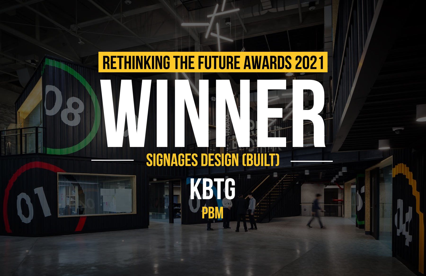
Rethinking The Future Awards 2021
First Award | Signages Design (Built)
Project Name: KBTG
Studio Name: pbm
Design Team:
Interior designer: pbm
Lighting designer: pbm
Environmental graphic designer: pbm
Area: 60,000 sq.m.
Year: 2017
Location: Bangkok, Thailand
Photography Credits: ©Spaceshift Studio ©W Workspace
Other Credits:
Project owner: KBTG (KASIKORN Business – Technology Group)
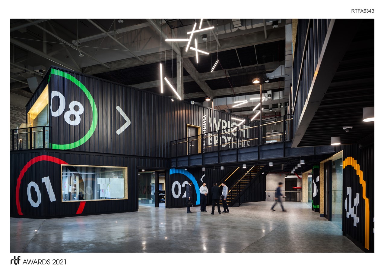
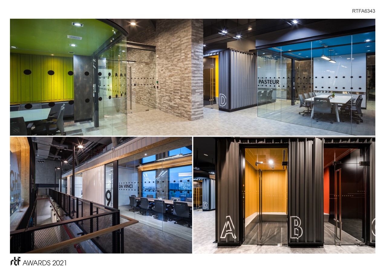
The designer has emphasized on creativity, functionality, and awareness in user’s health under the concept of “FUNction – FUN + FUNCTION”. ‘Circle’ is employed as the design’s key composition with an intention to proposes the combined state of fun and functionality. The dynamic and static form of circle conveys both fun and seriousness that corresponds with KBTG’s image as a unit that brings together a group of young generation talents who possess not only the lively spirit but also professional dedication.
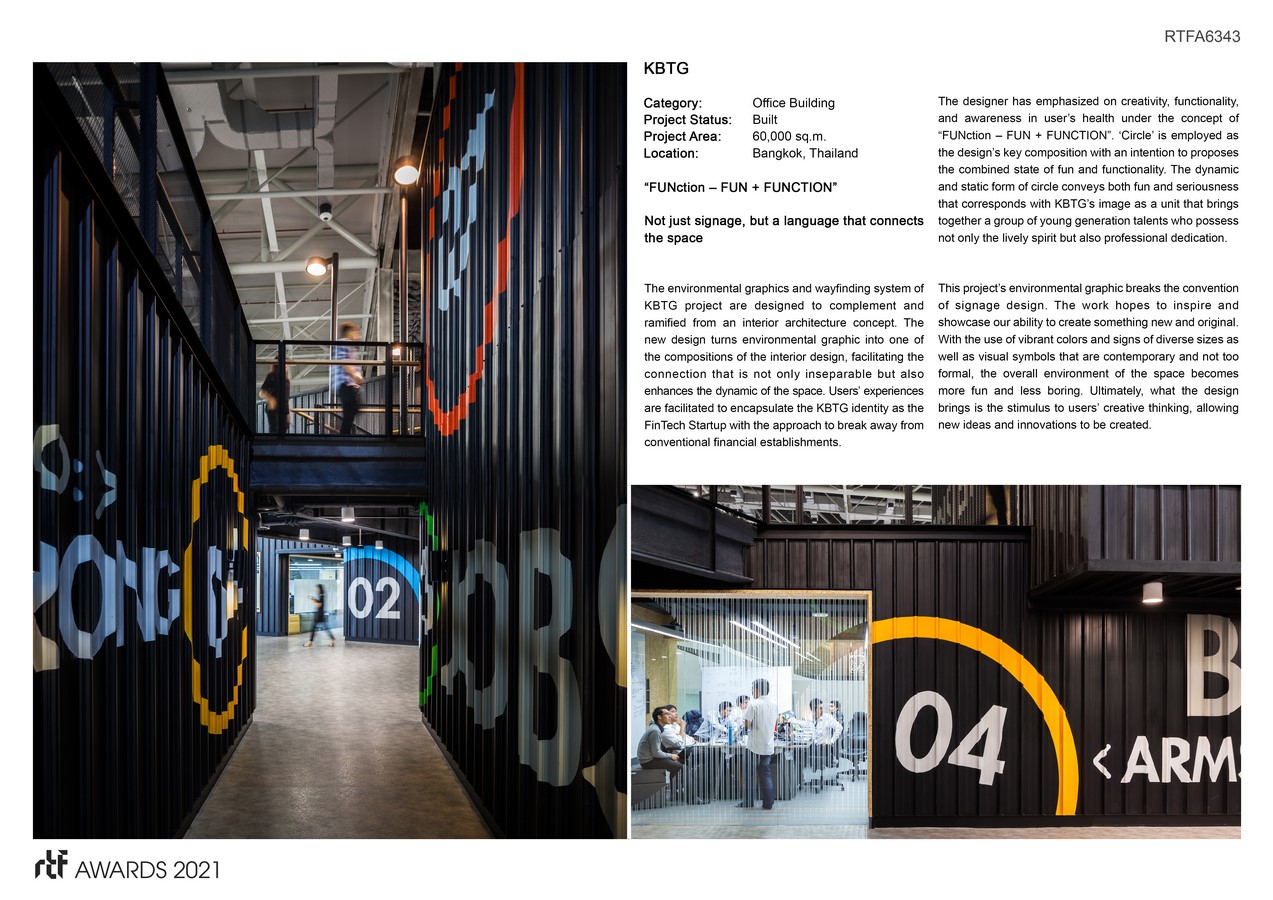
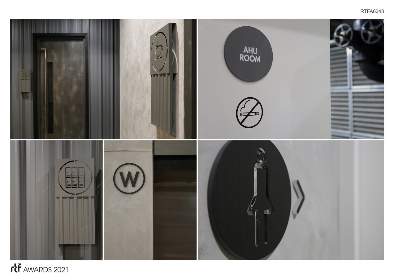
This project’s environmental graphic breaks the convention of signage design. The work hopes to inspire and showcase our ability to create something new and original. With the use of vibrant colors and signs of diverse sizes as well as visual symbols that are contemporary and not too formal, the overall environment of the space becomes more fun and less boring.
The designer references the aesthetic and functional details of the work to the working drawing of the project’s interior architecture. Such approach causes the proportions, lines, joinery details, height and size to be conceived specifically for the space’s functional and aesthetic context. It reflects is the holistic approach to design and the way signage system is materialized exclusively as a part of the interconnected whole of this particular spatial program.
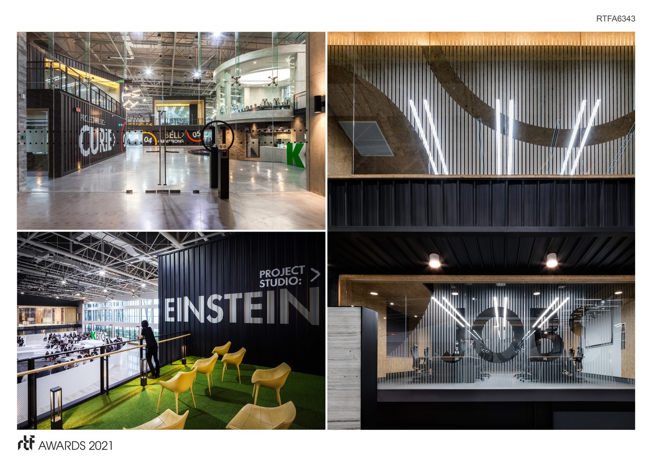
Being a large-scale office building that accommodates 8,000-10,000 staffs with 24/7 working hours, the consideration in users’ health and prevention of office syndrome are key strategies of the design. The intention is translated into the height difference of the signage, bringing interesting dynamic to the workspace while at the same time enhances users to exercise their visuals and neck muscles. Additionally, the use of eco-friendly materials and volatile substances is also intention to prevent users from any possible toxic environment.
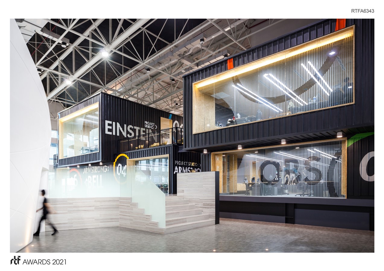
The details of the graphic design include the names of the studios, which are taken from the world’s most inspiring innovators whose brought incredible contributions to the world. Additionally, each studio wall patterns and glass films are visualized to be in one interconnected story. It emphasizes the users’ awareness in the role of purpose of the space where new innovations are brought to life and how it is conceived to enhance users’ creativity, and the significance of such creative force in the development of the organization. Ultimately, what the design brings is the stimulus to users’ creative thinking, allowing new ideas and innovations to be created.

