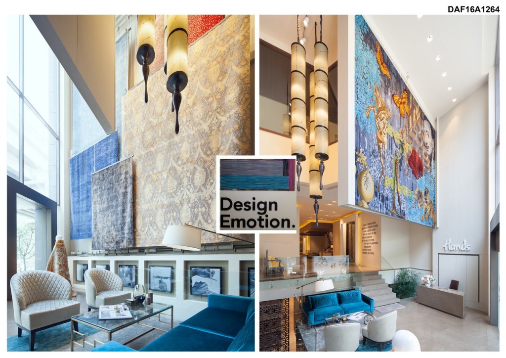
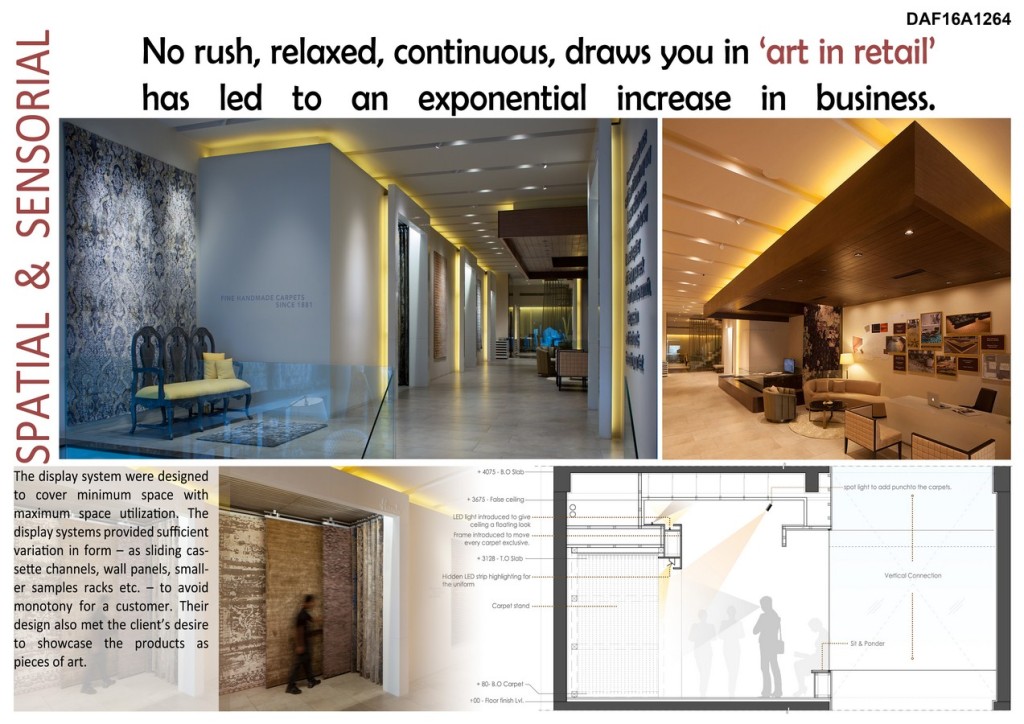
No rush, relaxed, continuous, draws you in ‘Art In Retail’ has led to an exponential increase in business.
SPATIAL & SENSORIAL
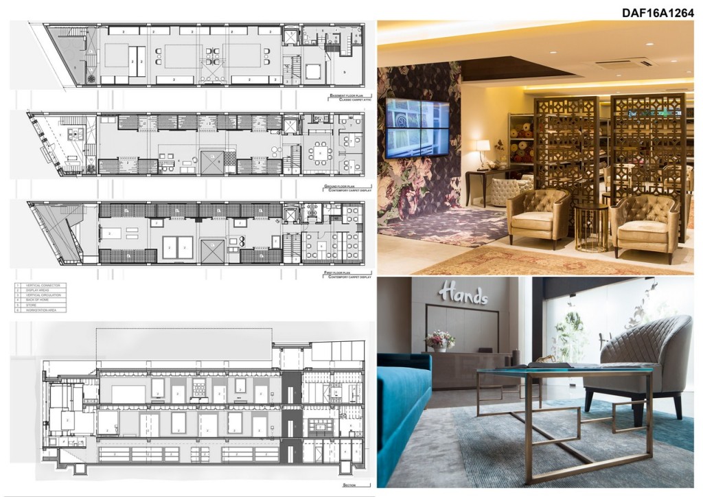
The display system was designed to cover minimum space with maximum space utilization. The display systems provided sufficient variation in form – as sliding cassette channels, wall panels, smaller samples racks etc. – to avoid monotony for a customer. Their design also met the client’s desire to showcase the products as pieces of art.
First Award | DAF 2016 Awards
Category: Commercial Interior (Built)
Participant Name: Rachna Agarwal
Team Members: Jyoti Malik,Mayank Mishra, Dharampal
Country: India
DESIGN
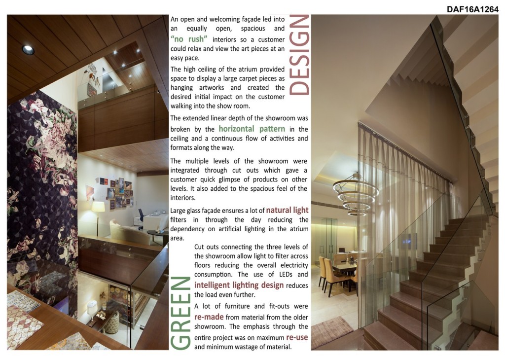
An open and welcoming façade led into an equally open, spacious and “no rush” interiors so a customer could relax and view the art pieces at an easy pace. The high ceiling of the atrium provided space to display a large carpet pieces as hanging artworks and created the desired initial impact on the customer walking into the show room.

The extended linear depth of the showroom was broken by the horizontal pattern in the ceiling and a continuous flow of activities and formats along the way.
The multiple levels of the showroom were integrated through cut outs which gave a customer quick glimpse of products on other levels. It also added to the spacious feel of the interiors.
GREEN
Large glass façade ensures a lot of natural light filters in through the day reducing the dependency on artificial lighting in the atrium area.
Cut outs connecting the three levels of the showroom allow light to filter across floors reducing the overall electricity consumption. The use of LEDs and intelligent lighting design reduces the load even further.
A lot of furniture and fit-outs were re-made from material from the older showroom. The emphasis through the entire project was on maximum re-use and minimum wastage of material.
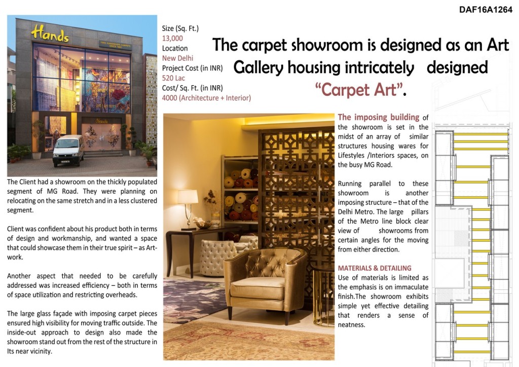
The carpet showroom is designed as an Art Gallery housing intricately designed “Carpet Art”.
Running parallel to these showroom is another imposing structure – that of the Delhi Metro. The large pillars of the Metro line block clear view of showrooms from certain angles for the moving from either direction.
MATERIALS & DETAILING
Use of materials is limited as the emphasis is on immaculate finish. the showroom exhibits simple yet effective detailing that renders a sense of neatness.
The Client had a showroom on the thickly populated segment of MG Road. They were planning on relocating on the same stretch and in a less clustered segment.
Client was confident about his product both in terms of design and workmanship, and wanted a space that could showcase them in their true spirit – as Artwork.
Another aspect that needed to be carefully addressed was increased efficiency – both in terms of space utilization and restricting overheads.
The large glass façade with imposing carpet pieces ensured high visibility for moving traffic outside. The inside-out approach to design also made the showroom stand out from the rest of the structure in its near vicinity.
If you’ve missed participating in this award, don’t worry. RTF’s next series of Awards for Excellence in Architecture & Design – is open for Registration.
[button color=”black” size=”medium” link=”httpss://www.re-thinkingthefuture.com/awards/” icon=”” target=”false”]Participate Now[/button]
[g-gallery gid=”16148″]
In
DAF2016 Commercial Interior (Built)
Hands – Carpet Showroom | Iaad – Its All About Design
3 Mins Read

