The city develops and changes rapidly while architecture remains because of its lasting feature and embodies emotional memory and historical value. The contrast of new and old buildings are everywhere in the city, which is exactly the mark of the changing times.
Architects: gad
Location: China
Area: 4949.0 m2
Project Year: 2017
Photographs: Fan Yi, Zhang Zefeng, Huang Jinrong

Development and Change of City Interface
The experience center is located in the central area of Wuhan city where architectural forms of different attributes, structure, and styles can be found.
The old plant next to the project with the industrial development marks of Wuhan City gives a strong contrast to a series of newly developed buildings across the street.

Based on the contrast of new and old interfaces, gad architects have a bold idea. Co-existence of traditional and modern elements can make the city appear more vivid and harmonious. How to avoid defects under current conditions and fully present the architectural dialogue in the design become the primary design concern.

Architectural Expression of Balance and Tension
Architectural form aesthetic feeling and humanistic connotation gradually become the windows of brand expression. Appropriate architectural expression form with tension is an aesthetic feeling of balance. The building maintains a certain distance from the old plant. Taking the façade and the northeast side, Wanda Plaza as the main interface, the project can achieve the maximum window-dressing effect, which not only hides the current street mess from view but also exhibits brand image.
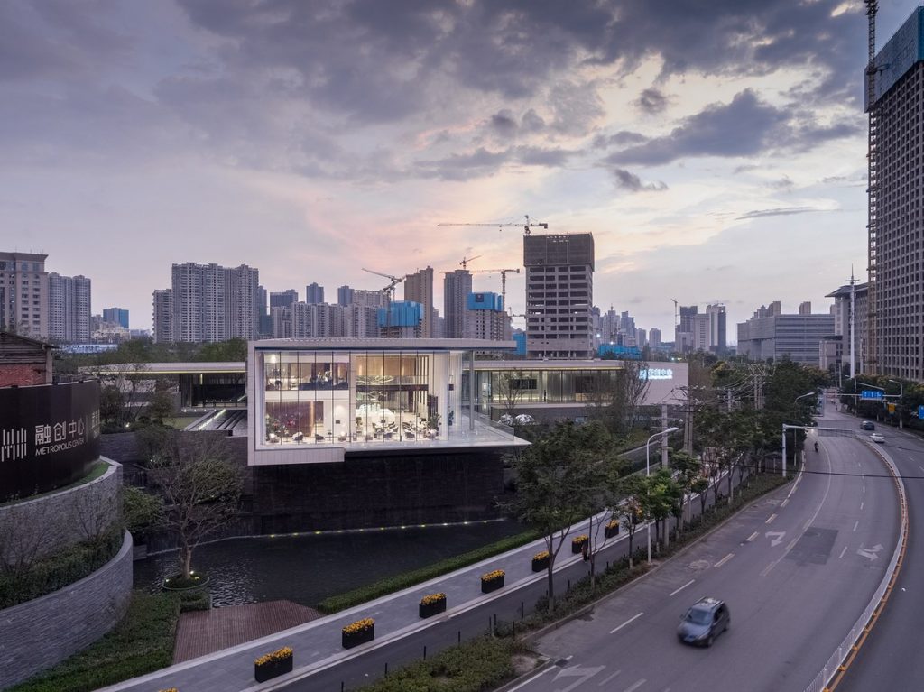
The space property is defined by the plane layout naturally. “+” type plane layout takes the intersection as the base point. The external building space is separated into four totally different places that create four places of different functions and properties internally.
The long-span overhanging appearance symbolizes the ambition of getting rid of gravity. Combining lightness and heaviness contrast of the materials, the architecture further strengthens the contrast of the new and old buildings. Here, the street corner image of conflicted feeling is more obvious.

Responding to Traditional Architectural Style,Courtyard Landscape
If architecture form is the direct illustration in modern language, the courtyard would be the implicit reflection of traditional elements in space.

The central courtyard of the building decreases crossing in terms of the flow line. Compared with the architectural form of western churches, the center adopts Chinese courtyard landscape form and reduces attention from people; the sinking-style inner courtyard further emphasizes space levels, makes the space more vivid, and brings the precious natural light to the pile solid space as well. Here, “light” extends becomes the medium to connect the inner and outer space.

Once arrived, visitors can feel the considerate and unique concerns for their psychological feelings from the designer. The outer courtyard landscape adopts the traditional winding path form. The winding path leads to another liking going up the stairs. The paths correspond to the multi-courtyard levels of the architectural inner spa extend the time of psychological feelings.

The architectural style of full tension and direct expression of the experience center integrates with the winding and peaceful style of the landscape, which is succinct, direct while being exquisite and euphemistic. “+” form reflects the architectural expression of the era nature and symbolizes the fierce waves of the era through abstract architectural form, which is exactly its unique charm.

