First Award | Commercial Interior (Built)
Firm Name: Soma Architects
Participant Name: Lito Karatsoli Chanikian
Country : United States
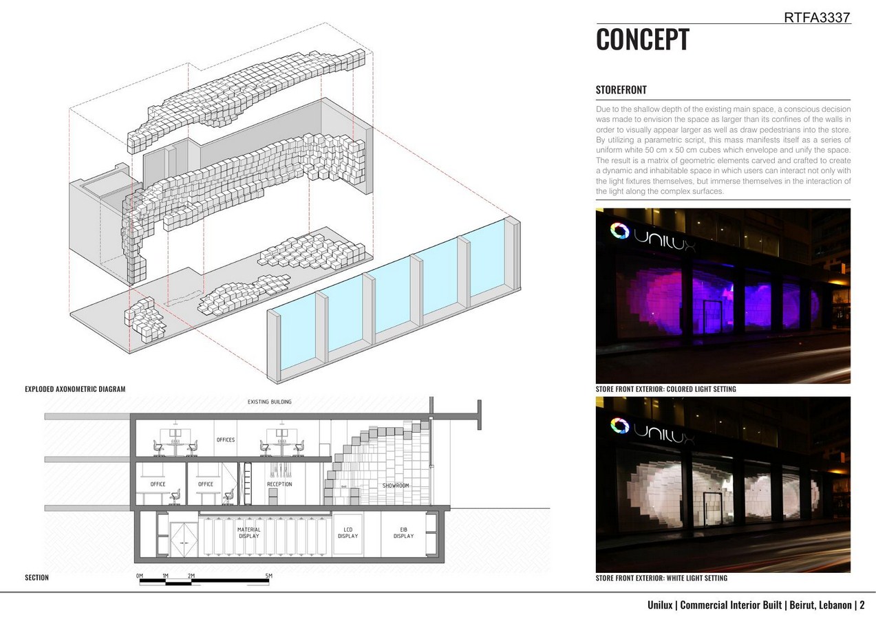
With 20 meters of frontage but only 4 meters of depth, the existing ground floor space provided a unique opportunity for a commercial street front fit for a lighting showroom. The client, Unilux Group – the largest supplier of high end light fixtures in Lebanon, requested a unique space in which to exhibit the products sold by the company. Due to the shallow depth of the existing main space, a conscious decision was made to envision the space as larger than its confines of the walls in order to visually appear larger as well as draw pedestrians into the store.
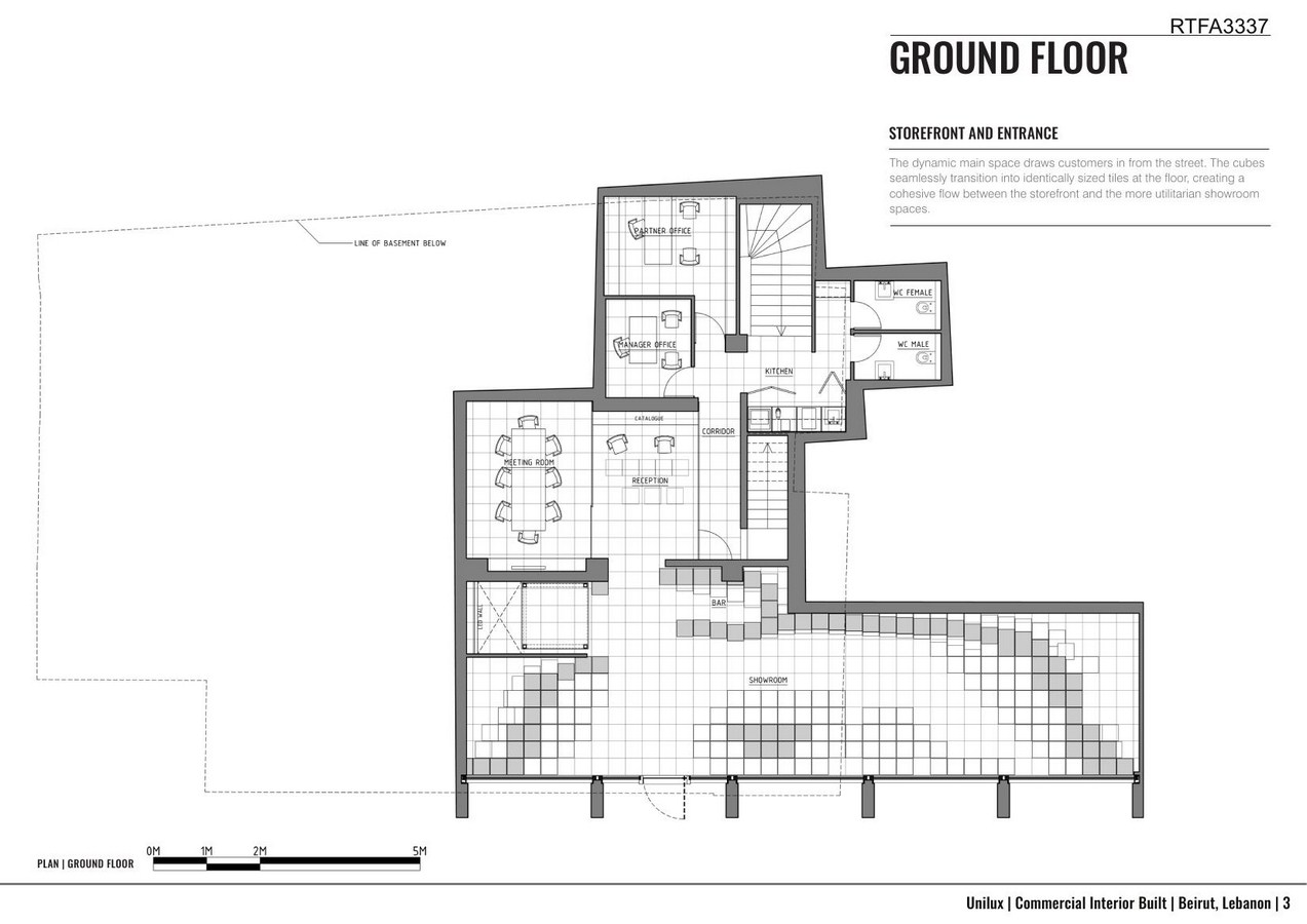
What started as a simple two dimensional system evolves into a sophisticated matrix that guides the design process throughout the space. By envisioning the space as a solid mass, we were able to carefully craft the negative usable space with incredible flexibility. This mass was thought of as larger than its confines of the walls, only to be sliced by a new glass storefront, effectively engaging the “fourth wall” of the sidewalk. By utilizing a parametric script, this mass manifests itself as a series of uniform white 50 cm x 50 cm cubes which envelope and unify the space. The result is a matrix of geometric elements carved and crafted to create a dynamic and inhabitable space in which users can interact not only with the light fixtures themselves, but immerse themselves in the interaction of the light along the complex surfaces.
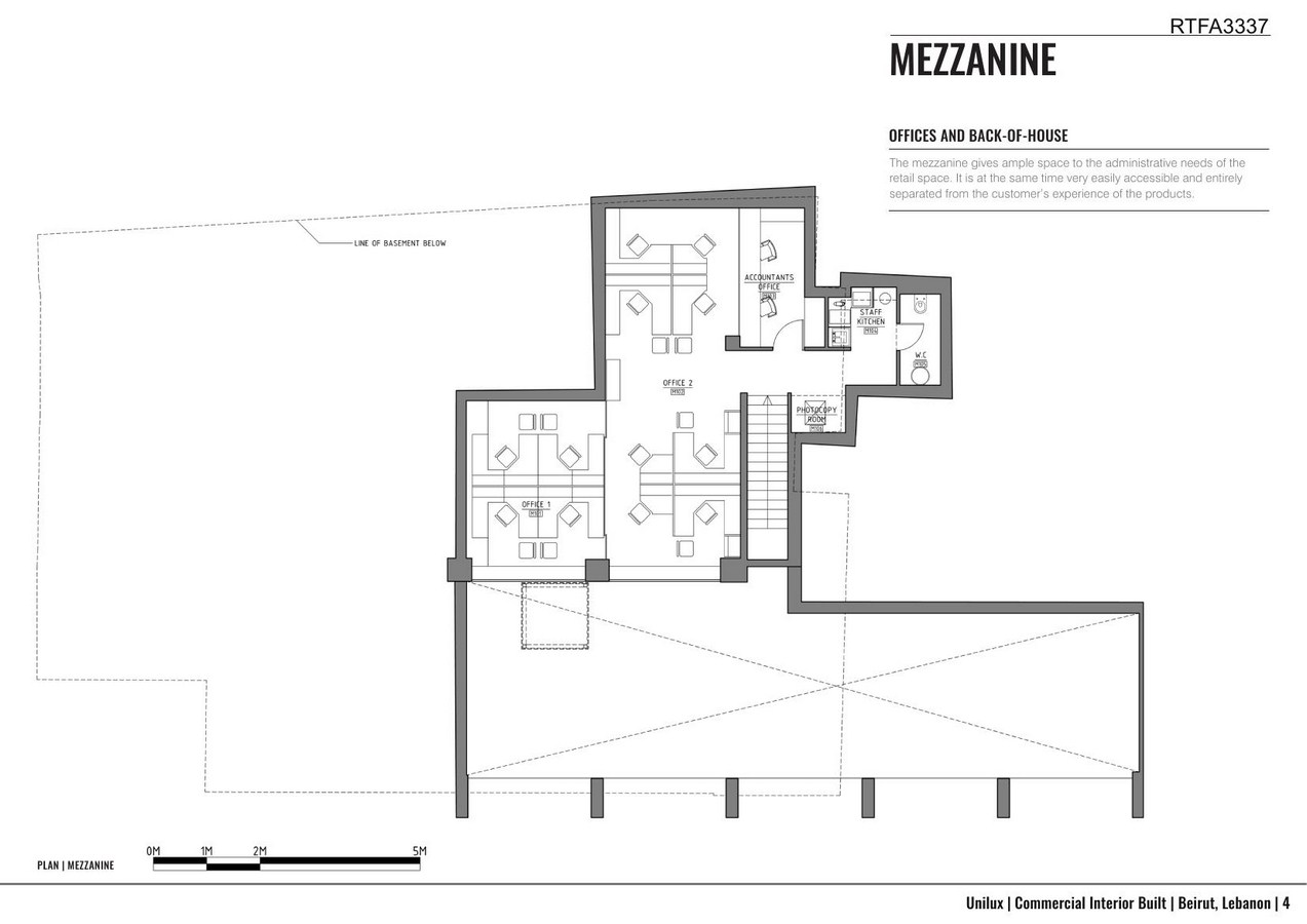
It is important to note that these intensive operations resulted in a matrix not only directed the physical implementation of the interior, guiding the formation of the space, but also laid out the additional interior partitioning. The consequence of this unique system of modular variation across all levels and all scales results in perfect alignments between floor, wall, and ceiling, as the white cubes engage white tiled floors of the same dimension. In summary, this unifying system, or matrix, successfully unites the design into one operation.
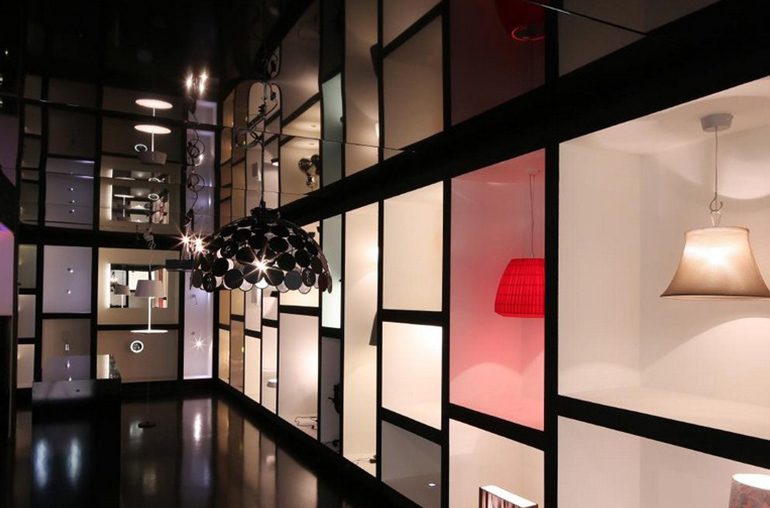
The lower level provides a more intimate setting in which products are displayed due to the existing lower ceilings. Inspired by this cellar appearance, the various light fixtures are displayed in a series of niches along the narrow lower level corridors. While the walls and floor are rendered in a highly reflective black, while the niches are rendered white so the individual characteristics of each light fixture are displayed. The result is a mosaic of different colors and shades of light expressed in their individual niches, reflected in the floor and ceiling.

The final result is not only an efficient and usable space, but also a space which in itself becomes a brand for the client and retailer. The design of the space not only allows customers to be immersed in the geometric space of the interior, but also visually extends beyond the glass storefront, enveloping pedestrians on the street.
If you’ve missed participating in this award, don’t worry. RTF’s next series of Awards for Excellence in Architecture & Design – is open for Registration.
Click Here

