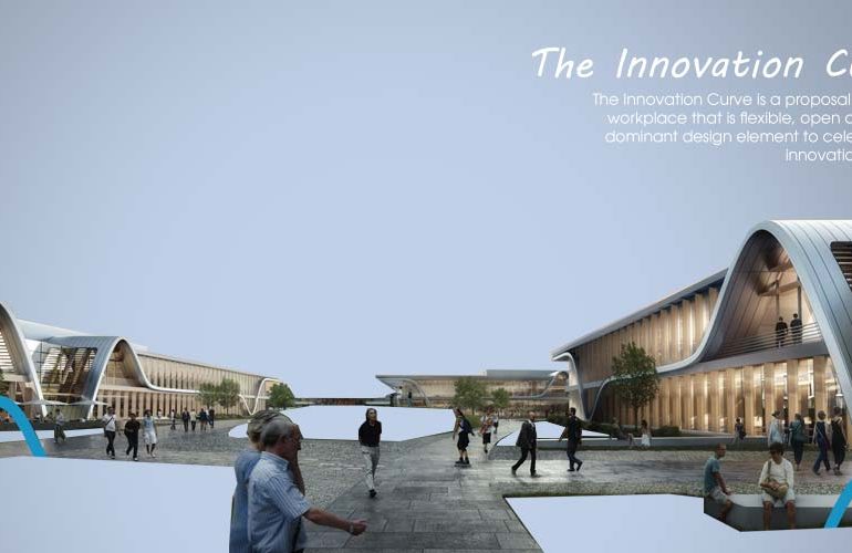
The Innovation Curve is a proposal for a new workplace that is flexible, open and uses a dominant design element to celebrate the innovation process that is so often associated with its geographical location of Silicon Valley. The proposed project rises on a hotspot in the golden geography of the bits economy. Located on the edge of Stanford Research Park, the site sits directly across the street from the Hewlett Packard Headquarters. The two existing buildings were deemed inimical to future growth for the sought-after tenants, these obsolete structures are slated for demolition. But their previous occupants are just as legendary as their immediate neighbors: the two bars housed the most recent headquarters of the giant company Facebook.
Second Award | RTFA 2014 Awards
Category: Commercial Concept
Participant Name: John Marx
Country: United States

The proposed design recognizes and celebrates the essence of the research park: an innovative entrepreneurial spirit. The architectural containers hosting these teams flirting with our shared tomorrow lend themselves to become built-up manifestation of the mindset of the people inhabiting it. This design de facto gives material form to a creative tension grounded in the ruthless reality of economically viable implementation. The sensuous, mid-level, blue horizontal ribbon-shading element follows the shape of the classic R&D timeline; from creative spark, though trial and tribulation, to welcome success. The highs and lows of an idea within reach, yet to be perfected and fine-tuned, form the discreet points of a curve, jolting yet proceeding, and metaphorically bearing anticipation and anxiety. For this scheme, the innovation diagram is generative of the compound’s urban appearance as well as its internal parti. To further activate the space, terraces break down the scale of the building along the inner campus to create places for people to work or meet. In erecting a billboard of the innovation rollercoaster, the community is reminded of the peaks and valley of effervescent thinking characteristic of the process of change.

Ever conscious of the importance of sustainability, the envelope shading strategy, conceived in a lyrical way, takes on a form evocative of this entrepreneurial spirit. The clear glass envelope with glass shading fins creates a crystalline form that evokes a sense of lightness and spirit. In an effort to let the energy model allow more exterior glass, deep horizontal sunshades are present throughout the buildings. Translucent glass fin verticals and a deep roof overhang complete the shading strategy. The building will achieve a LEED Platinum rating, and through the use of photo voltaics will also achieve a Net Zero rating.
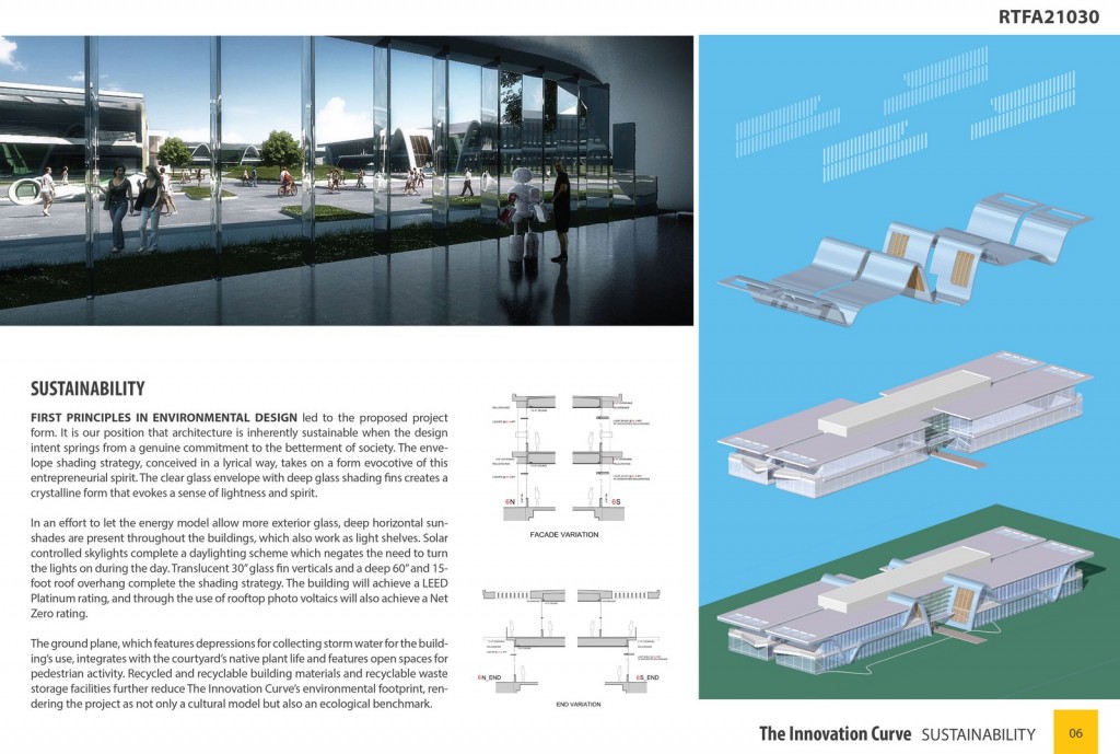
In making the innovation diagram the face of the buildings, users and visitors inhabit symbolically a space of and for innovation, for expansive and intense focus. It is at the building’s entry point, however, where the spatial experience reaches its apex. The lyrical metaphor yields maximum effect onto the users at the threshold. The valley of this innovation vessel gives a magnetic material form to the intoxicating excitement of what is yet to come. Tomorrow is already here.

