The restaurant designed is a beautiful fusion of an industrial look in a fine dine setting. When the cuisine focused client got in touch with the Architect’s to design their multi course set menu restaurant in Pune, the brief was to design something that was not just unique, but comfortable for a guest to spend hours and enjoy the many courses they had to offer. Privacy, comfort and an ambience that feels cozy yet offers respite from the usual wood and marble fine dine restaurants was broadly what was needed. To cater to this requirement, the Design team got on the drawing board and designed a space that offers a calm and earthy ambience with an unusual mix of materials and design ideas. The overall theme of the restaurant is planned keeping in mind the client requirement of a space that is not only one-of-a-kind but also one that inspires a sense of luxury. The restaurant has been quite innovative in creating fusion dishes and plating them into courses for the guests.
Architects: Studio Osmosis
Location of project: Pune
Size of the project/total area: 2500 sq.ft
Photography : Sameer Chawda
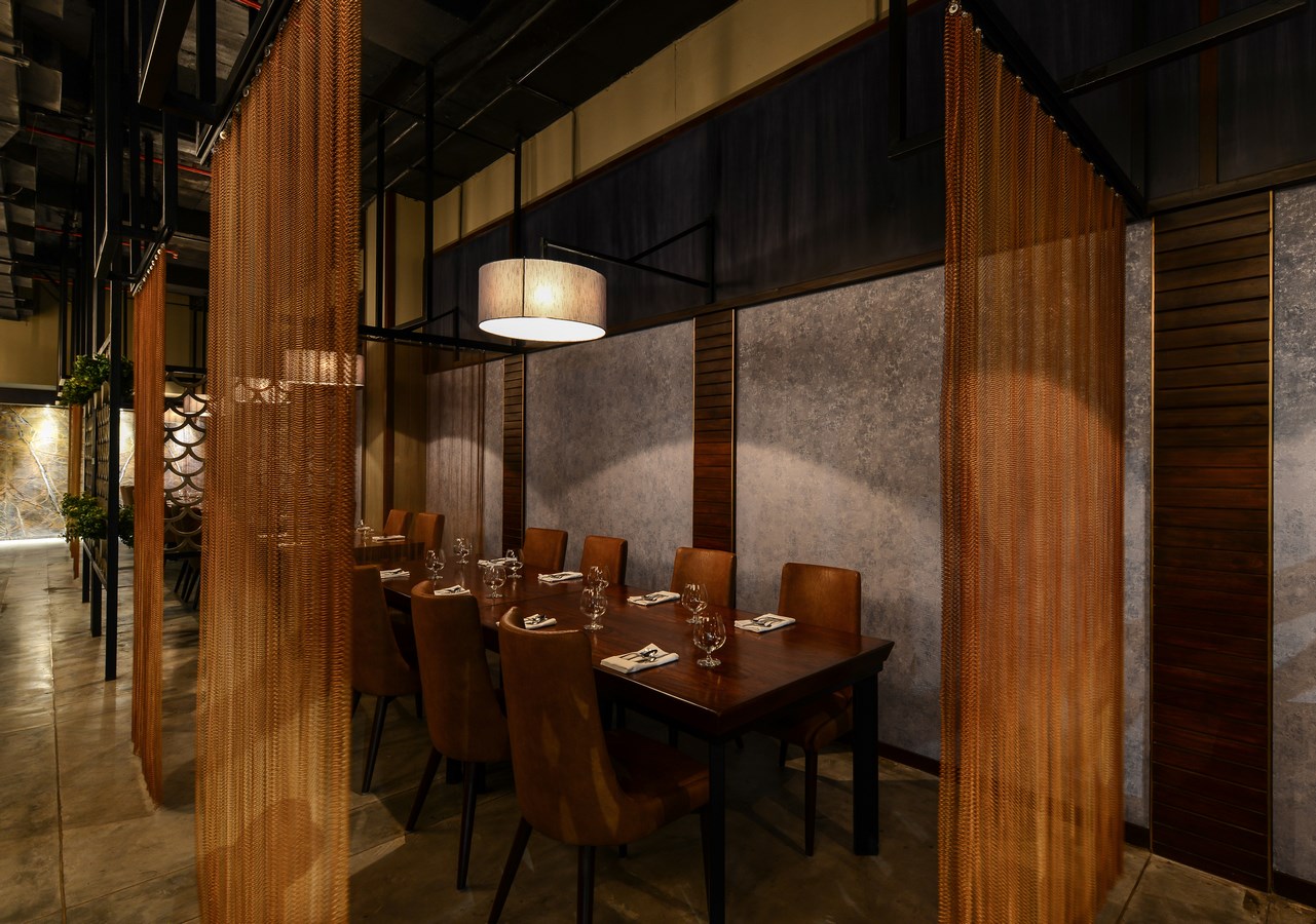

Going in the detail
With a clean, minimal layout, the design team managed to put into focus the various elements used to set the interiors apart. Approached through a reception, the general dining space is flanked by two private dining areas having an openable partition in between. The rest of the space is taken up by a modern kitchen the glimpses of which can be seen via one of the private dining area adjacent to it. Pre-cast concrete latticed screens doubling as wine stackers were custom designed to act as dividers between the key areas of the restaurant. This ensured privacy yet did not make the spaces feel boxed in. Further, brass-plated metal chain-link curtains were hung from painted metal members hanging from the ceiling to screen the various internal seating arrangements. The seating divided by the concrete screens is placed around the periphery of the restaurant while the metal chain screens are seen in the core area. These see-through metal curtains are moveable and offer flexibility in maintaining privacy for every table. The concrete and metal material palette is further combined with Walnut wall paneling and teak wood and polished leather for the tables and chairs respectively, adding a touch of warmth. The ceiling is left raw with exposed ducting to fuse with the theme of metal and wood. All these materials are used in their raw form and keep in mind the simplicity and sustainability of each of these materials without over layering them, keeping in mind the wabisabi concept of materiality, authenticity and imperfection.

Finishing touches
Each area in the restaurant has been designed with an eye for detail towards creating something unique and full of character. Individual custom designed cube lights have been hung from the ceiling and camouflaged within a grid that runs throughout the restaurant connecting the semi-open dining spaces. Green planters have been placed within this grid which appear to be floating in mid-air when seen from certain angles. The flooring is made in IPS with brass inlay to compliment the overall décor while the walls flaunt a combination of locally available Nepali brown marble and a light patterned wallpaper with a fabric finish. Overall the LED and dimmable lighting is muted to accentuate the fine dine ambience as well as keeping in mind a sustainable approach to dining.

Exclusive class
The Private dining area located at a ninety degree angle from the main seating area enjoys an exclusive view of the kitchen. The chairs here are upholstered in fern green textured leather while a sliding door made in sandwiched glass with fabric within has been provided to divide the room into two if needed. A green wall in the PDR is made with recycled PVC pipes with planters within lending an outdoor feel and adding to the raw character.
Near the entrance, the logo created with recycled brass screws clearly nails the design which is unique and inviting to say the least. Rooted firmly in experimentation, it defines the creative instincts that the designers as a team spells.
Shilpa Jain Balvally & Sameer Balvally
Founded by Sameer Balvally and Shilpa Jain Balvally in Jan 2010 with an aim to transform quality of lifestyle through the spaces they design, be it interior or architecture, the firm beautifully balances their youthful enthusiasm with experience gathered by working with clients from all realms. The Studio’s foundation is based on the genesis of the ‘Osmosis’ phenomenon by absorbing the individual needs of the client, working cohesively on the design and collaboratively arriving at a solution which is not only creative but also tangible and sustainable. All designs at the Studio are based on research and experimentation with adaptability as the key factor.
While Studio Osmosis has a contemporary and flexible approach towards design and technology, we derive inspiration from various walks of life, art, culture, history and people. It is a Studio where young minds work together; ideas are born, nurtured and streamlined to offer the perfect service and a superior product to the client. It is a firm where professionals enjoy what they do; building relationships.
Both their designs and creativity are influenced by the environment and the built fabric in the various places they have travelled and observed over the years.
All designs at the Studio are based on research and experimentation with adaptability as the key factor. The focus is always on the Site, context, the constraints and the opportunity that a project presents. Every design project we take is constantly reinventing itself from the conceptual stage till its execution. The idea is open, dynamic and flexible while retaining the design essence of the project.
Philosophy: It is a Studio where young minds work together; ideas are born, nurtured and streamlined to offer the perfect service and a superior product to the client. It is a firm where professionals enjoy what they do; building relationships.
From big entrepreneur homes to hippest of restaurants, Studio Osmosis in its 8 year journey has transformed spaces with a knack for providing that X factor that makes them stand apart from the rest. Even homes as small as 450 sft elude empathy, and pent houses transform into cozy spaces where the families enjoy interacting with each other. Every office designed by Studio Osmosis has at least one element of design that leave an impression in the mind of the visitor while for their fantastic restaurant designs the only testimony is repeat customers.
Studio Osmosis is currently working on numerous architecture, interior design and planning projects. They have worked on various Hospitality, Commercial, Residential, Healthcare projects in various Indian cities as well as abroad.

