Bupyeong, the central part of Incheon, had been a wetland and field of reeds formed by frequent deluge along with a plain of Gulpo stream before the Japanese colonization.
Global Design & Architecture Design Awards 2019
Second Award | Category: Commercial (Built)
Studio: nonespace
Architect: JungBae Shin
Country: South Korea
DESIGN – None Space / JUNGBAE SHIN, JEEWON KIM
CONSTRUCTION – None Space / JUNGBAE SHIN, SUNGWON LEE
PICTURE – JUNGBAE SHIN
CONTACT / none-space.com
CLIENT – On The Bar
LOCATION – 206-1 BUPYEONG-DONG, INCHEON-SI, REPUBLIC OF KOREA
FLOOR – 132㎡
YEAR OF COMPLETION – 2018
FLOOR – CONCRETE
WALL – PLYWOOD, BRONZE MIRROR SUS
CEILING – BRONZE MIRRORSOL, PRESERVED FLOWER, PLYWOOD
 Starting with the end of the colonial rule, arms factories and stores entered into the region and Bupyeong is now becoming a busy and bustling place of underground shopping malls and markets.
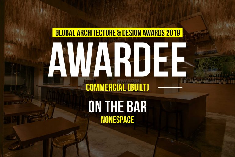
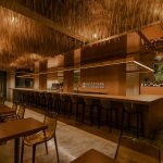
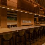
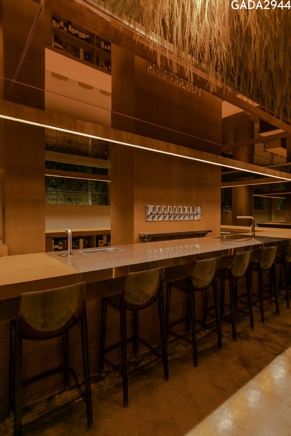
On The Bar has the functionality of eating, resting, and communicating and for this, experts of three parts (barista, bartender, baker) greet customers in 1:1 settings like curators. The bar located at the center of the space represents the philosophy and spirit of On The Bar.
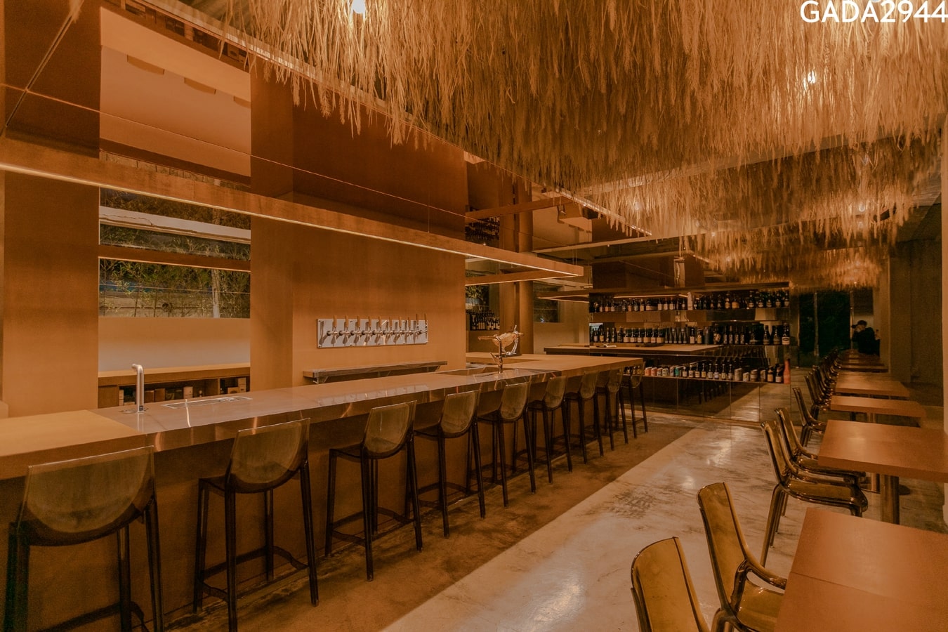 The design has considered three elements, firstly “brand identity” to be “space for rest”, secondly “placeness” of Bupyeong as the past reed field and thirdly “solution” to the problem with no resting place.
What’s unique about it?
“ On The Bar is a phenomenal space. “
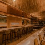
The reeds randomly moved by wind are replaced by emotions such as coziness, comfort, and even loneliness on the background of the past field and people will enjoy emotional healing or sympathy while interacting with them.
The concept of the space is “Nest” + “Bar”, meaning house, nest, or resting area. And its motif implies a kind of comfort a nest mixed with grasses and branches could give. The plywood BAR is an axis in the space.
 The walls of reflectors are seen along with the axis and it creates both the real image of existing things and the illusion of non-existing objects, emphasizing BAR, the brand’s symbol.
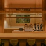
The BAR has the shape of a ㅁ, where the contents (café, bakery, pub) break down their boundaries to achieve harmony and like this, the served space(order pickup) and servant space(kitchen) are designed to be functional as a one structure that is aimed at practicality as well as sanitation for the space.
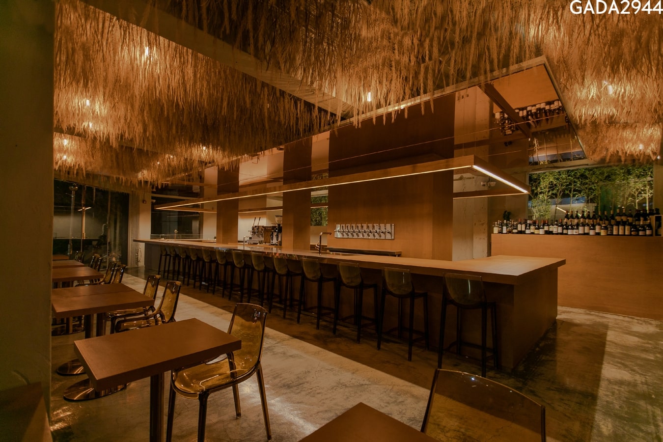 The front bar is adequately suited for the openness (communication) and the back side naturally gets a private space due to dispenser walls and columns, which in turn makes an environment for both such public and private space.
Bamboo on the window through which an old warehouse is seen at the back side gives a feeling of nature, and the shadow of bamboo shaking by light with time makes the space something phenomenal. And other walls maintain existing concrete and cement finish.
On The Bar with a warm feeling given by plywood, trees outside the window, bamboo shadow by light and windblown reeds that visualize wind creates an atmosphere in which people emotionally want to experience nature and stay longer.

