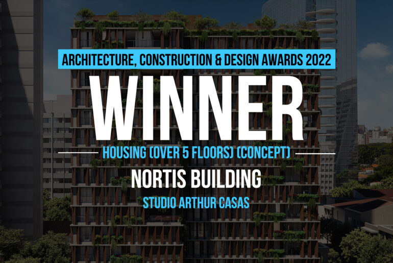
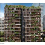
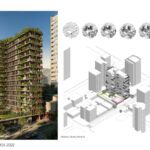
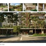
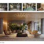
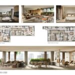
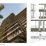
This building’s main features are its sustainability and the dialogue it creates with the public space in the surroundings, whilst guaranteeing privacy and comfort for its residents. It is composed of one residential tower, a commercial ground floor and a suspended green plaza. The project was developed entirely in BIM technology, which facilitated the interfaces between the programs and the compatibility of structural projects.
Architecture, Construction & Design Awards 2022
First Award | Housing (over 5 floors) (Concept)
Project Name: Nortis Building/ Bioma Building
Project Category: Housing (over 5 floors) (Concept)
Studio Name: Studio Arthur Casas
Design Team: Author – Arthur Casas; Co-Author and Director Architect – Gabriel Ranieri; Co-Author and Architecture Manager – Cadu Villela; Coordinator Architect – Beatriz Mendes Costa; Interiors Manager – Gabriel Leitão; Decoration Manager – Rafael Palombo; Sustainability – Renan Prandini; Collaborators – Raul Valadão, Raimundo Borges, Marilia de Castro, Fabíola Andrade, Claire Dayan, Amanda Tamburus, Maria Pedreschi Gonzalez, Augusto Mattos, Susanna Brolhani.
Area: 10.166,99m²
Year: 2020
Location: Rua Clodomiro Amazonas, 121, Itaim Bibi – São Paulo
Consultants: Projeto Academia (gym); Arpa (accessibility); Echo (acoustics); PBSE (definitive anchorage); WSAR (air conditioning); Hayden (central vacuum); P&S (frames); Nitsche (visual communication); CHP (coordination); SPHE (electrical and hydraulic); Avila (structure); MGA (foundations); Yusuf (garage); Saoseg (fire protection); Regatec (irrigation); Studio IX (light engineering); Beltec (metallic); Cardim (landscape); CA2 (thermal and lighting report); CTE (certification of sustainability); Addor (sealing);K2 Arquitetura (ventilation).
Photography Credits: Studio Arthur Casas
Other Credits: Nortis Inc. (contractor)
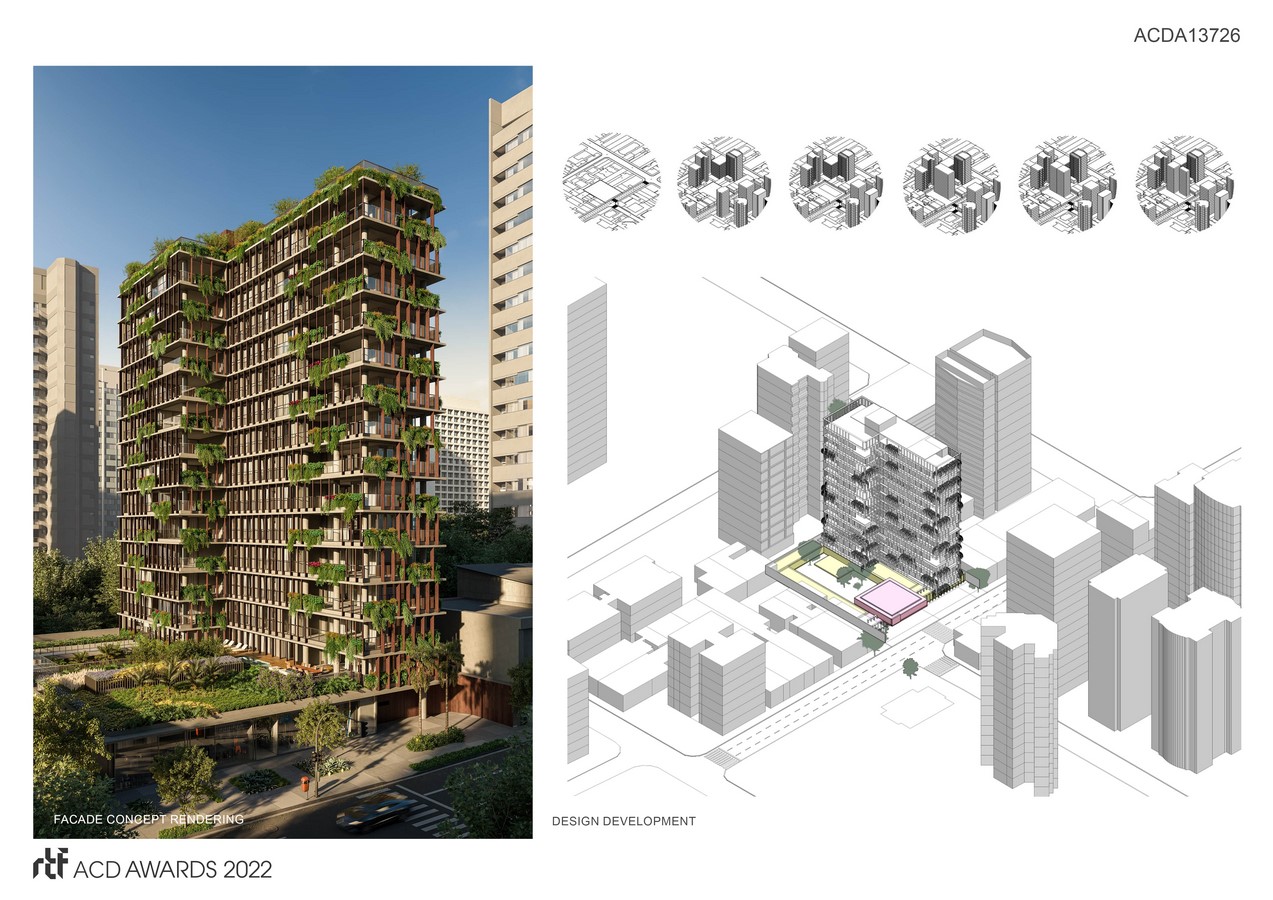
The building’s design was conceived to have a pleasant relationship with the pedestrian’s point of view. The residential tower is recoiled from the front of the construction, giving space to the suspended green square on the first floor, full of lush vegetation composed by native species. This space creates an unbuilt green lung of more than 40m along the entire main street, maintaining a fluid perception between the surrounding buildings and preserving the views of the residential tower and the street.
The main façade of the building was designed with data on the thermal, lighting and visual comfort of the apartments: it is north-oriented to ensure natural lighting and has flexible wooden louvers to allow environments to be naturally well lit and comfortable from a thermal point of view. Each façade has a different modulation according to the amount of light received, in addition to the condition of the surroundings. From an outside point of view, the dynamic wooden louvers also key aspect for the building’s design, and can be found in every aspect of the project.
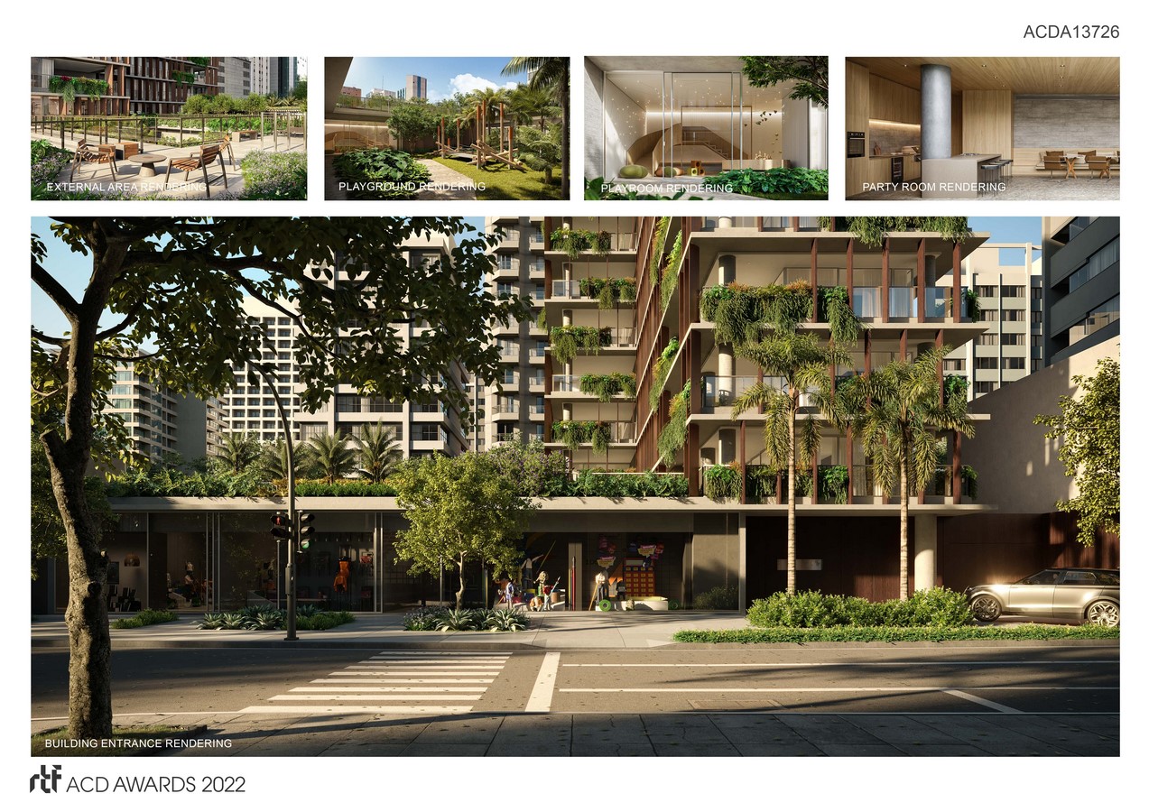
The materials used are natural materials that meet high standard performance requirements such as certified wood and efficient lamps. Furthermore, the practice of biophilia is a factor that permeates all main decisions regarding the project. Among these practices are the abundance of natural lighting, use of native vegetation, large openings that allow integration between internal and external environments and establish natural ventilation. These techniques used have scientific bases that contribute to the comfort, productivity and well-being of the inhabitants. The use of natural lighting and ventilation reduces energy consumption, and the donation of sidewalks contributes to more walkable streets and the use of native vegetation and green roofs reduce flooding risks in the city.
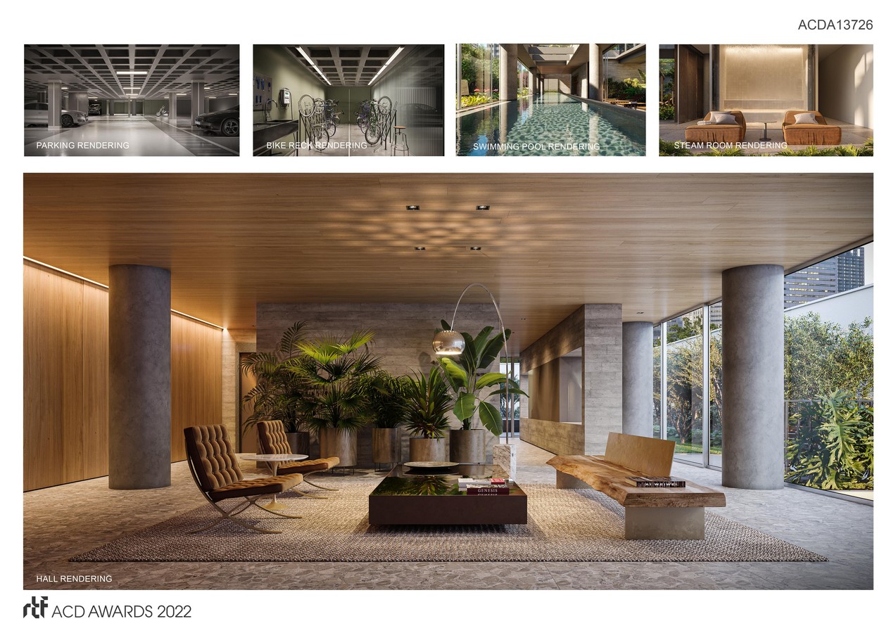
The project has a wide program of common areas with a swimming pool, sauna, massage room, party room, playroom, playground and gym. The layout of the apartments is versatile: the kitchen can be integrated into the living room and the suite can be integrated into the living room, creating a bigger space. The concept of the interior design was born from the integration of the materiality of the facade and the connection with the outside. The building has a great connection with the green areas and the interior needed to take this premise as a starting point. The materials were designed for the best possible maintenance, with lower risk of deterioration. All finishes follow the same minimalist language of the façade, ranging from macro to micro details.

