Having the brief of “A Space that is Contemporary, Striking, Iconic and Extraordinary” is probably one of the most charming project briefs we have encountered. The Clinic, located in a prominent mixed-use building, has enabled us designers to have an experimental field regarding this motivation.
Global Design & Architecture Design Awards 2021
First Award | Category: Interiors – Healthcare & Wellness (Built)
Project Name: Çağdaş Kışlaoğlu Clinic
Project Category: Interior Design Healthcare / Wellness
Studio Name: Slash Architects
Design Team: Şule Ertürk, İpek Baycan, Quentin Gaucher
Area: 250m2
Year: 2020
Location: İstanbul, Turkey
Consultants: –
Photography Credits: Alt Kat Architectural Photography
Text Credits: Slash Architects
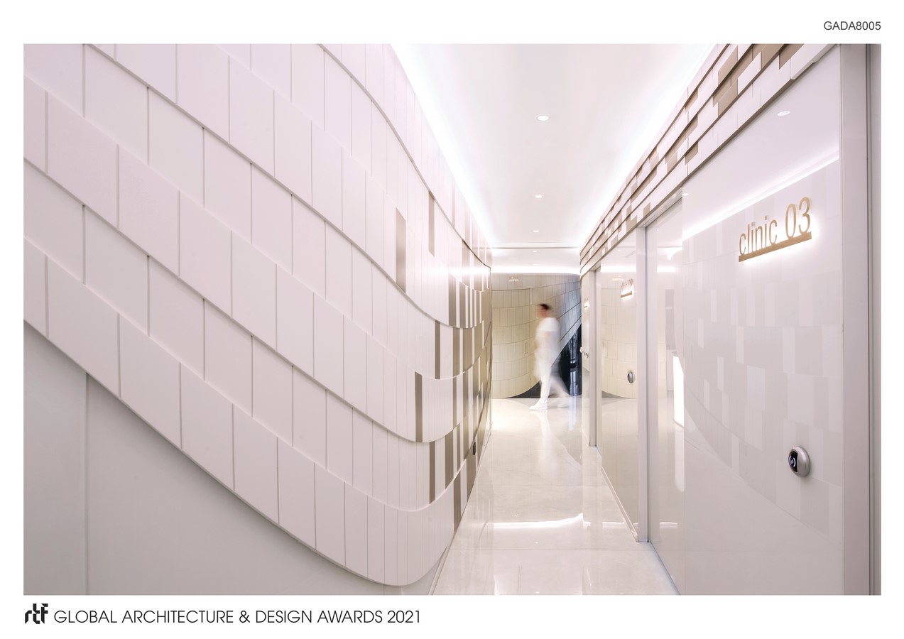
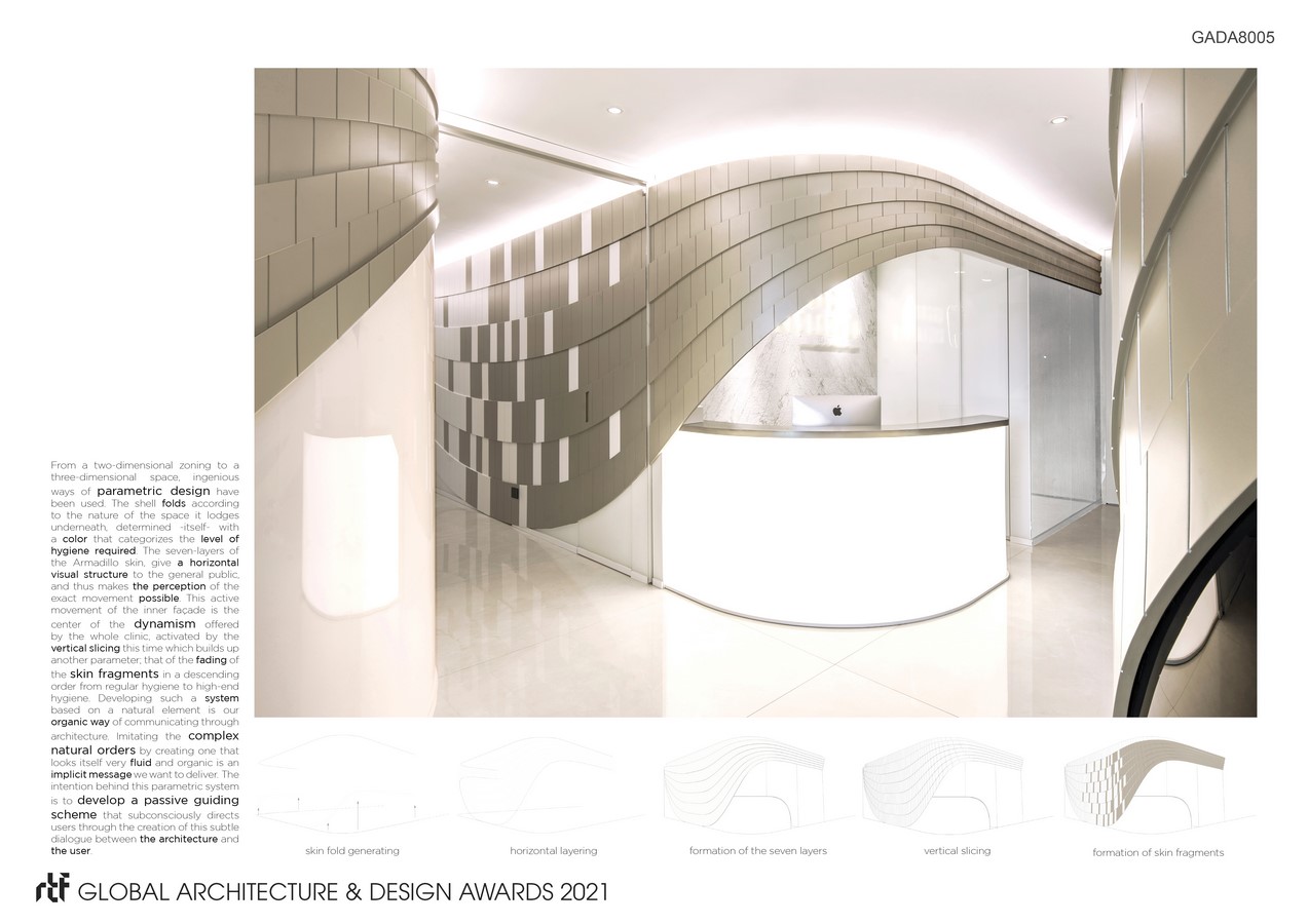
With this approach in mind, the focus was on the sensation of flow and thus the location of the spaces in a composition that provides a proper circulation. The tectonics of the interior architecture are additionally shaped by the organic nature of the idea of flow. As for the plasticity of the clinic, it is derived from the inner facade, which folds and flows according to function. The nature’s mathematical response to this folding system has been the greatest reference. This biomimicry process mainly landed on the armadillo’s mechanical folding parameters. Considering the characteristics of the animal, we have mostly examined its organic folds, stretches and openings. On another note, the metallic color and texture of this skin intends to highlight the man-made nature of this element as well as the technologic orientation of the clinic.
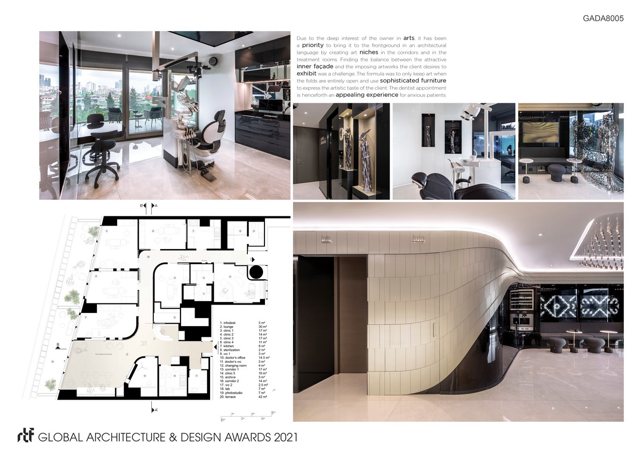
The human scale is the primary reference taken while creating an interior attitude entirely shaped by natural codes and references. Contemporary design technologies emphasized the importance of art and technology omnipresent in the overall space. Architecturally, the spatial design and the zoning of the interior are shaped by parametric tools and methods. Having two office plots affiliated, the architects were bound to generate a five-treatment-room dental clinic in 250 sqm for an internationally renowned dentist.
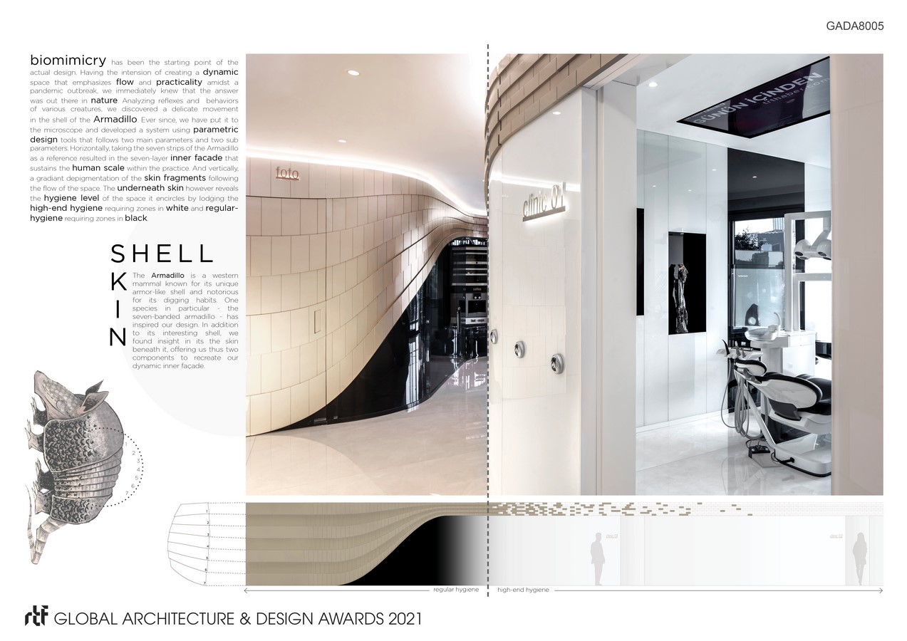
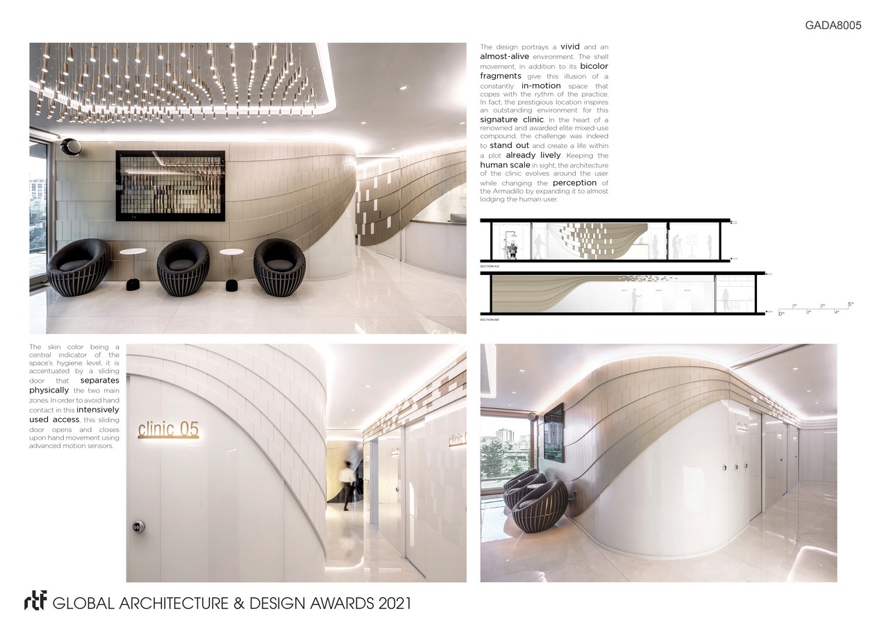
Regarding these constraints, we focused on creating spaces that provide considerable ergonomics for the staff and remarkable comfort for the patients. The circulation and the waiting area defining the public spaces of the clinic are the most crucial zones in terms of design. The “ring corridor” that is planned considering the differentiation of the visitor and staff access, also provides separation of public and private as regular-hygiene and high-end hygiene zones. The waiting area and entrance that host the reception are located in the former where one can benefit from different waiting experiences such as digital activities and self-service kitchenette. This zone is indeed separated from the rest of the clinic by a motion-sensor sliding glass door. Starting from this separation, the inner part of the clinic is entirely dripped in a striking white color emphasizing the high-end hygiene approach.
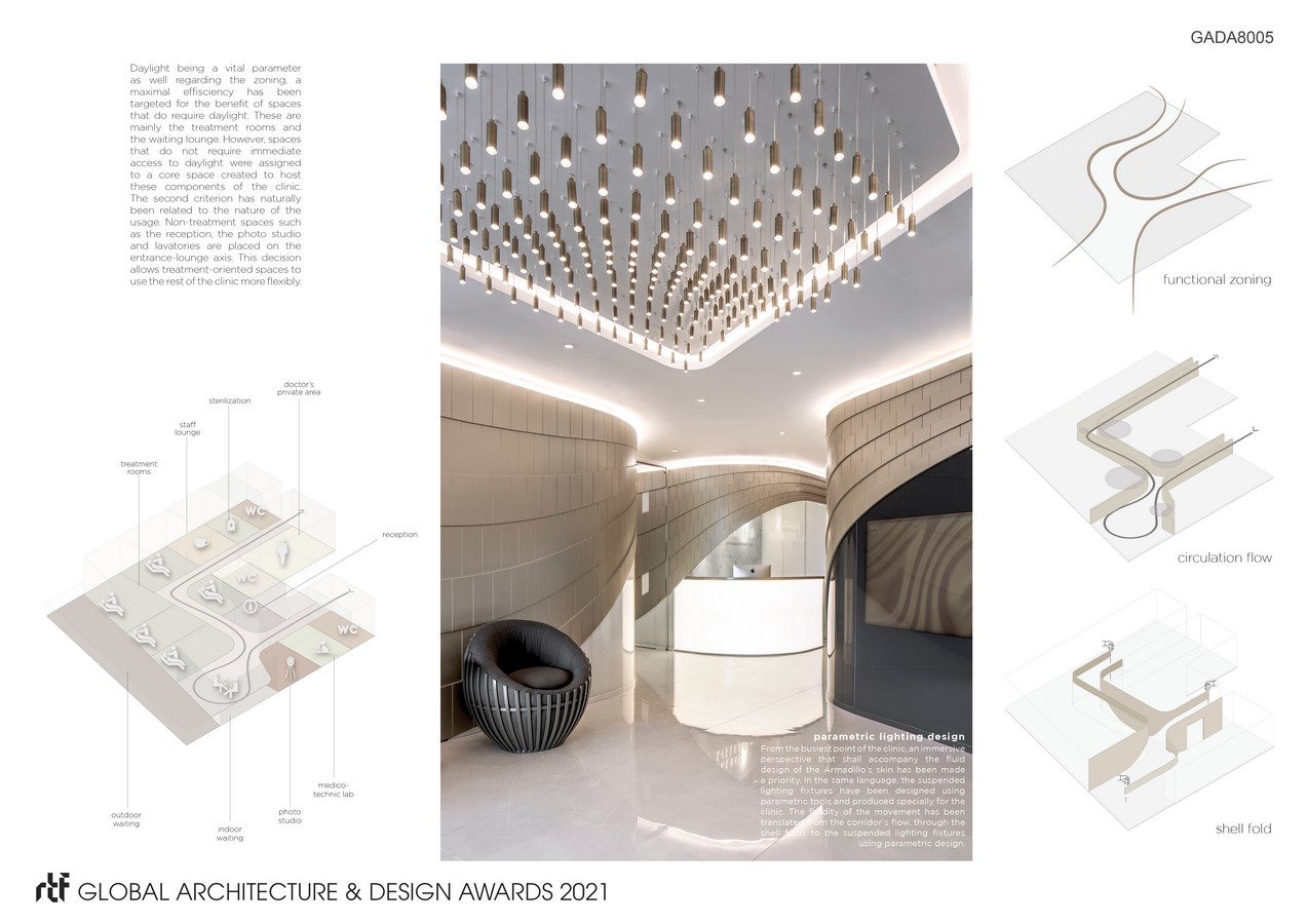
The inner “shell” that is surrounding this circulation changes “skin” color and opening according to the functional usages and change in the level of hygiene required. Basically, the detailed parameters of this design operate as a fourth-degree equation, to which the parametric design responded in curve, color, and size change. Some spaces are camouflaged within the shell as the client prefers to keep these rooms out of reach of the patients. This shell, being the most dominant and memorable design element of the project, provides a lot of different perspectives within the clinic.

