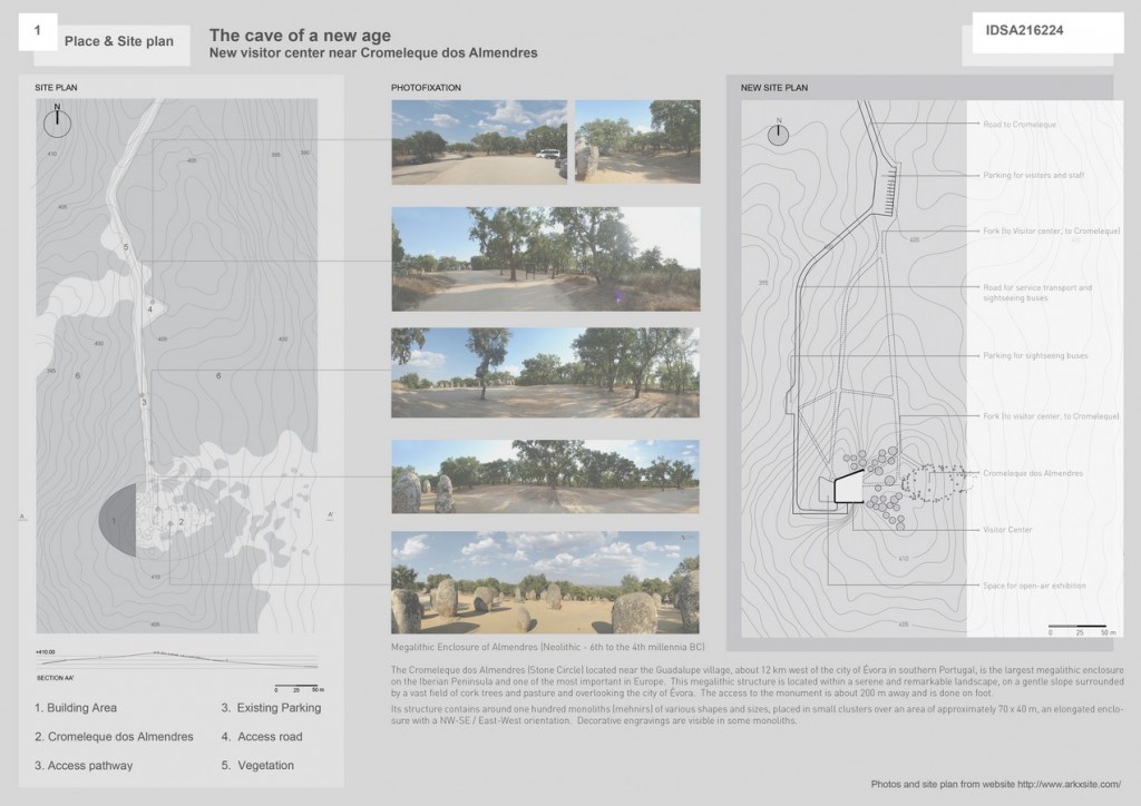
When architects consider construction near historical monuments, they attempt to underline features of cultural heritage. The past comes into the focus, and the present is just an entourage. Such principle enriches an impression from the monument, but it can harm contemporary architecture.
Participant Name: Alexander Kuznetsov
University: Ural State University of Architecture and Arts
Country: Russia
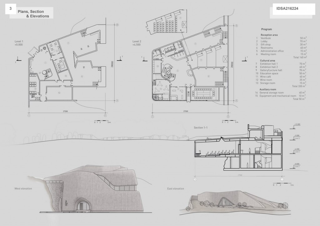
This new Visitor Center is based on beneficial symbiosis of the old and the new. The composition of perception allows successive changing of contrast accents both near the Cromeleque and inside the Center. Structures of ancient people are famous for their close connection with the nature. That is why this project pays much attention to ecological issues. Thanks to terraforming and green roof, the east elevation becomes an extension of the natural terrain with a small superstructure, concealing the main staircase. When you visit either Cromeleque or open-air exhibition space at start, by the elevator and staircase, you get on the second level. The main distribution node locates there. You can easily get to the cloakroom, restrooms, wine cafe or, through the gallery, exhibition halls. The glamor of inner space is achieved by the expressiveness of lines and the contrast of artificial and natural light. The latter coming through the windows, light wells and the light-transmitting concrete. Exhibition spaces of the Center produce an impression of a contemporary cave – natural, although operated by humans. Reinforced concrete gives a feeling of natural stone, both inside and outside the building. The effect is especially strong when look at the west side, where building resembles an enormous rock.
The Center is multi-functional. The open space in front of the west façade allows diverse usage. In addition, space of the gallery and classroom is transforming. It makes the building perfect both for annual needs (center for visitors), and for temporary events like workshops or local exhibitions. Barrier-free environment is well taken into account: use of tramps and elevators allows disabled people enjoy the interiors on a line with the other visitors.
The idea of contrasts interaction (straight and curved, natural and artificial) was a source of the inspiration throughout the whole design process. Starting with the plan (useful flow distribution) and ending with the facade design (the light one, merging with an environment, on the east, and the massive one on the west).

