The typology of the typical block is a based on the search for a balance between maintaining a relationship with the alignment of the streets, on the one hand, and avoiding dogmatically following their perimeter, on the other, with the aim of not being tied to the rigidity and dryness of a building whose form is the direct result of the outline of its boundaries. The simple play of volumes that is proposed consists in two squares similar in size to the site, which are moved, rotated and intersected with the perimeter of the site in order to provide the formal basis of the project.
Architects: Rubén Hernández
LOCATION: Russia, Moscow
YEAR: 2017
STATUS: Competition
PROGRAM: Residential + Retail + Educational + Parking (45.500m²)

The concept can be repeated several times in an urban fabric providing rationality, coherence, and continuity to a portion of the city and, in turn, allowing for volumetric variety. Two blocks will never be the same, ensuring variety and formal continuity at the same time. The irregular perimeter also demonstrates the flexibility of this strategy to adapt itself to different types of pre-existing urban contexts.
This results in two irregular linked rings, which define a series of open spaces. These spaces could be used as private or semi-private courtyards. The open spaces next to the pavement act to widen the streets, enlarging public space and serving as the connecting element with the ground floor retail units.

As can be inferred, the essence of the project is the search for a block that is visually compact and that aspires to formal unity. In this way we aim to respond principally to urban aspects and the consideration of a unified vision. The opposite strategy, on the basis of volumes of a different nature, which presumably would reflect the diversity of typologies and uses of the block, would in our opinion be much weaker from an urban point of view, making the building more of an assembly of contrasting elements rather than an element that is correctly embedded in the fabric of the city.
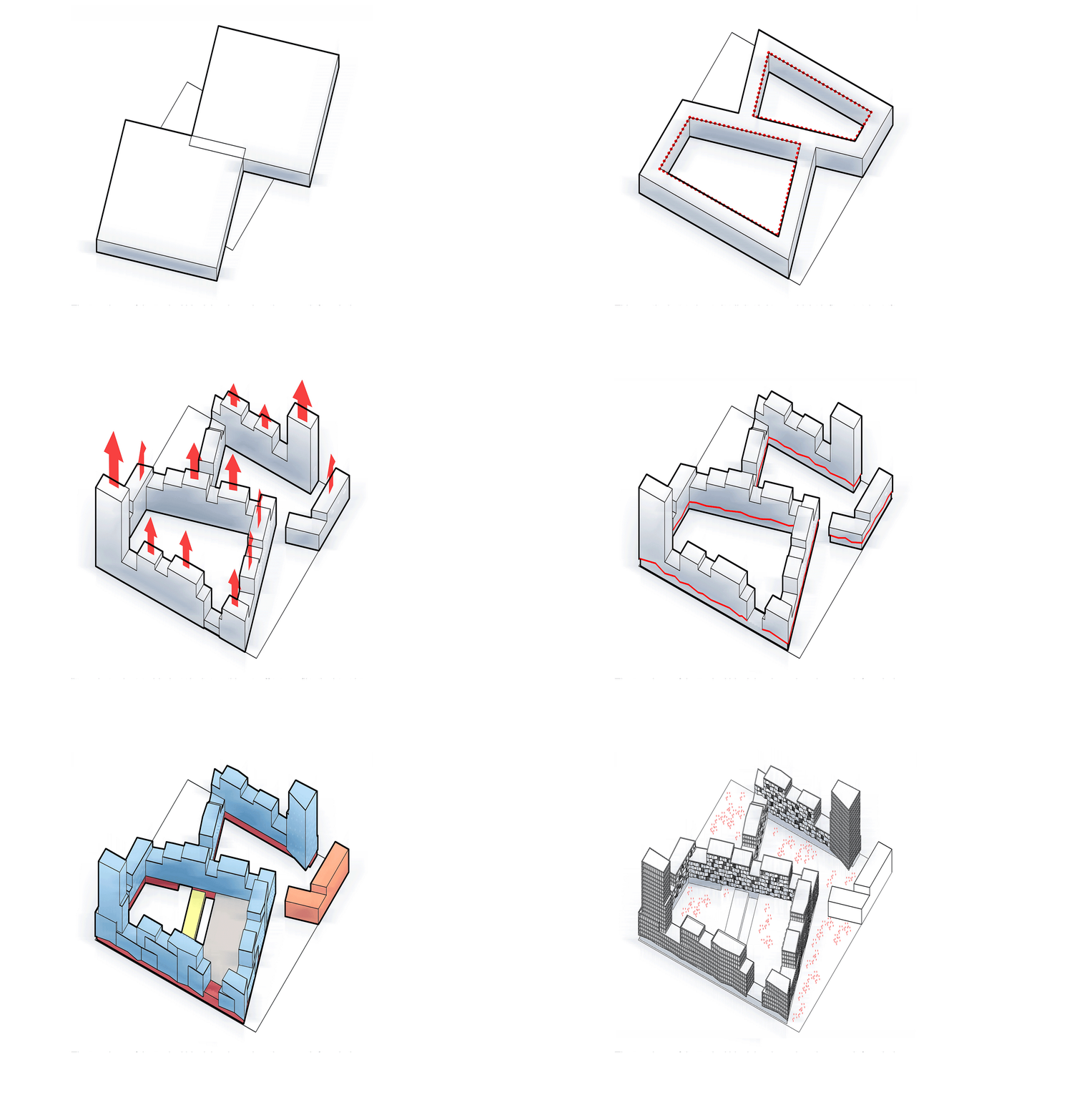
The volume is moulded as it rises with an offset profile designed to achieve a formal balance between the elements, whose final profile will depend on each specific urban context. Towers of different heights rise at two of the corners, serving as visual references for the development. This strategy is further evidence of the flexibility of the standard block to adapt to various urban contexts.
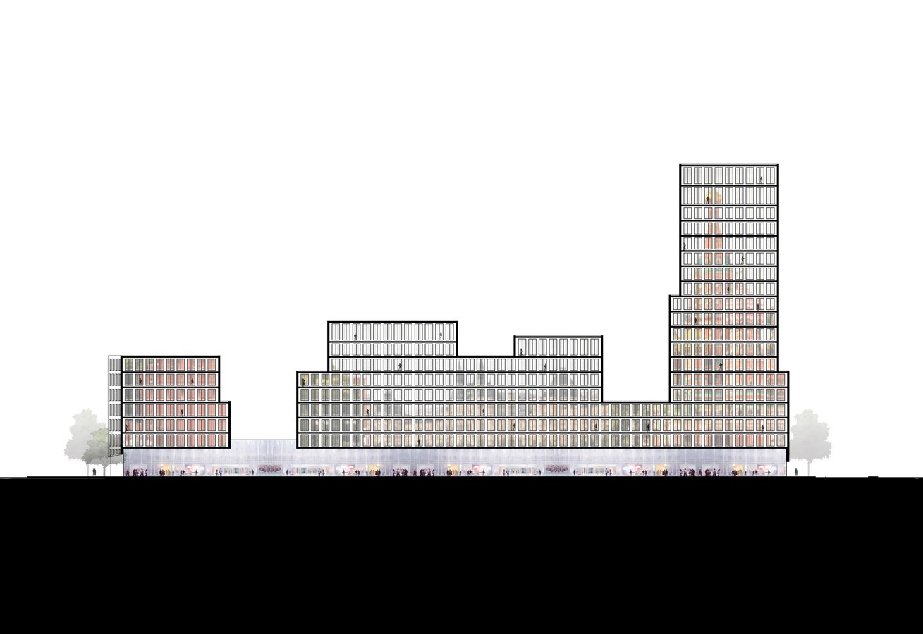
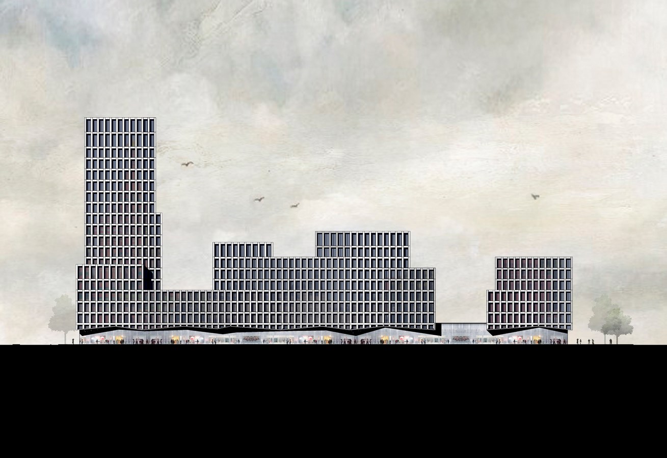
The formal separation between the ground floor commercial space and the residential use of the upper stories is achieved by the use of a broken profile – linked to a change of material, from brick to glass – which creates the impression that the upper stories float over the ground floor, creating a certain tension at the meeting point between these two volumes.
In the same way the street façade is linked as it rises with a subtle play of folds that articulate the vertical offset of the building’s volumes. All of these planes of the façade are placed at an angle that diverges slightly from the alignment of the street. The play of shadows and light produced by this folding is easily appreciated in the principal image.
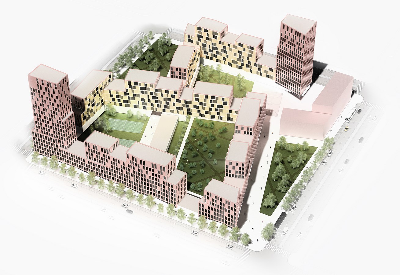
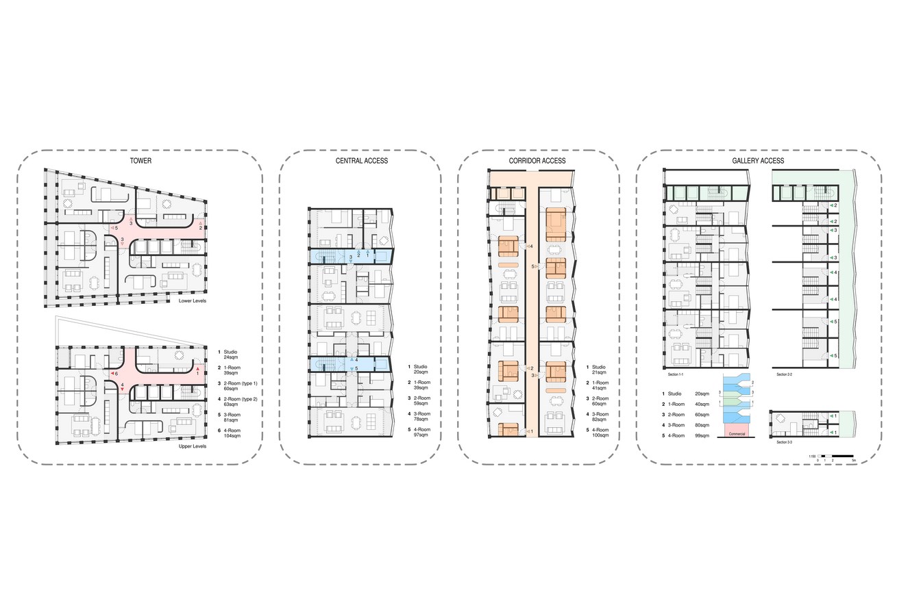
As has been indicated previously and as can be appreciated, once the school and the commercial space as well as the various residential typologies have been inserted in the development, their characteristics are merged within a shared volumetric concept, which becomes the dominant theme of the project. The parking area has been located at ground floor level, rather than underground, avoiding excavation costs and allowing these savings to be used in the rest of the project. Its roof is used as one of the two private residential courtyards, this element having a dominant position because of its height.
The interstitial spaces created by the formal layout will become pedestrian spaces with varying levels of privacy: public (adjacent to the surrounding pavements); semi-private (in the area of the sports centre); the private area serving the school; and the private spaces used by the residents.
The façades are designed on the basis of two completely different approaches. The façades facing the streets seek to reflect an image of simplicity, elegance, modulation, and austerity. A solution that is valid for a variety of urban contexts where the building could be inserted with the aim of urban continuity and without ostentation, but at the same time, with sufficient personality to not succumb to the context. Emphasis is placed on the repetition of the window opening that is repeated along the entire brick façade. The façade that faces the courtyards has the opposite character. The design changes to a timber façade with much more domestic qualities, softer and with a greater level of informality. Both façades are completed with the addition of louvres to resolve the problems of solar protection associated with the orientation, and which, of course, will be present in lesser or greater amounts depending on the orientation and the geographical area in which these prototypes are located.
Structure / Construction: It is proposed building with KLH, cross-laminated solid timber, as it is a truly sustainable alternative to traditional materials. Structural capabilities are akin to concrete in material strength. The speed of construction reduces overall programme length which reduces contractor’s prelims and reduction in overall cost of construction. It also provides time savings on programme, and with no wet trades, following trades are on-site quicker. The structural (bi-axial) performance allows design flexibility. The elements are cut using state-of-the-art CNC systems. The elements are delivered directly to the construction site on a just-in-time basis, either by lorry or in a container.

Rubén Hernández
Rubén Hernández was born in Gijón, Spain, in 1984. He studied architecture at the Higher Technical College of Architecture of La Coruña (Spain). During that time he received an honourable mention in the 17th Iberian Competition for Solutions in Pladur in 2006 and 1st local prize in the 18th Iberian Competition for Solutions in Pladur in 2007. After graduating he won a Scholarship from the Caja de Arquitectos Foundation to work in Rafael Moneo’s office, where he was employed for five years. He subsequently expanded his professional experience in Sydney (Australia). In 2017 he founded FolieCity.

