The Revillon Annex, the former fur warehouse for the Revillon Frères sat abandoned for several years. The existing tenant fit-up, a warren of offices, buried the character of the space behind layers of drywall and suspended acoustic ceilings. The space was disengaged from the street and lacked access to natural light. The potential of the space was hard to imagine.
Third Award | RTFA 2014 Awards
Category: Interior Public Built
Participant Name: Shelley Smith
Country: Canada
Faced with having to leave an existing space that they had outgrown, our client looked to find a new downtown location that would support their vision and integrated way of working. Their goal was to bring everyone together on one floor in space that inspires creativity and collaboration and demonstrating a commitment to urban vibrancy.
The client and design team identified the Revillon Annex as having potential even though the previous renovations had hidden the heritage and architecture of the building. The space was stripped back to its original architecture, exposing the board-form concrete ceiling, original brick walls and cast-in-place concrete columns. The columns and ceiling were sandblasted to remove layers of plaster coatings and paint, revealing the natural character of the concrete. Many of the columns had existing steel surrounds that were preserved in their natural state. During demolition, the design team was delighted to discover the building’s original loading dock concealed beneath a raised floor.
The design concept is about creating a sandbox for exploration and creativity. It is about experimentation and play – being able to pin up work, move the furniture around, make the space work for the team. Hence the environment is designed to be flexible and collaborative and a reflection of the client’s core values – doing great work, enjoying the journey and always making a difference.
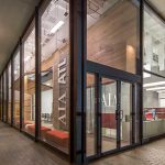
The design is anchored by a double volume space located in the centre of the studio flanking the public street. The raised floor was removed allowing the main reception and meeting space to be located at street level with the studio and amenity spaces on the surrounding upper level. New exterior windows, reinstating the openings of the original loading dock doors, open the reception area to the street level and engage the neighbourhood.
The studio space is organized around a large central gathering space. It connects the north and south studio and functions as an event, staff lounge and meeting space. It is the heart of the studio and encourages informal interaction and collaboration across project teams. Adjacent to this central gathering space are glass fronted project team rooms. These rooms open to the studio and provide quiet space for both collaboration and independent work. Views and access to natural light are priorities. The team restored and added new skylights.
The space is designed to LEED® Commercial Interiors with a goal of Silver. New energy efficient mechanical systems and LED lighting are incorporated into the project. A low profile access floor was added to enhance the studio’s power and data flexibility, allowing the studio to easily change over time, an important sustainable goal. As part of a staff wellness strategy, the project includes a large bike room, shower and locker room facilities.
Prev Post
AIA | 5G Studio Collaborative
2 Mins Read
Next Post
Seattle Net Zero | Connor Kramer
4 Mins Read

