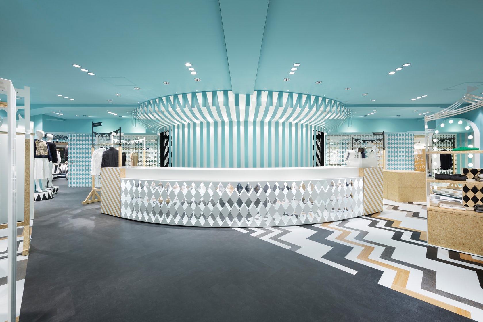
“key to style” is the women’s fashion floor within the main building of the Seibu Shibuya department store. It is connected by a walk-way with the “COMPOLUX” floor on the third floor of the annex building that we designed in 2013, and has a more casual feel by targeting the young customer. We wanted to create a dynamic setting while maintaining the connection with the “COMPOLUX” area that was inspired by a cozy European park.

Hence, we decided on the “mobile amusement park” that is held at parks as the design theme. The colours are based on a monotone colour scheme, while to add some accent the ceiling was coloured blue and wood was used in some parts, .which helps to enhance the colour and the sense of texture of the products. The design of the sales area is inspired by a circus tent, and the collection of the brands are arranged to give the impression of market stalls. The fixtures of the accessory floor were inspired by wagons.

The flooring scheme of the “COMPOLUX” uses grey plastic floor tiles that are laid out in a herringbone style. To follow this scheme, we made the same colour change gently using the gradation effect along the passage that connects the annex bldg. and the main bldg.. In the “key to style” area we enhanced the contrast of the colours of the plastic floor tiles incorporating striped patterns. The sales area surrounds the escalator, around which a circular line is formed for people to walk through.

Cross shaped passages that run diagonally were added to this area in order to improve the flow of people and create a line of sight. The project became one of, not simply designing a space, but to think of theSeibu Shibuya department store as a whole and to expand the concept of COMPOLUX.
If you’ve missed participating in this award, don’t worry. RTF’s next series of Awards for Excellence in Architecture & Design – is open for Registration.
Click Here
Prev Post
Merkel Cooper Residence By In Situ studio
3 Mins Read
Next Post
Panorama House By Sosu Architects
3 Mins Read


