RENESA ARCHITECTURE DESIGN INTERIORS STUDIO has added a new touch to an upcoming pizza chain in new delhi called ‘instapizza’. The concept of the design was to capture the relationship between those who love food and design.
Instapizza, GoodEarth Mall,Gurgaon.
(Pizza Chain- Retail Category)
2016.
Built Up Area-
550 sq feet(including the mezzanine) approx.
Design Team:
RENESA ARCHITECTURE DESIGN INTERIORS,New Delhi
- Sanjay Arora – Founder| Principal Architect
- Sanchit Arora – Studio Head Architect|Concept Design Head | Graphic Design.
- Vandana Arora – Interior Designer| Decor Head
- Virender Singh- Studio Technical Head| Architectural Assistant
Photographer-
- Vibhor Yadav – RENESA’s Official Photographer.
Owner – - Ashwin Jain – Instapizza – (www.instapizza.in)
Consultants | Contractors:
Site Contractor – Star Construction – Mr. Umesh Mehta.
Social Media Connect:-
RENESA ARCHITECTURE DESIGN INTERIORS STUDIO, New Delhi
The initial birth of the concept germinates from the target audience of this chain- the very youth. The design philosophy needs to capture the essence of youth and freshness at the very same time. The process of pizza making (an industrial chain effect in itself) was one of the most inspiring factors for the final outcome of the design. The conveyor belt process of pizza making gets replicated in the ambiance of the space.

A pipeline light installation has been included to guide the visitors to the various pocket-spaces so they can seat down and eat. Painted in red and yellow, almost gives you the feel of tubes of ketchup and mustard, and the rough plastered brick walls have been kept simple and white to create an airy look to the already existing small space. Metal framed chairs and simple wooden tables offer customers a spot to eat their pizzas and admire the unusual interior of the restaurant, with its interesting lighting with artistically arranged tubing.


Renesa Architects carefully designed and crafted the space around the furniture keeping in mind the essence of the whole ideology of the concept. The slick curvy iron bars with the industrial wheel legs control the harmony of the space and add significance to the branding by the introduction of the colors. Adding up to the theory of industrialization, the air ducts (silver corrugated pipes) act like pieces of installation at the site and provide a pause for the viewers from the rough plastered walls.
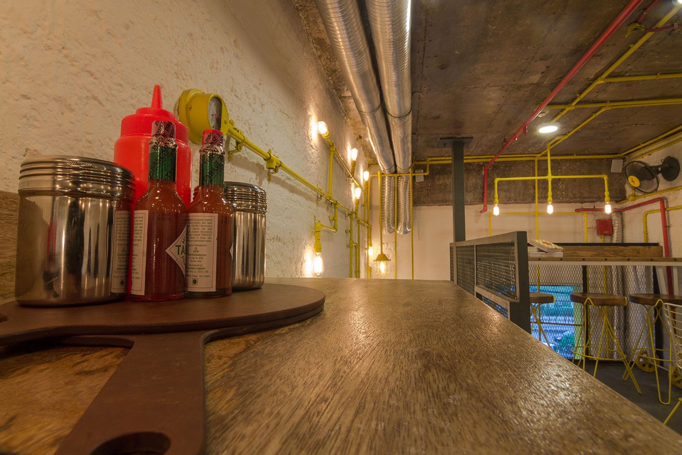


As for the space constraints, the studio decided to use all the height of the volume and provide a mezzanine floor, hence dividing the outlet into two horizontal parts — a kitchen entrance on the lower level, and the seating and eating area on the second floor. The use of perforated industrial steel railing was used in certain areas to allow natural and artificial light to flow throughout the space, as well as giving a sensation of an area that expands.
The outdoor ambiance was taken care of with the help of glass decals which were designed according to brand strategy and its aim is to attract the youth audience. The glass decals(stickers) gives an interesting impression about the inside space and gives a very welcoming look to the outlet. The idea was not only to provide the customers with great pizza but also to give them a youthful space for them to interact with. Hence finding that right blend of architecture and gastronomy for the user’s delight.
If you’ve missed participating in this award, don’t worry. RTF’s next series of Awards for Excellence in Architecture & Design – is open for Registration.
Click Here


