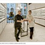
Our eyes are our best facial features yet are often taken for granted. To have the beauty of our eyes emphasized and appreciated, we need to adapt to new fashion styles through the help of eyewear. Mutually, the space design for eye care should be planned to cohesively merge eye care treatment with new fashion trends into an organic whole.
Global Design & Architecture Design Awards 2022
Third Award | Interiors – Retail (Built)
Project Name: ………..Eyes on Park
Project Category: ……Interior Retail (Built)
Studio Name: ………….Autograph Architecture, P.C.
Design Team: ………… Julia Rata, Samuel Derenboim
Area: ……………………….914 square feet
Year: ……………………….2022
Location: …………………287 Park Avenue South, New York, NY 10010
Consultants: …………..N/A
Photography Credits: Autograph Architecture, P.C.
Text Credits: …………….Autograph Architecture, P.C.
Other Credits: …………..N/A
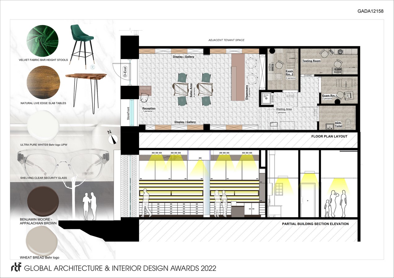
Project Title: Eyes On Park. A play on words because the store fronts Park Avenue. While the patrons of the store view the street, the inherent question becomes – how can pedestrians take notice of the store itself?
Project Justification: The project commenced as part of the client’s optical office/shop series named according to the streets they are facing. The high-end design boutique was to house luxury products in conformity with the area’s customer base and was an opportunity to establish itself as the client’s flagship location.
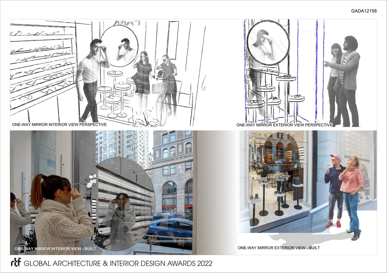
Objectives: The objective behind the project was to portray the idea that eyewear is a threshold through which we see others and how others see us through the method of design – the patrons being the focal point themselves in addition to merchandise when viewed by pedestrians outside. On the inside, the attention then is directed toward the merchandise for the patrons, and comfortable working offices for medical professionals.
Phases of Work:
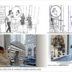
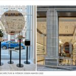
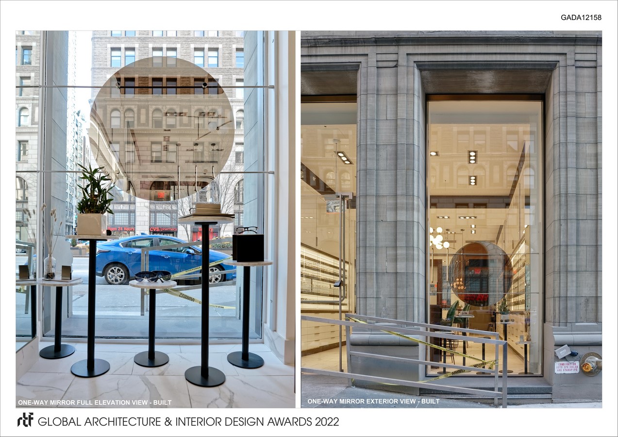
- To address the question of how pedestrians can take notice of the store, we first take advantage of the floor-to-ceiling window. In front of it is installed a one-way mirror shaped like a monocle, which becomes a practical gesture of allowing the outside public to see how the store patrons look at themselves and their reflections. Furthermore, it sets off an inadvertent interaction between the public and the patron by means of display and observation, which also serves as personalized advertisement of the merchandise.
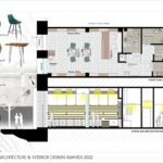
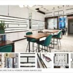
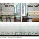
- The use of underlighting in the shelving enables a focus on the products rather than the store
- Mid-level shelving design and placement is at eye level to focus customer attention to specific merchandise first
- Use of light-colored finishes creates a breezy and airy atmosphere, allowing ambient light to better showcase the eyewear during the day
- Isolation of the exam rooms from the entry’s line of site allows patrons to focus first on the eyewear
- “Floating” midspace tables allow for flexible planning where customer service could be maximized and adapted as needed
Metrics for Evaluating and Monitoring: At substantial completion, this store’s appointment schedules have been fully booked, indicating the desire of customers to use this location as their primary source for eye care treatment and purchasing eyewear.
Timeline of the project from conception, through city approvals of construction and millwork drawings, to full build-out from the “white box” initial condition, was extended from half a year to a year. This was due to some construction equipment delivery delay affected by the coronavirus pandemic.
Estimated Budget: Original estimate was considerably exceeded by factors involving construction change orders and decreasing overall construction timeline.

