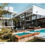
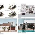
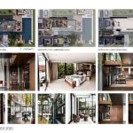
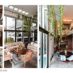
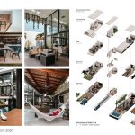
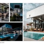
Casa Knize is a contemporary home with a modern feel. The influence of modernism is clearly perceived through the emphasis on clean simple lines, stark minimalism, and direct connections to the exterior. Design elements such as materiality, typology, and the implementation of natural lighting is what essentially defines the project’s program and façade geometries, emphasizing the notion of “form follows function.” The overall design of the residence follows the concept of being split in two, where one side of the house is half a level higher than the other. This provides fascinating interactive viewpoints between most areas of the house, although maintaining a certain amount of intimacy within each room. Having a different space every half a level offers a unique experience for guests to discover different zones throughout the house as they climb the stairs.
Architecture, Construction & Design Awards 2020
Second Award | Private Residence (Large)
Project Name: Casa Knize
Studio Name: Knize Architecture + Design
Design Team: Architects Stephany Knize, Patricia Simon, Jose Antonio Delgado, Guillermo Delgado
Area: 520m2 (total site), 490m2 (built-up)
Year: 2019
Location: Santa Cruz, Bolivia
Consultants: Daniel Morales
Photography Credits: Stephany Knize
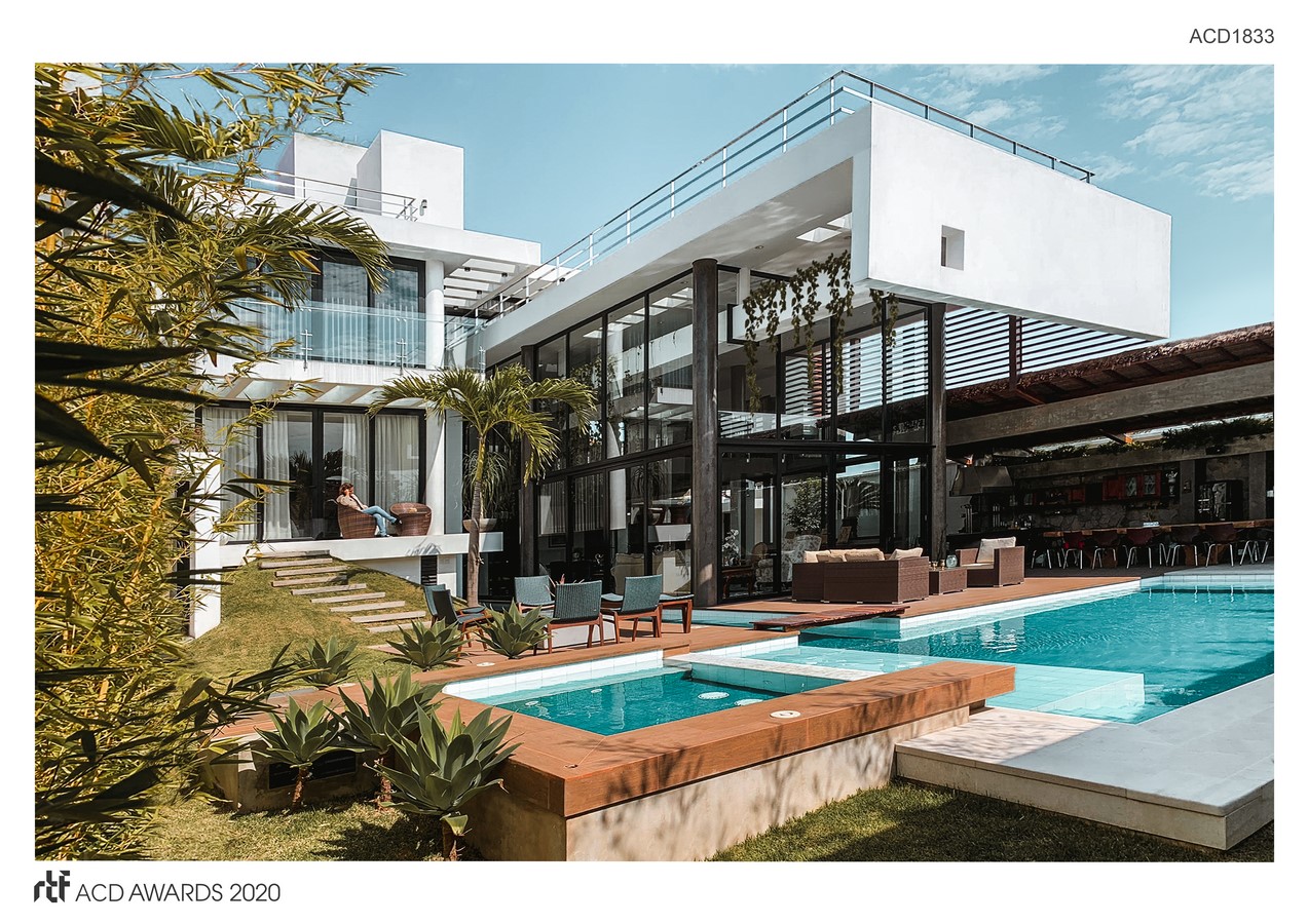
The floor plans consist of minimal doors and walls, focused entirely on flexible spaces and openness. In keeping with today’s lifestyles, the layout has been designed to adapt as the homeowners’ family evolves, with movable partitions, pocket doors, and non-load-bearing walls that can be easily relocated when desired. Such plans allow homeowners to carve out extra bedrooms for future uses, if needed. The largest open area of the house is a double height living space on ground level, which is perfect for large family gatherings. Additionally, the kitchen sliding pocket doors are designed to be able to reach absolute openness. Above this large open area is a massive cantilevered mezzanine space, which features a bold geometric shape that overhangs to the outside and creates an asymmetrical façade. This is probably one of the most impressive structural features of the house.
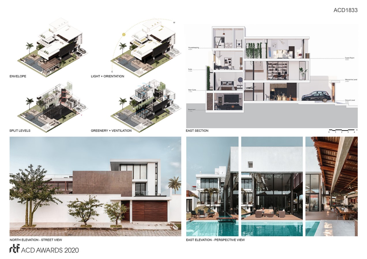
The transparency offered through large windows and varying levels provide visual connections between the interior spaces themselves and the outside living environment. This design implementation not only allows plenty of natural light to the interior but provides a healthy environment for users. In addition, multiple squared skylights were distributed to allow natural indirect light for all indoor planters. Greenery in the interior is not only an aesthetic solution but offers clean and fresh air, which helps reduce the need for heating and air conditioning year-round. Such design decision helps cut down lighting costs. Moreover, the smart orientation of the house allows for hot winters and cool summers. Since the project is in the southern hemisphere, north-facing windows let in plenty of solar thermal energy during winter. Therefore the house is east-west oriented, with maximum exposure on the north facade. Furthermore, large overhangs and cantilevered roofs, which were calculated within a specific angle and height, took part of the design to block direct solar gain on the hottest days of the year during summer.
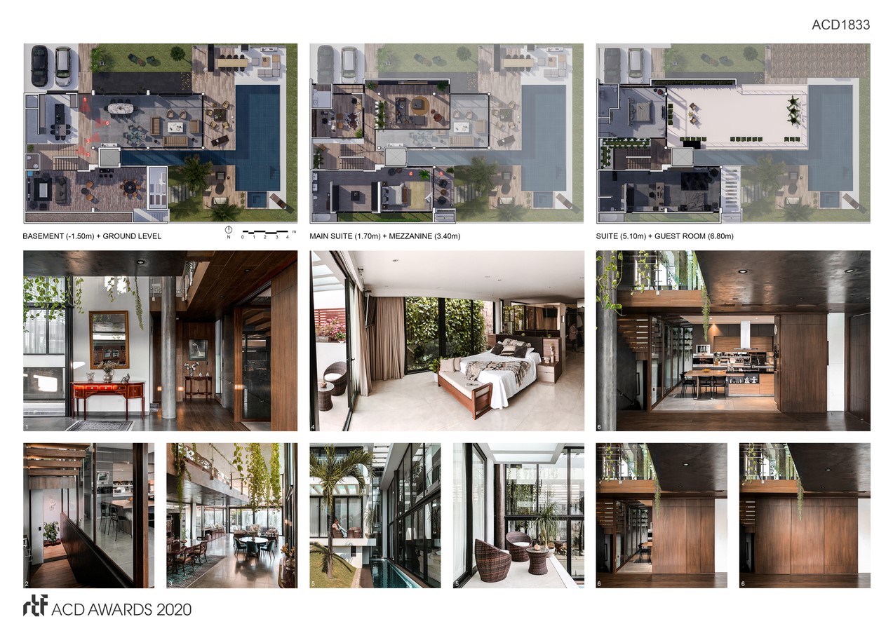
Finally, there is a huge emphasis on the use of natural and sustainable materials, such as wood, concrete, and natural granite on countertops. Concrete is left exposed in most areas of the house, yet some volumes of the façade and columns are coated with microcement. There is no use of drywall nor stucco.

