Casa di Marco & Roberta By Maurizio Giovannoni Architetto
Architects: Maurizio Giovannoni Architetto
Photographer: Stefano Corso
With the interior relooking we can give a new and fresh identity to space, without any structural intervention. We can “relook” an old home, already full of its history or a new building, where to begin a new story in an improved and comfortable stage, imagined for the residents.
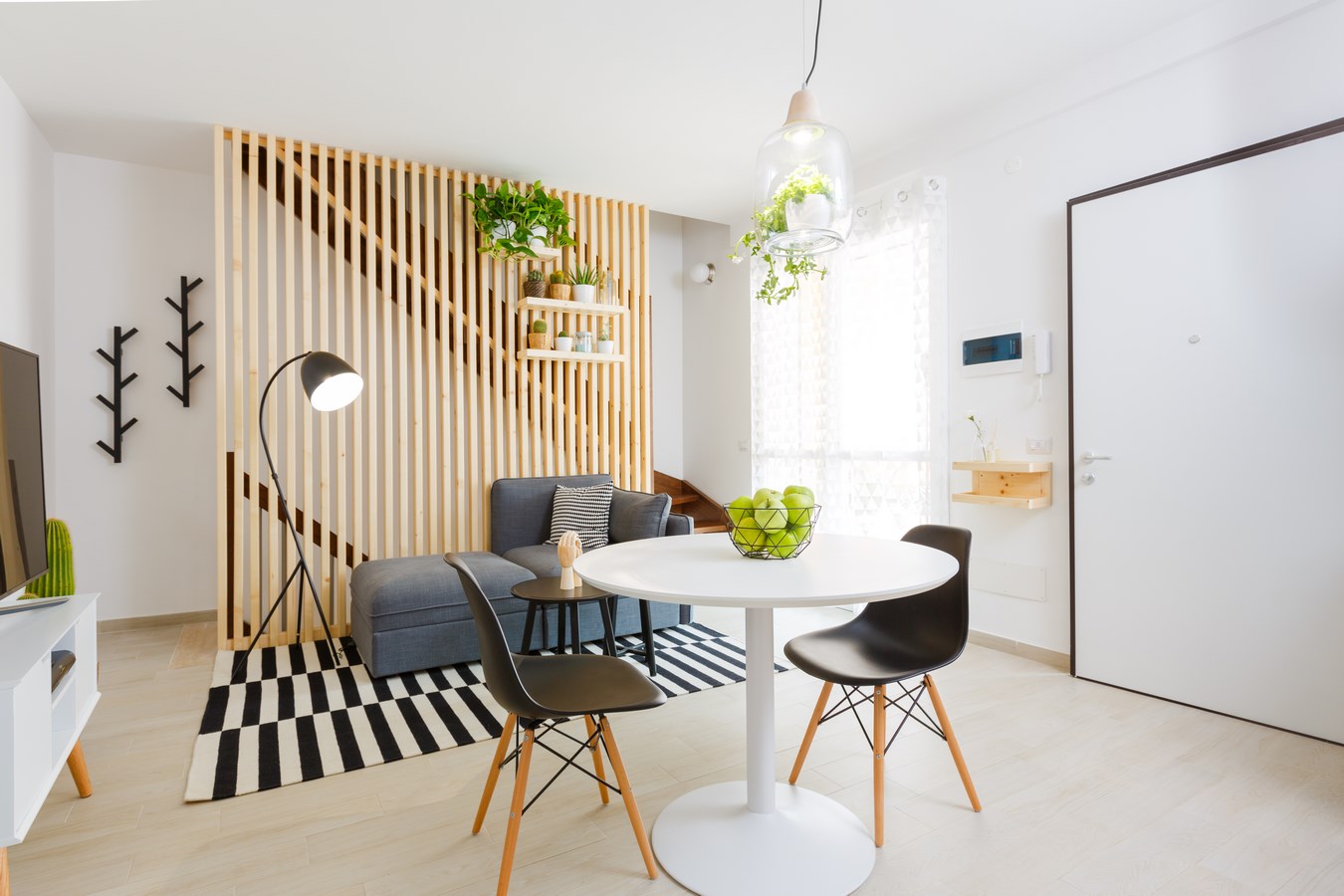
Marco&Roberta’s home is part of this category; it was a white sheet of paper where to create a project, paying attention to the important structural restrictions like the position of kitchen, radiators, lights and accessories. I choose to focus on the bigger intervention in the ground floor, a more or less 20 square meters room, where to create a kitchen and a living area.
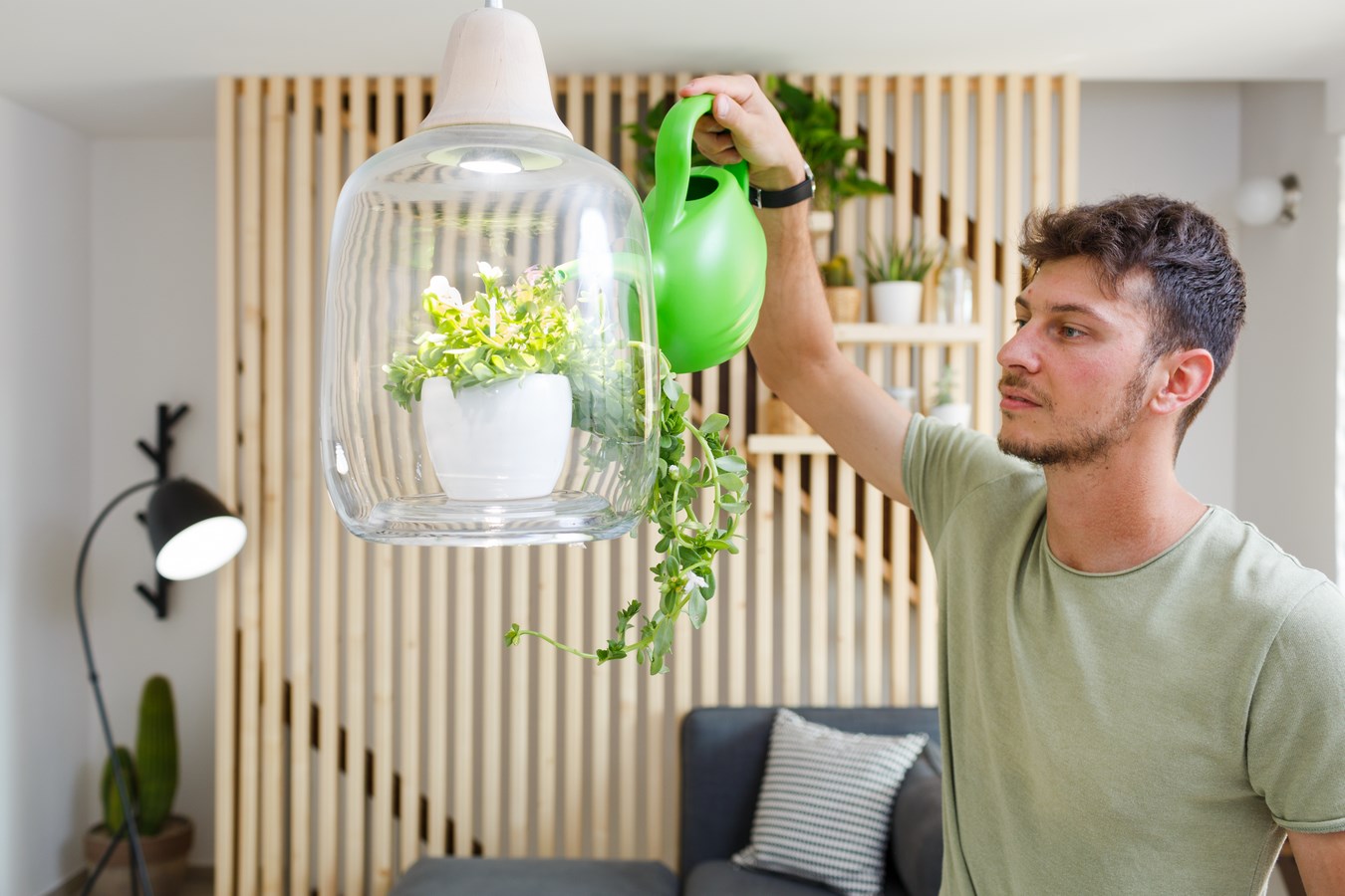
The windows fixtures, originally in dark wood, have been painted in white and the staircase balustrade has been replaced by a wood customized backtrop, following a Scandinavian inspiration. In this way, I’ve created a perfect scenery fiat for the sofa and the relaxing area. On this backtrop we can find three shelves where to put some Succulent plants in colorful and different vases. Instead, above the table, we can find the Milo Baby pendant lamp by Lightovo Studio, a characteristic lamp that can houses some type of plants thanks to the hole in the lampshade. A closer approach to nature.
For the little terrace outside, thanks to the inspiration of home telling, Marco and Roberta have furnished independently their sunny corner; in the composition sticks out the Copacabana Chair by Maison du Monde and some other plants, for greenery inspiration.
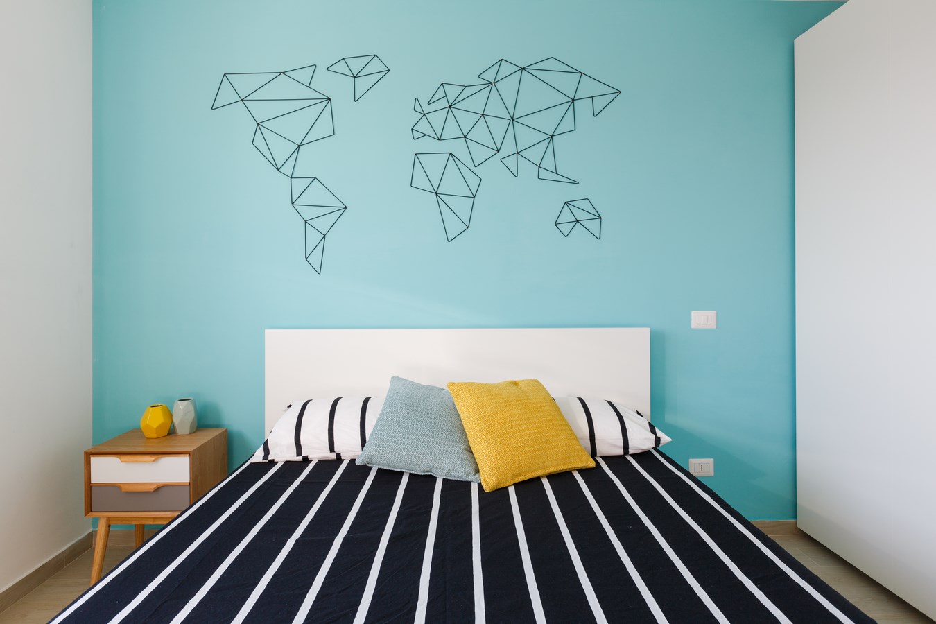
In the upper floor, precisely in the bedroom, sticks out a light blue wall where is attached the black iron world map by Ale Druciak, where the two guys can add pictures of their travels and their new life together.
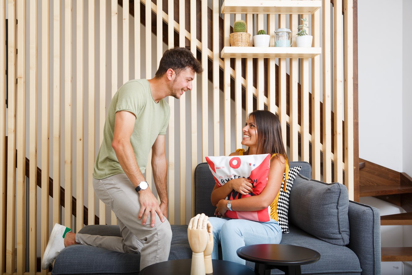
In this project we can find less colour and more warmth; the same one that we find even during the photo shooting in which the two guys have become actors of the photo story of their life when the design is just a frame.
