What project are you currently working on with Hollybrook Homes?
I have just completed designing a luxury apartment Showhome for Robswall by Hollybrook in Malahide by the Award-winning developers Hollybrook Homes. The selling agents for these new homes are the leading agents Knight Frank Ireland.
Global Design & Architecture Design Awards 2019
Third Award | Category: Interior – Commercial (Built)
Studio: The Interiors NRD
Architect: Rocca Natasha
Country: Ireland
 Is this the second showhome or is this a new phase of Robswall?
This is my third time working for Hollybrook Homes and my second showhome design I have completed for Hollybrook. So, it is a pleasure to be working with them on different stages of their development and on various and diverse projects. These particular apartments are final stages of the Robswall by Hollybrook development. It is an exciting time for the Hollybrook team who on completion of this are preparing to move onto their next Dublin development next year. Therefore, I am delighted to be a part of this final chapter of Robswall. It has been a rewarding experience to have been part of such a talented team of developers, builders and agents.
 What is the interior theme running through?
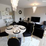
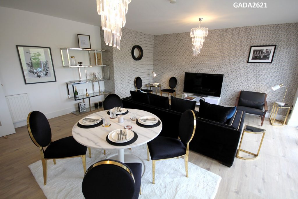
Art Deco | Gatsby was the main design theme while, accessorised with a Hollywood Movie Star glamour is what I chose for this showhome apartment. I opted to blend the romance of these iconic historic styles, with more contemporary finishes; drawing on that feeling of Hollybrook luxury and bringing it forwards into the modern era.
As a ‘Staging to Sell’ specialist, stemmed from my work in Los Angeles, I always choose a minimum 3-5 potential buyers with diverse backgrounds and ensure each of the clients would appreciate elements of the design for aesthetics and functionality alike. Once I can justify this then I go ahead into the creative and practical stages of a project. If not, I address and adjust the theme as in the end it is a showhome to sell.
 What inspired your interior choices?
It is my job to create emotion in a space. So, I always survey the site I then allow my intuition to guide me towards a theme which leads to the colours, styles and looks that I see throughout. If I can’t feel it the chances are no one else will either. I saw the apartment as a place to live in but also a place to entertain. I wanted there to be a feeling of stepping back to a that vibrant era of The Great Gatsby, Hollywood movie star while at the same time allowing for contemporary living.
After spending time surveying the space that needed to be furnished, I grounded the theme of The Great Gatsby | Art Deco with movie-star styles threaded throughout. On a personal level, I have always adored the romance of classic and iconic literature, movies, architecture and design. With our lives centred around technology I feel there is advancements yet, an innate lack of tradition and connection. I wish to evoke feelings and emotions in each of my projects.
 “I love her and that is the beginning of everything”
With F. Scott Fitzgerald’s quote(s) and iconic influence in mind, I designed this apartment as a place of romance, sensuality and glamour, embracing the romance of old movies, literature and lifestyles, particularly Gatsby style.
Furthermore, while I lived in Los Angeles working as a real estate agent and designer I was invited to stay in iconic hotels like The Culver Hotel owned by Charlie Chaplin and attended various events in hotels like The Roosevelt where the movie star like Marilyn Monroe lived and the first Oscars were held. Along with ‘The Beverly Hills Hotel’ where Elizabeth Taylor, Frank Sinatra and Dean Martin resided and The Sunset Tower Hotel famous for its Art Deco style, to name a few.
Combined with my Italian heritage and time spent designing and living in Milan, I have a natural connection to Italian, design particularly it’s glamour and style. Hollybrook renowned for their luxury homes and international buyers, have a development sense of style steeped in diversity and culture, of which ties to the overall theme.
My aim here was to design and style an art deco glamorous themed-home. That vibe one gets when they walk into an art deco and historic hotel but adapted to suit their own home. I wanted the new owners to get an immediate feeling of luxury and cool salubrious of that era.
Where have you found the furniture and decor to put in?
As I run a staging and design studio, I am constantly sourcing furniture from various eras and I then tailor each project. For this project, I sourced various items of furniture, lighting and accessories from all around the world. The goal was to retain a luxury art deco theme throughout with a universal twist.
After my studies of Interior Design in ‘KLC School of Design’, Chelsea Design Harbour London, I had the opportunity to work on projects for the renowned wallpaper company Cole & Son. I adore their patterns, textures and diversity of materials. Their wallpaper adorns the walls of Kensington Palace and multiple 5-Start Hotels around the world. I decided to use various Art Deco style Cole wallpapers as a feature this is apartment home. I opted for Art Deco | Movie star styles to ensure this theme was paramount.
While I was in London and Los Angeles and San Francisco in recent months I sourced some accessories. Plus, I imported some of the furniture from Italy and London. In Ireland, I sourced items from both local high-street and luxury brands to ensure a sense of luxury yet, diversity throughout this space.
Have you chosen the paint and lighting fixtures too?
Yes – I chose the paint, lighting, along with the furniture, art and all accessories.
I chose very Art Deco | Movie Star style lighting, all of which I felt is appropriate not only for a showhome apartment but for any of the apartments purchased. Lighting can transform a space and enhance any atmosphere. The correct positioning and style of lighting; pedants, accent or garden lighting can have such a profound effect within a space our garden area.
For further details;
Paints –
For we opted for Dulux, luxury brand. Mirrored against Cole & Son wallpapers, sourced by Furnishing Distributors who supply Cole & Son in Ireland. I have focused primarily on colours that compliment Cole & Son Wallpapers. Often designers choose a colour to contrast with darker or printed wallpaper yet, I embodied dark colours to allow for sultry finish and a movie-star feeling.
Lighting –
As I specialize in lighting, I have mixed modern, luxury vintage and my own collection to ensure luxury throughout. Each space in has lighting reflective of that particular room and space yet, all very Art Deco | Movie star like.
Blinds & Voile –
For the blinds, I worked with Hollybrook’s supplier, opting for stylish Voile & Blinds to compliment the wallpaper and paint choices, along with the 0verall style.
Art and Accessories –
I sourced photography via London stores, online and in a number of design stores in Los Angeles, Dublin and London from my collection. For the black and white prints, I chose Getty archived black and white images including an iconic photo of Steve McQueen and a glamorous beach image from the 1960’s. I chose ROADS collection of books ‘Hotels of The Stars’ and ‘Paparazzo’, along with curated Champagne and Brooke & Shoals scents.
Flooring and Carpets –
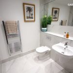
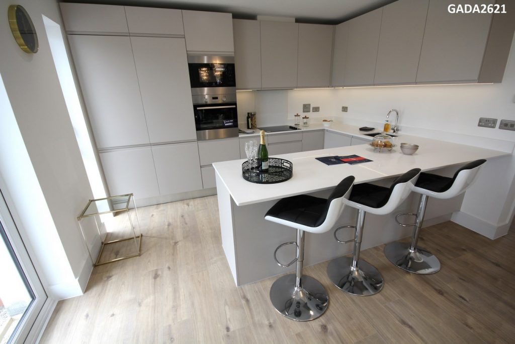
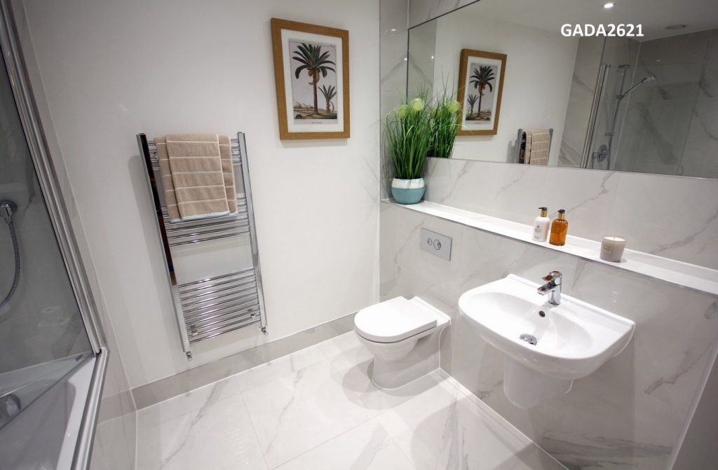
The flooring, carpets, kitchen units and bathrooms are of the high-luxury standard known to Hollybrook Homes brand.
How long does an interior design showhome generally take?
Each project is different so timing can vary. It does depend if I am involved in the fit out, design and styling or the interior design and styling. As I am constantly sourcing to avoid delays in deliveries (can be up to three months) I had sourced some of the pieces prior to beginning the project and planned diligently to have new pieces delivered on time.
On site, working closely with Hollybrook developers ensured a structured scheduled. So, we completed the project within two weeks. This included the wallpaper, lighting and complete led all photography and video shoots.
What you found the most challenging?
As I worked with Hollybrook developer’s builders directly it was very efficient as the site is extremely organized.
So, the challenges were minor and design related. For instance;
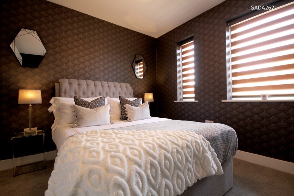
- View Obstruction – There was a water tank, which is legally required for the site, obstructing the view in the second bedroom. I embraced this design challenge with my wallpaper and paint choices. Now they all complement one another and the focus is on the wallpaper and the interiors. Often in design there are views or other obstructions and working with them is the best choice rather than trying to avoid the reality of the space.
2. Design Details – As the theme was very strong to take on for a showhome, I found it challenging to decide what to keep and what to leave in terms of final accessorize, art and styling to ensure it was showhome appropriate and not just aesthetic.
I always prepare a design and stock schedule yet, have various options for rugs, accessories and so forth and sometimes things do not work side by side, factoring in lighting and additional features not expected.
So, retaining a subtle glamour which was not too overbearing was key here. Along with ensuring the ergonomics in the space are not limited by the placement of furniture in areas clients will wish to walk around.
 Ultimately, it is a showhome, which must be appealing to various nationalities, ages and demographics and I need to ensure this is achieved without having to compromise my vision.
How you utilised the space/light in the showhome
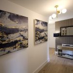
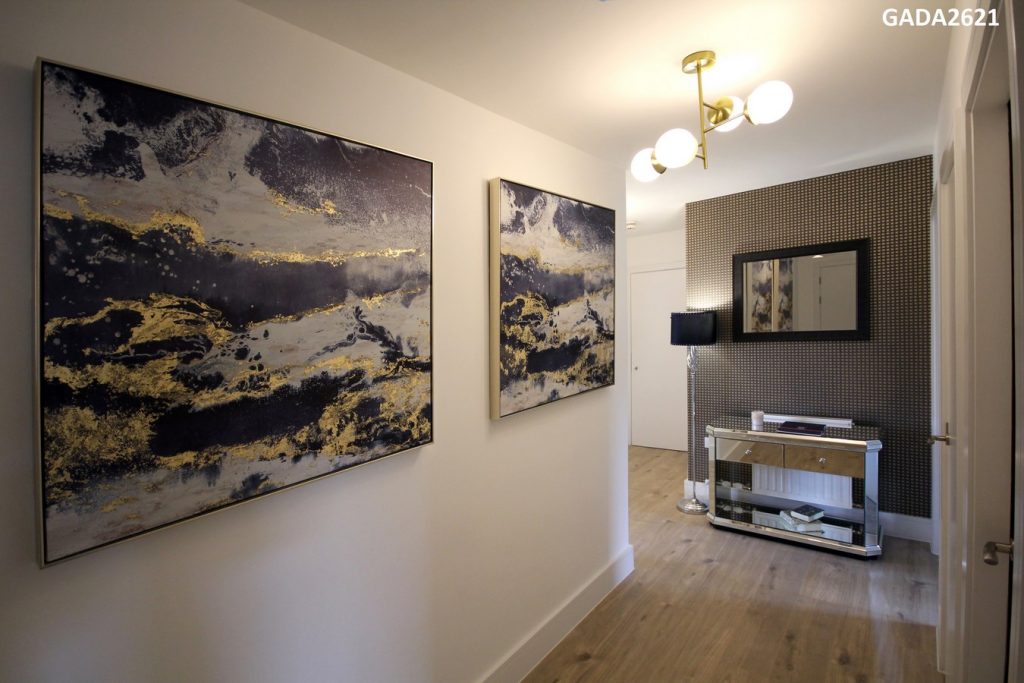
As the hallway was quite dark I focused on decorative lighting, and large sized prints, along with mirrors to reflect the light around. Also, the use of Cole & Son mosaic wallpaper helped to bounce the light back.
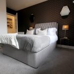
For the bedrooms, I wanted to utilise these spaces so I chose strong prints of wallpapers and paint, inspired by Scott Fitzgerald and movie star eras. Lighting, the placement of mirrors and mirrored furniture, bouncing light, the use of fabrics and rugs all added to the theme I wanted to develop.
For the living | dining | kitchen and the outdoor space the light was strong. I therefore added in detailed accent and featured lighting. The goal was to add layers of light to avoid the are being too bright. The use of lighting combined with the voile (instead of curtains) and blinds produced a darker yet more subtly relaxed atmosphere in this area.

