Honorable Mention | Commercial Built
[tabs type=”horizontal”]
[tabs_head]
[tab_title]Project Info[/tab_title]
[tab_title]Details[/tab_title]
[/tabs_head]
[tab]Firm Name: Five AM
Participant Name: Olivier Caluwier
Country : Belgium[/tab]
[tab]Container Offices
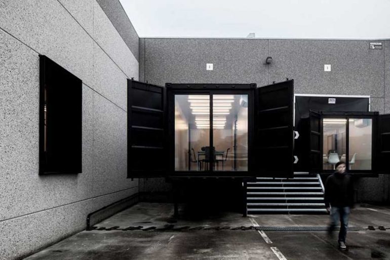
One of the 2 companies aimed to step away from the classic image of a printing office, where there is hardly any room for image building. Both owners wanted a concept pivoting around ‘experiences’, so that clients leave with a lasting memory after their visit. Silo mentality had to make way for optimal transparency of all of the company’s activities. During their quest for a partner for this project, our concept for the Liebaert Projects art centre, immediately caught their attention. More precisely the shipping containers which were assembled track-wise in the large space. This idea of integrating the office space in shipping containers or some other kind of units, seemed the perfect solution for the 4000 sqm warehouse. Also from a sustainability point of view, both partners subscribed to the philosophy of recycling and re-using second hand containers.
Assembling shipping containers into larger constructions and fitting these into existing buildings, is not a new idea for fast and durable building concepts. However, we delivered added originality, which is of course applicable to other companies.
The choice for upcycling was an easy one. Rather than building a brand new construction in the warehouse, upcycling allowed for existing materials to be applied in a sustainable way. Moreover, the flexible and modular character of the containers opened a wealth of options – so deciding on the basic material was not hard. From then on, We could start on designing the actual set-up, the interior design, the finishing and…choosing what kind of containers they would use. The containers were chosen by hand and in person in the port, before being put together in a test assembly. This way, we could experience what kind of set-up would support the best the relation with the existing building and the atelier. The clients were really looking for more than just a creative, original and appealing design. Just as important was the link with the total concept. This unusual take on office space design had to be translated towards both companies’ activities.
For the finishing of the containers, we opted for a sober but attractive style, to go with the preferences of both building partners. For the cladding for instance, building materials were used. For the interior walls in one office, the use of multiplex created a warm and cosy feel, further enhanced by the carpet on the floor. The other one, we went for a bit more minimalistic style, with MDF panels painted white. Also functionality
was important, since the containers were partly outside and had to be insulated. We kept the lighting sober: rhythmically placed TL lights in the offices and indirect lighting in the toilets. Apart from artificial lights, in the yellow offices especially a lot of thought went into having as much natural light flowing in as possible, with big windows in the containers and in the façade, but also by placing a long skylight in the area for manual handling.
[/tab]
[/tabs]
If you’ve missed participating in this award, don’t worry. RTF’s next series of Awards for Excellence in Architecture & Design – is open for Registration.
[button color=”black” size=”medium” link=”httpss://www.re-thinkingthefuture.com/awards/” icon=”” target=”false”]Participate Now[/button]
[g-gallery gid=”2924″]

