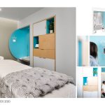
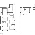
The project consisted of the development of a new concept prototype and first flagship location for Squeeze – a new massage concept from the founders of drybar. As with drybar, the design goals were to create a paradigm shifting new space that would help fill a hole in the market between the limitations of the discount and very high-end existing options. The 4,000 sf project included reception, relaxation lounge, private treatment suites, shared open treatment areas and back of house support spaces.
Architecture, Construction & Design Awards 2020
Third Award | Interiors Healthcare / Wellness (Built)
Project Name: Squeeze
Studio Name: HEITLER HOUSTOUN ARCHITECTS
Design Team: Josh Heitler, Jesus Malagon, Elena English, Edgardo Cadiz, Carol Zhang
Area: 4,000 SF
Year: 2019
Location: Studio City, CA
Consultants: CWA(Branding), PLUMP ENGINEERING, INC. (MEP), Atkinson Building (GC), JACOBSCHANG ARCHITECTURE(AOR)
Photography Credits: Clark Dugger Photography
Other Credits: N/A
Experience.
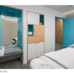
The experiential journey of Squeeze is imagined as a gradual transition from the hustle and bustle of the outside world to the privacy and serenity of the individualized treatment rooms. After being greeted at reception, customers move to a protected, interior relaxation lounge where they can enjoy tea or water and sample aromatherapy options. Once inside the treatment room, guests will find their own dedicated space to comfortably change, conveniently store their belongings, and easily customize their environment with touch screen control of light, temperature and music. The guest station is stocked with everything needed to help support the experience within easy reach – including mints, cough drops, hair ties and phone charging – as well as a large personal mirror for checking in before emerging back into outside world.
Design.
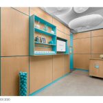
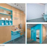
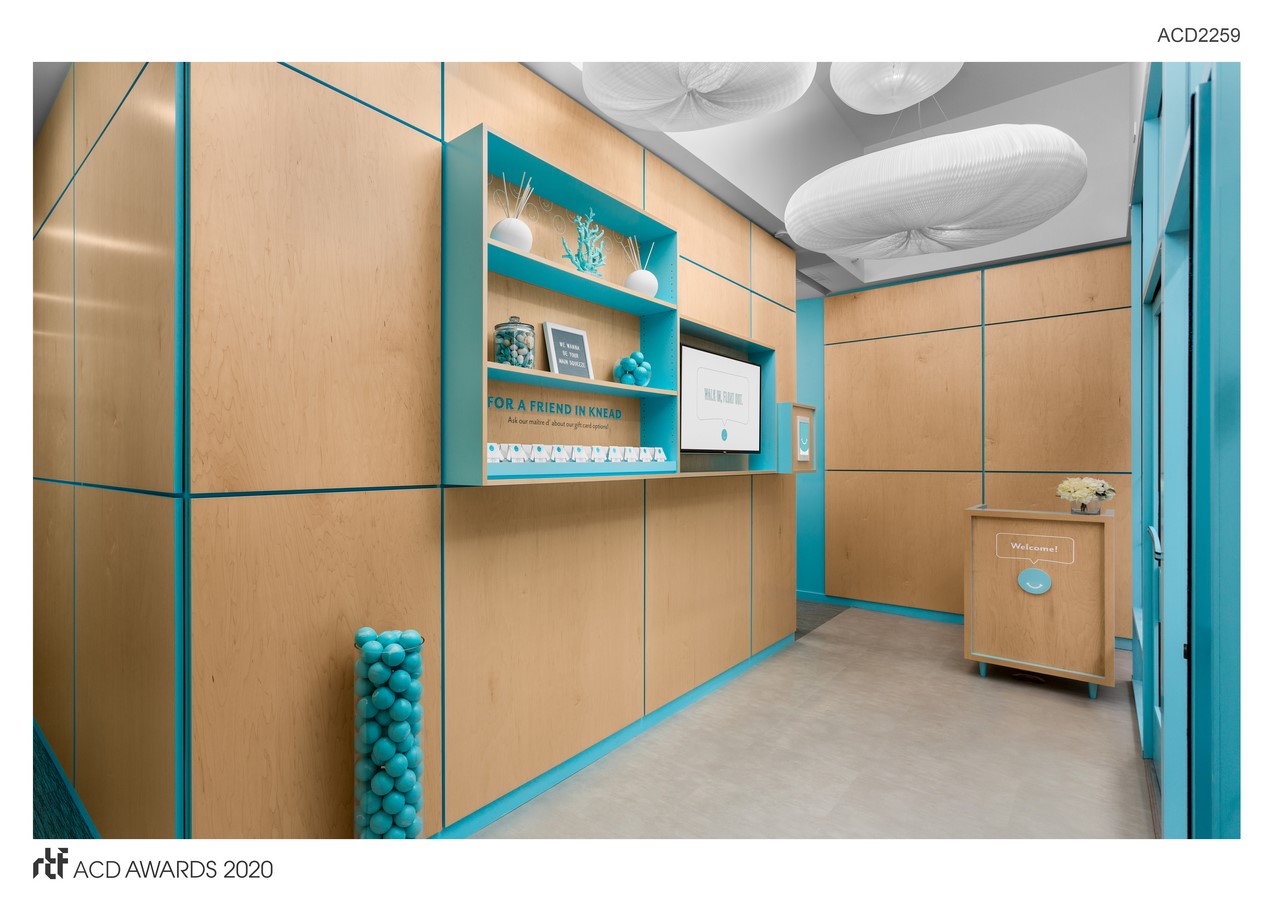
Squeeze is exactly the kind of project we love – partnering with a client who is intentionally trying to disrupt an industry and create something entirely new and ownable. Like drybar, which sought to break the ubiquitous hair salon mold of a long line of chairs facing mirrors, the design of Squeeze has moved away from the impersonal collection of endless doors and hallways to a series of individualized treatment cubes. Like jewelry boxes, the treatments suites have protective wood paneled rectilinear exterior walls that help insulate the softer and quieter finishes of the rounded interior spaces. In the relaxation lounge, common rubber stress balls have been used to create a signature feature wall that resembles and winks at the iconic tufted fabric walls of drybar.
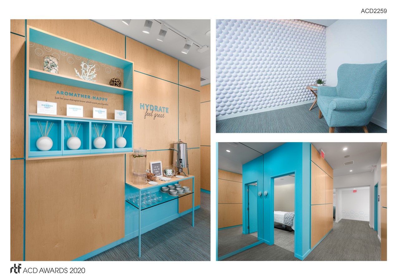
Brand.
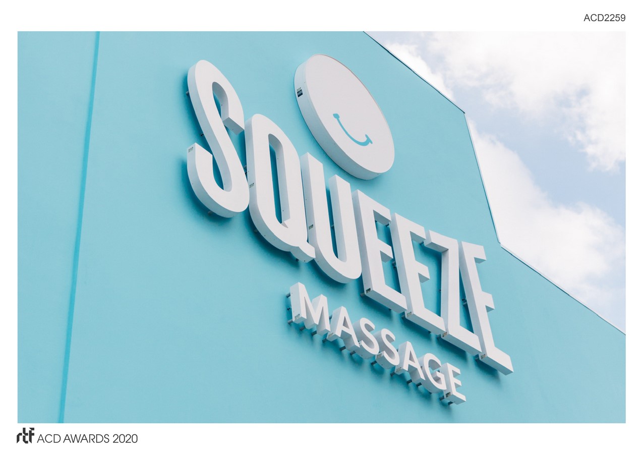
Reuniting the teams behind drybar, Squeeze presented a great opportunity to again develop a physical design concept in parallel with the evolution of the overall brand and graphic identities. Through close collaboration, core elements of the identity which are featured in their print, web, and collateral materials were seamlessly integrated into the interior design in colors, materials, graphic patterns and signage. One of the overall goals of the branding is to bring a playful and whimsical voice to the brand through the personification of the logo – a smiling squeeze ball named Pat. Pat, as well as more abstracted spheres and curves, are strategically featured in 3-demensional and graphics moments throughout the space.

