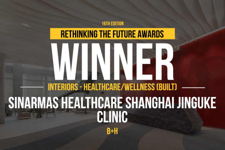
This project in Shanghai, jointly invested in and established by Sinar Mas Group and PreferUS Healthcare, is the first overseas branch of Kerlan Jobe Surgery Center. The functions include sports medicine-related outpatient, imaging (MRI, X-ray, etc.), surgery, rehabilitation, etc. The project targets to build a world-class one-stop sports medicine center for sports support, injury treatment, and postoperative rehabilitation.
Rethinking The Future Awards 2024
First Award | Interiors – Healthcare/Wellness (Built)
Project Name: Sinarmas Healthcare Shanghai Jinguke Clinic
Category: Interiors – Healthcare/Wellness (Built)
Studio Name: B+H
Design Team: Coco Lin, Rose Sun, Weili Chen, Jason Tang, Tonic Zhu, Thomas Rogel
Area: 2,800 square meters
Year: 2023
Location: Shanghai, China
Consultants: N/A
Photography Credits: Yijie Hu
Render Credits: N/A
Other Credits: N/A
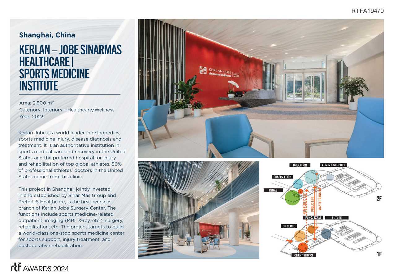
The design aims at showcasing the process of sports medicine rehabilitation through a customized design vocabulary. The dynamism in nature is everywhere: flapping birds, rippling ripples, and a gentle breeze brushing against the face. Inspired by these constant movements, the designers bring the elegance of nature into indoor spaces, creating a vibrant space through the combination and interweaving of horizontal and vertical lines to reflect the beauty of speed. The spatial design expresses dynamism everywhere, with a unified but varied design language that highly aligns with the unique characteristics of the sports medical center.
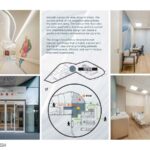
The functional layout is the core of interior design. The designers classified the functions based on the daily clinic operation. The first floor is equipped with the reception, outpatient department, and imaging department. The sports rehabilitation hall, surgery department, and administrative office are located on the second floor, effectively distinguishing the front and back areas of the clinic and achieving a balance of movement and stillness.
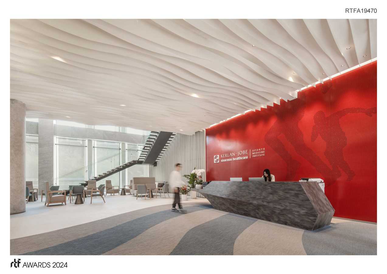
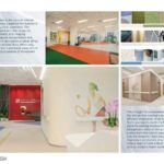
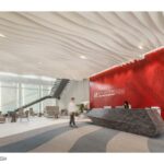
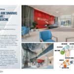
The thoughtful consideration of color in the design has created a professional and efficient impression of an international first-class sports medicine brand for patients seeking medical treatment. The background color of the public space comes from the brand logo. The heavily colored reception area leaves a deep impression on visitors. A soothing color tone is used on one side of the entrance area to create a warm waiting space.
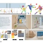
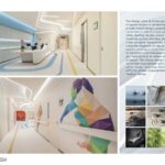
The use of patterns is particularly ingenious. Unlike the waiting and reception areas, the design incorporates lines on the floor as part of the wayfinding system, with different colors leading to corresponding departments, such as outpatient and rehabilitation, making it easier for patients to travel among departments. The dynamic and artistic patterns of athletes on the wall enhance brand perception and spatial experience and effectively stimulate patients’ rehabilitation autonomy.
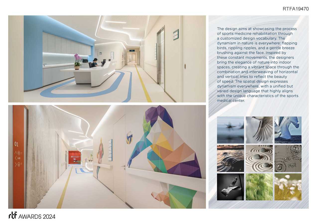
Smooth curves are ubiquitous in clinics. The curved ceiling of the reception area echoes the reserved lobby. The lines on the floor also consider wayfinding functions, and the curved and chamfered plane design can create a gentle and friendly environment for patients.
The design embodies a remarkable and appropriate image that is highly aligned with the Kerlan Jobe brand, providing patients with professional, efficient, and warm medical treatment experiences.

