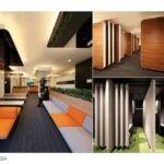
Orient Corporation is a leading credit company with over 11 million members. This project revitalizes a training center that, after 30 years, had shown signs of aging. In doing so, it sought to imbue the entire space with Orico’s identity, anchored by the black of the ‘pitch-black universe,’ representing the logo’s origin, and the energetic orange of the sun, guiding the visual identity (VI) development.
Rethinking The Future Awards 2024
First Award | Signages Design (Built)
Project Name: Orco Training Center
Category: Signages Design (Built)
Studio Name: Nobuaki Miyashita + MR STUDIO
Design Team: Nobuaki Miyashita + MR STUDIO
Area: 2,397.59 m²
Year:2020
Location:Tokyo,Japan
Consultants:N/A
Photography Credits: Nobuaki Miyashita
Render Credits: N/A
Other Credits: N/A
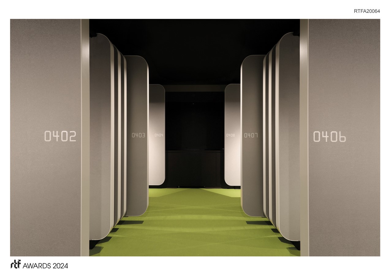
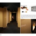
The design intricately incorporates the strictly defined shape of credit cards and their unique international standard font, creating a motif based on the various types of cards issued, applied across accommodation rooms and common areas.
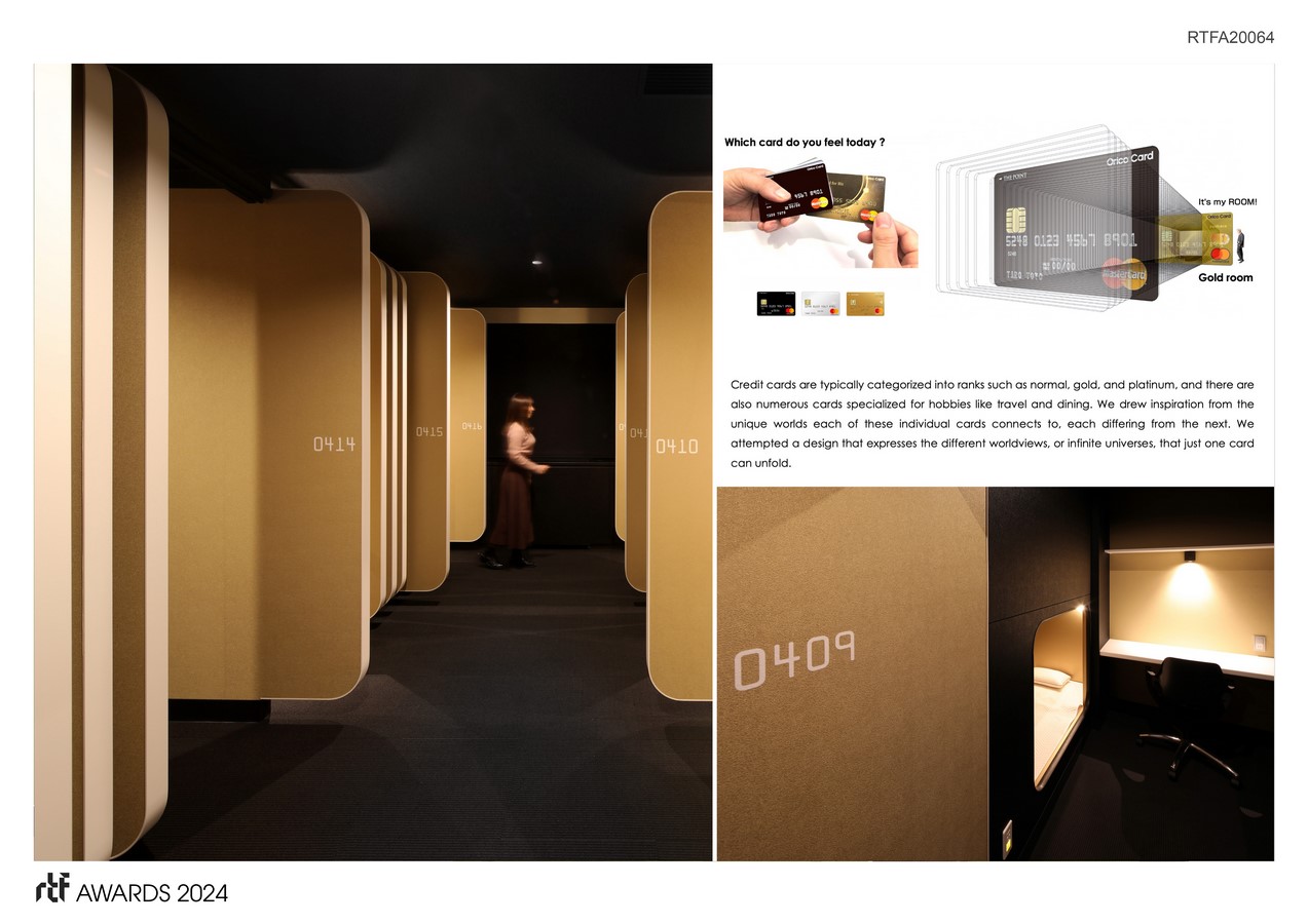
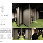
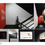
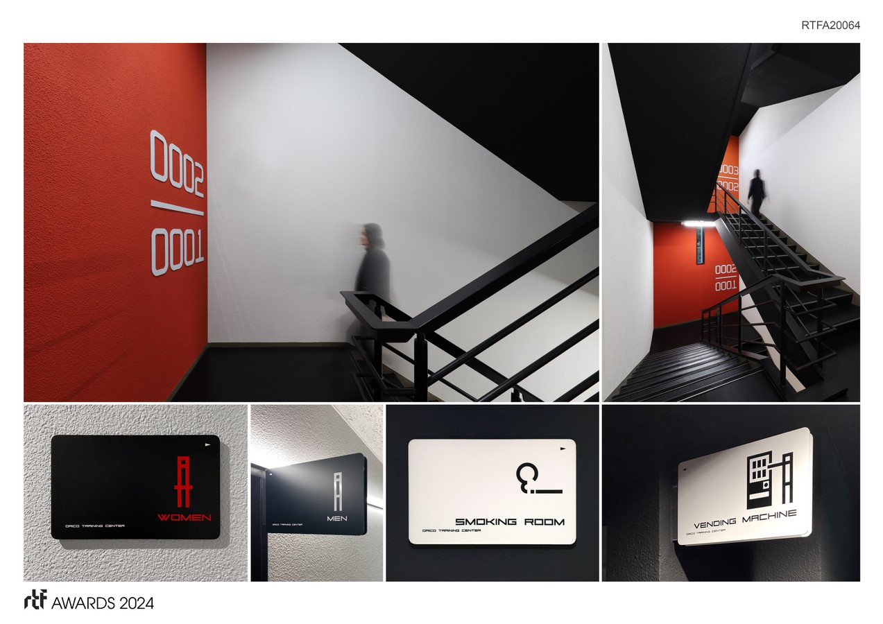
To ensure Orico’s identity permeates every aspect of the space, the design leverages ‘credit card’ motifs throughout the interior and signage elements. Specifically, the unique notation of credit card numbers, a 4-digit sequence repeated four times for a 16-character display, inspired the representation of floor and room numbers (e.g., the second floor is indicated as 0002). This design employs the “Farrington 7B” font, a credit card international standard recognized globally for its error-free readability.
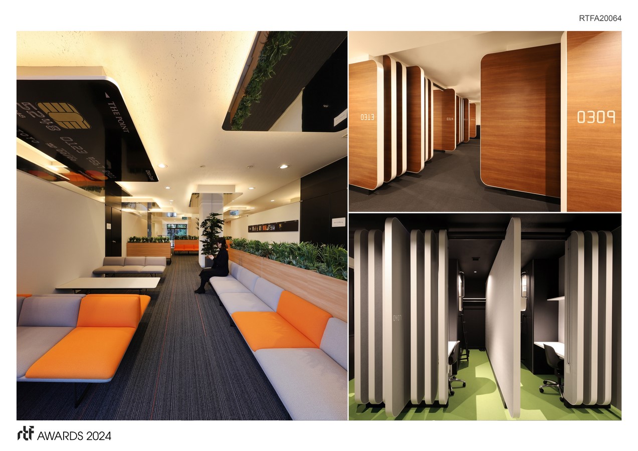
Each of the six accommodation rooms is themed after the variety of cards Orico’s issues, such as “Gold Card,” “Platinum Card,” and “Black Card,” to manifest the distinctive world each card represents. The partition shapes reference the precise shape of credit cards, including corner radius and thickness. Similarly, functional spaces like toilets and smoking rooms feature room signs designed after the credit card motif.
The design aims to alleviate the tension of stay-in training sessions, such as those for new employees, through the power of design. By sharing Orico’s world view (identity) among employees, the project hopes to foster a sense of belonging and contribute to employee satisfaction (ES).


