Infoglobo’s new headquarters was designed considering the newspaper’s dynamic structure and the company’s current image: that of being an interactive and integrated center – online, on time and full time. In that sense, the building’s greatest characteristic is the facade’s design. Similarly to the newspaper, that reaches the reader’s homes on a daily basis, the facade is composed by automatic sunshades that move according to the solar incidence. This way, the building’s envelope also varies on a daily basis. This system also serves as an energy efficiency measure since the optimization of sun rays incidence on the facade reduces the air-conditioning demand across the office spaces.
Honorable Mention | RTFA 2014 Awards
Category: Commercial Concept
Participant Name: Ruy Rezende
Country: Brazil

Infoglobo wanted the building to reflect the same rapid pace of the news, which is released by the minute. Due to this, facilitated communication and the rapid interaction between the news teams is a key element within the project. This interaction is further enhanced through the central atrium which integrates the different floors and office spaces between themselves.
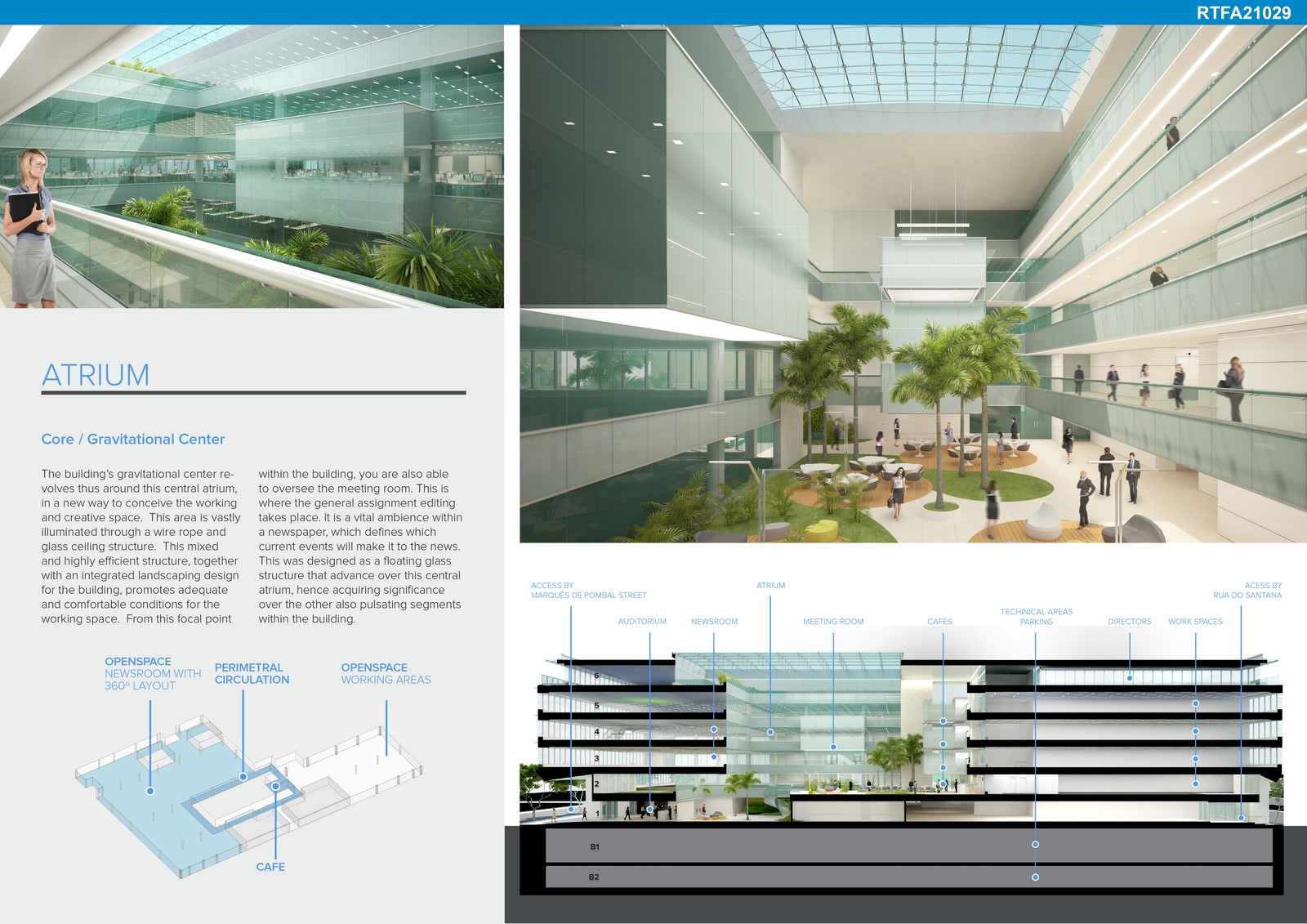
The building’s gravitational center revolves thus around this central atrium, in a new way to conceive the working and creative space. This area is vastly illuminated through a wire rope and glass ceiling structure. This mixed and highly efficient structure, together with an integrated landscaping design for the building, promotes adequate and comfortable conditions for the working space. From this focal point within the building, you are also able to oversee the meeting room. This is where the general assignment editing takes place. It is a vital ambience within a newspaper, which defines which current events will make it to the news. This was designed as a floating glass structure that advance over this central atrium, hence acquiring significance over the other also pulsating segments within the building.

By night, the object is transformed. An illumination from the inside the building highlights Rio de Janeiro’s silhouette on the facade, here represented by the outlines of the Pedra Branca and Tijuca ridges. These are made out through diverse texts on the ground floor level. This image portrays a symbolism of the city cut out by words.

The headquarters’ new address is next to the former one, in Rua Marques de Pombal. Being this a region with several building constraints, this area, composed by two plots, had spent years in an abandoned state, with an hangar serving as storage for old rotary presses. The new building will have 6 floors, 2 underground levels and a total of 27.300m², 5 times the original plot’s area.
Throughout the project’s development, another property was incorporated – Number 13, Rua Clementino Fraga. A historical mansion built in 1910, which used to be the ateliê of the painter Aurélio de Figueiredo. The mansion’s facade and form were renovated and it has been integrated into the design of the new building. This was another challenge we had to face and the privilege to solve within the process.
Prev Post
Vandecasteele | Ching-Yen Hsieh
1 Min Read
Next Post
Spaces Between Places | Federica Zatta
3 Mins Read

