Whole Axo Image: This axonometric shows the integration of new and old. We preserved elements such as bare concrete structural columns and the waffle slab above, while organizing the new partitions within.
- An important programmatic request was to have as much galley space as possible and allow for connection and collaboration between some key spaces.
- Highlighting spatial organization and task surface configuration
First Award | RTFA 2014 Awards
Category: Interior Corporate Concept
Participant Name: Tim Keepers
Country: United States

Axo Section Page: This section intersects three main spaces of the project. These spaces are connected to each other by the shared gallery/entry corridor space and by the kitchen/ catering prep area. The meeting room uses various methods of collaboration by integrating movable dry erase easels, a drop down projector and a blue back painted glass wall, which enables the use of dry erase markers, notes and images. The study space takes sunlight from the 14’ high existing glass windows in the office space and pulls it through special panels, which are equipped with a solar tube system that directs the light through a diffuser allowing for natural ambient light in each study room.

Second Page Final: The main office space houses various multi-function rooms in order to maximize the amount of different activities the client requested. Each of these areas is directly connected to both the exterior gallery space and the kitchen/catering space, allowing for quick access to the additional main rooms. Both active and passive systems of light and comfort are integrated. Some of the passive systems include Mecho shades on all windows, motion LED lights, recycled sound attenuation baffles, recycled cork flooring, and passive ambient light reflection panels in the blue wall for the study rooms.
Axo Back Final: The main work space, kitchen and storage areas, along with the converse portion of the office, are pulled apart to show organization and their relationship to one another.

Axo Front Final on A3: The front reclaimed wood and travertine walls, along with the obverse portion of the office, are pulled apart to show organization and their relationship to one another.
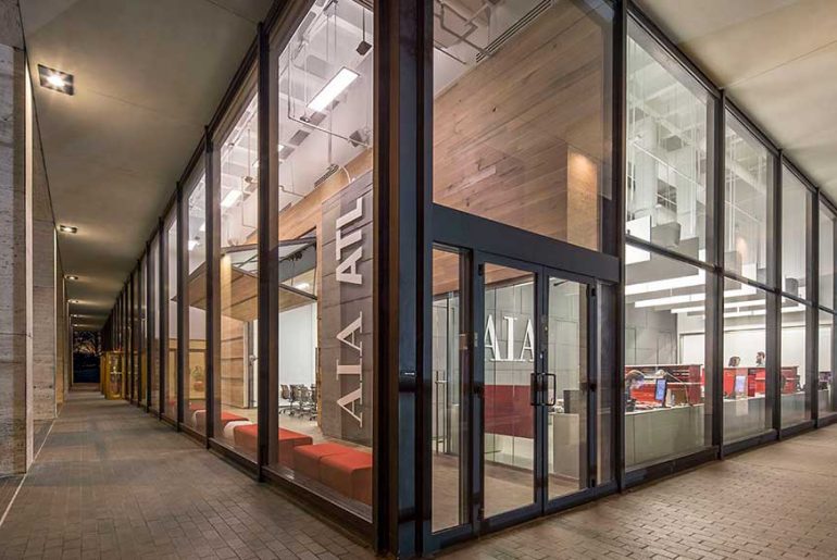
- Front page Main Image:
This office is transformable in both the aesthetics of space and program to enable a multiplicity of functions, events and creative endeavors within a small footprint. Additionally, the project provides a sustainable and organized work environment through material usage and passive lighting and cooling methods.

