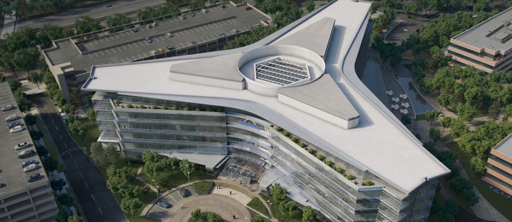
Bridging the gap between the neutrality of a core and shell structure and the exhilarating vitality of a business enterprise is a design challenge filled with universal and particular complexities. This could not be more true than in the case of the 60,000 sq. ft. tenant improvement project for Workday Inc.’s headquarters, a company on the rise committed to consolidating its solid footing in the marketplace of digital offerings. Its leadership saw a unique opportunity of making out of its own workplace a manifesto of the principles informing the software design of its products. It is the lively lexicon of the company’s culture that the ideas driving the big design moves took their concrete form: intuitive users experience, speedy collaborative work, usability, flexibility, integration, connectivity supplied the words for the design language of this uplifting enclosure.
Honorable Mention | RTFA 2014 Awards
Category: Interior Public Built
Participant Name: John Marx
Country: United States
To deinstitutionalize the traditionally rigid arrangements of office layouts is the hallmark of the digital age. True to the prevailing trends to boost a sense of community within the Silicon-Valley-type company, we picked the metaphor of the village to shape Workday Inc.’s bustling interior commons. Village is evocative of collectives, unstructured gathering, welcoming informality, and human scale.
In celebrating the scripted informality of the workflow, the staff can coalesce in discrete spaces, regroup in multiple areas, disperse in individual cells, all while maintaining the long view of the entire interior.
The sculptural interaction between existing and new geometry sets the stage for the expansion and contraction of the personnel within space. Against the predictable orthogonality of the structural grid and the building envelope inherited from the existing condition, the architects’ counterpoint is a constellation of floating objects filled with common areas animating the hard edges located in the center spine of the floor plate. Curvaceous shapes, angled rooms, rounded partitions, accent color in end walls (blue and orange are Workday Inc.’s brand colors), become the vanishing points of ever changing perspectives viewers experience walking the building’s interiors. In this Workday’s headquarters, a sense of play confers visual appeal, while retaining clear orientation in the mental maps of the occupants.
Deep sightlines, the great legacy of the open plan, help navigate the web of spatial events tailored to the company needs. The flooring patterns and the reflected ceiling plans make explicit possible paths of travel, making signage redundant. Although the departmental structure of the organization is legible in the architectural plan, the linkages between its distinct parts is as fluid as the volumes punctuating the various conference rooms and break areas. Within the given L-shaped footprint, what bisects the wings of equal length is a most sensuous trail. The reception and the main conference room signal the endpoints of these powerful lines. A business café, a game room, huddle rooms, kitchens, and seating areas distributed on two stories are the neighborhood amenities of a metaphorical village, where interaction and the magical chance encounter so dear to the mythology of digital culture can yield the dreamed next “big thing”.
Workday | Form4 Architecture
