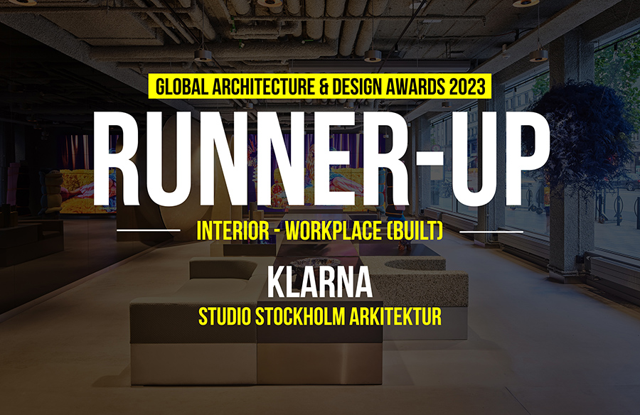
We’ve given Klarna the unexpected, the quirky, the wow-factor and the dynamic environment without sacrificing any functionality. An arena and place for exciting meetings, and interaction and an experience for all senses: a unique and brand-building physical environment as an eye candy, tactile materials that feel and creates the right sensation, your own Klarna scent that reinforces the overall impression, specially designed sound that builds the feeling on a deeper level and your own roasted Klarna coffee beans to offer that little extra.
Global Design & Architecture Design Awards 2023
Third Award | Interior (Workplace) (Built)
Project Name: Klarna
Category: Interiors-Workplace (Built)
Studio Name: Studio Stockholm Arkitektur
Design Team: Marco Checchi, Caroline Thuning, Elin Larsson, Jacob Granat
Area: 22.700 sqm
Year: 2022
Location: Stockholm, Sweden
Consultants: Node Ljusdesign, Thule Fastighetsutveckling
Photography Credits: Per Kristiansen
Other Credits: Tableau CPH, Hangmen, Bucktron Studio
Klarna´s new offices should always reflect Klarna’s bold personality and smooth shopping philosophy. Studio Stockholm is bringing Klarna’s seamless digital experience into the real world, making it feel like a living manifestation of the world of Klarna. Klarna´s six keywords have been important elements in the design: Optimistic, Quirky, Non-Judgemental, Unexpected, Considered and Emotive. Like peanut butter and jelly, sometimes odd combinations just work. In the design of Klarna’s physical spaces we always look for these unusual pairings and bold contrasts because they create intrigue and balance. And we love surprising people.
Klarna is a thoughtful, refined world in its look & feel, even in its simple or eclectic moments. We have a clear identity, even in the smallest details. This means not using too many elements in the same space. The design of the Klarna offices is done in a sustainable way. Make the architecture last and then add elements according to how often it´s supposed to change. The goal when choosing textures is to evoke the feeling of opposites attract. Pick textures that complement each other in unexpected ways. Pair hard and soft, or textural with smoooth.
Klarna’s offices are divided into two main parts, external and internal. Within the internal area there are three layers; The social layer is the ’heart’, here you socialize, you take breaks etc. Meet & Focus is where you go for short periods of time (meetings, phone calls, printers, wc etc). Work area has the most need of focus and daylight since this is where the employees spend most of their time. Within the whole office you find the wow-areas! The most emotional experience shall be found in the lobby, the wow-areas and the Klarna market while the team areas are an example of an area where the functionality is the highest priority and shall make the group join as a team. The lobby will be everything an average bank reception isn’t. You have stepped off the street into a parallel universe where you find a quirkiness and surprises around every corner. It is a welcoming space with an underlying trustworthiness, that is central in everything we do. You are intrigued by the design and want to discover more. The bubble is the gateway to the Klarna universe.
