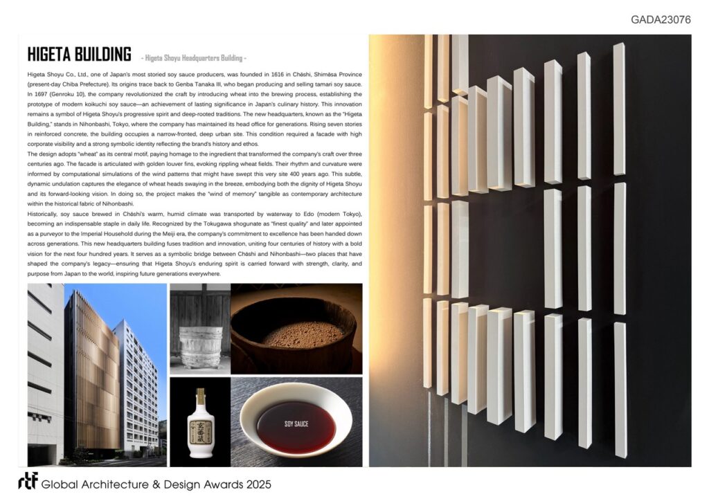
Higeta Shoyu Co., Ltd., founded in 1616 in Chōshi, Chiba Prefecture, is one of Japan’s most historic soy sauce producers. The company has long stood at the forefront of innovation, most notably in 1697, when it introduced wheat into the brewing process, establishing the prototype of modern koikuchi soy sauce.
Global Design & Architecture Design Awards 2025
First Award | Signages Design (Built)
Project Name: HIGETA BUILDING
Category: Signages Design (Built)
Studio Name: MR STUDIO Co.,Ltd. + Chuo-Nittochi Co.,Ltd.
Design Team: Nobuaki Miyashita, Yukari Hirose, Miki Kase / MR STUDIO Co.,Ltd. + Yasuo Hirase, Akiko Tanaka, Kojiro Katsura, Kota Inoue / Chuo-Nittochi Co.,Ltd.
Area: 1,722.03 square meters
Year: 2025
Location: Koamicho, Nihombashi, Chuo-ku, Tokyo, Japan
Consultants: Kojima Manabu, Yuki Takano / Jones Lang LaSalle
Photography Credits: Nobuaki Miyashita / MR STUDIO Co.,Ltd.
Sign Design: Hideaki Tomita / MR STUDIO Co.,Ltd.
Render Credits: N/A
Lighting Design: Yukari Atsuta / LCR, KOIZUMI Lighting Technology Corp.
General Contractor: OKUMURA CORPORATION


This transformative act has defined Japan’s culinary heritage and remains a symbol of Higeta Shoyu’s progressive spirit. The new headquarters in Nihonbashi, Tokyo, embodies this four-hundred-year legacy, merging tradition with a bold vision for the future. Within this architectural framework, the signage and environmental graphics have been conceived as a profound spatial articulation of corporate identity.
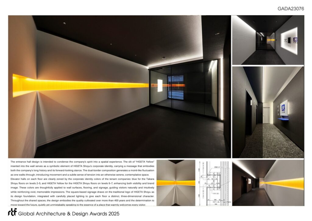
The entrance hall condenses the essence of the company into a singular experience. A luminous slit of “HIGETA Yellow,” inserted into the wall, functions as a symbolic incision, capturing both historical depth and forward-looking dynamism. The dual-border composition creates a moiré-like fluctuation as visitors move through the space, introducing a subtle sense of motion and tension into an atmosphere of serenity and contemplation. This treatment transforms the hall into a threshold where the company’s identity is made spatially tangible.
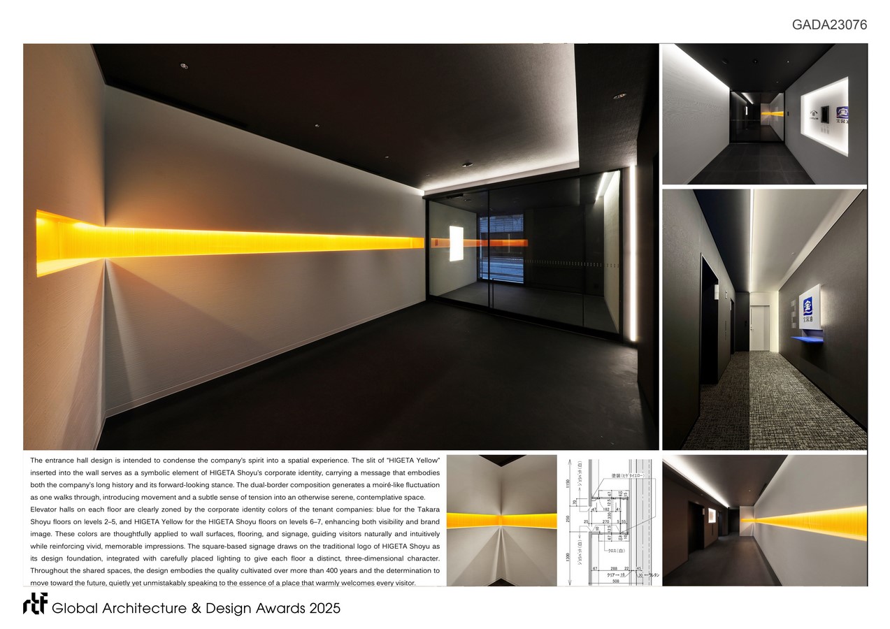
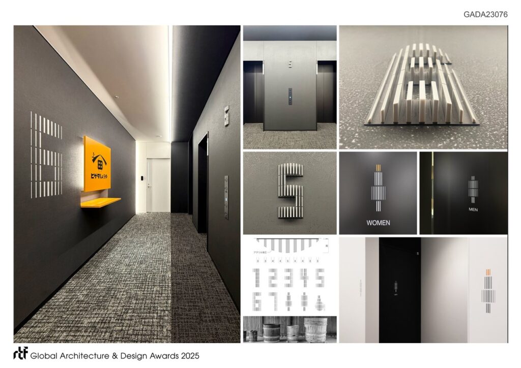
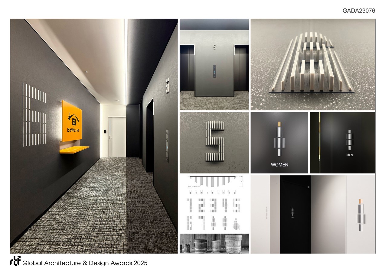
Elevator halls reinforce brand presence with clarity and elegance. Corporate identity colors distinguish the tenant zones—blue for Takara Shoyu on floors two through five, and HIGETA Yellow for Higeta Shoyu on floors six and seven. These colors extend across wall planes, flooring, and signage, ensuring intuitive navigation while leaving vivid, memorable impressions. Square-based signage derives from the traditional Higeta logo, integrated with carefully orchestrated lighting to impart dimensional depth and a contemporary expression of heritage.
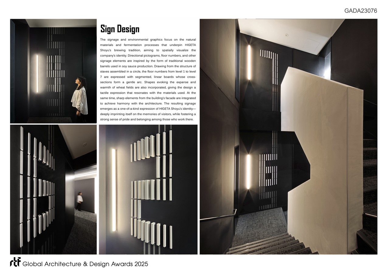
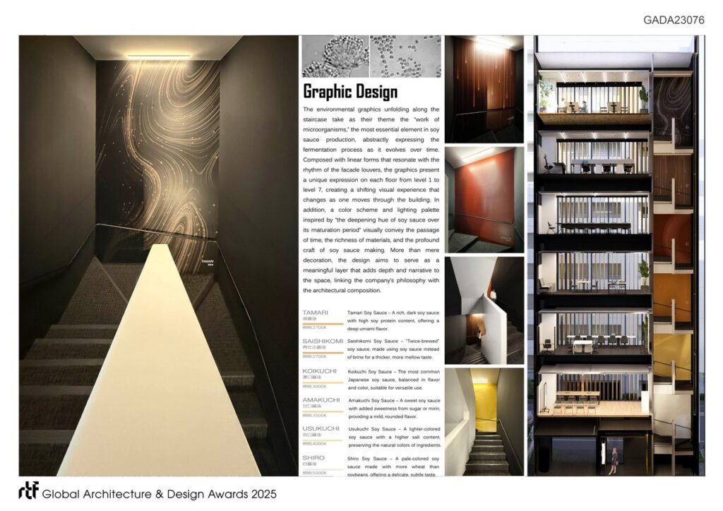
The environmental graphics draw inspiration from the natural materials and fermentation processes that anchor the brand’s craft. Pictograms, directional signs, and floor numbers reinterpret the circular structure of traditional wooden barrels used in soy sauce brewing. Each floor number, from one through seven, is composed of segmented, linear boards whose cross-sections arc gently, echoing the curvature of barrel staves. This design vocabulary transforms functional elements into tactile reminders of cultural continuity.
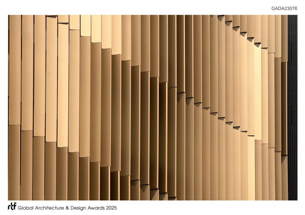
At the same time, the signage incorporates motifs from the building’s facade, where golden louver fins evoke rippling wheat fields shaped by wind simulations. By uniting interior and exterior, the signage achieves harmony with the architecture while carrying forward the symbolic resonance of wheat—the ingredient that once revolutionized soy sauce brewing. Additional gestures reference the expanse of wheat fields, conveying warmth and openness while balancing sharp geometries that reflect modernity.

The result is a one-of-a-kind expression of corporate identity that integrates history, materiality, and spatial experience. The signage system does more than guide movement; it narrates a story spanning centuries while instilling pride in those who work within. Visitors encounter a design that is at once welcoming and iconic, deeply imprinted in memory. By fusing symbolic heritage with contemporary sensibility, the project sets a new benchmark for how environmental graphics can embody cultural identity with dignity, precision, and lasting impact.